
Contrast is a compositional element in art and a principle of art and design. Artists can use contrast to create their intended effect, whether that is one of balance, or dynamism. By altering the difference between colour and value in an artwork, you can create a sense of realism, or abstraction, and produce a harmonious or discordant image.
In this article we’ll explore contrast in art, including its definition and some examples. We’ll also give some tips on how to use contrast to make your own art piece more successful.
Disclaimer: Fine Art Tutorials is a reader supported site. When you make purchases through links on this site, we may earn a small commission at no extra cost to you.
Contrast in art definition
Contrast can be defined as the juxtaposition of two elements that are different, but which work together to create a balanced whole. In art, contrast is used to direct the viewer’s attention to a particular area of the painting, and can be used to create a variety of different effects.
Contrast can be created using a number of different visual elements, including colour, value, texture and form. By altering the level of contrast in an artwork, you can change the overall tone and feel of the piece.
Types of contrast in art
Contrast in art comes in many forms, the contrast between light and dark (values), the contrast between hues or saturation (colour), and even the contrast between texture and form.
Value contrast

Value contrast is created by using light and dark tones to create a sense of depth and three-dimensionality. The definition of value in art is the relative light or darkness of a colour, irrespective of its hue. Value contrast can be used to make an object appear closer or further away, and can also be used to create a sense of drama or movement.
The value scale

The value scale was invented by Denman Ross, it’s a scale of 9 values that range between white and black. Artists can use this scale to determine how values in their artworks relate to one another.
One tool that can be really useful is a value finder—match values on the card to the values in your artwork. You can use it whilst mixing colours, or use it to match values in your art to the values in your reference. This way, you can achieve your desired contrast in your artwork.
High and low contrast

High contrast in art refers to an image where there is a big difference between the light and dark values. Low contrast, on the other hand, is when there is not much difference between the light and dark values. The level of contrast you use in your artwork will depend on the effect you want to create. For example, in this painting of a wave at just before dusk, I wanted to create a serene feeling, whereas the sunset painting on the right appears more vibrant and eye catching at first, due to the high value contrast.
Colour contrast

Colour contrast describes the contrast between the hues of an image. Complementary colours have a high colour contrast, those are the colours that are situated at opposite ends of the colour wheel. For example, blue and orange are complementary colours, or purple and yellow. Create a high colour contrast by using complementary colours in your artwork. Choose a colour scheme to work from, to plan the colours of your painting. In the paintings above, I chose to work with a limited palette of ultramarine blue, burnt umber and white for the painting on the left to create a monochromatic scheme. Whereas the painting on the right has less value contrast, but more colour contrast. I used a larger palette of phthalo blue, burnt umber, magenta, lemon yellow and white.

Saturation is another way to describe colour contrast, this refers to the intensity of a colour. For example, a highly saturated red, like the red you see on a postbox (in the UK) or a fire engine, compared to a muted red of a brick wall.
Contrast and texture

Texture is another way to create contrast in art. This only works with thicker mediums that can add three dimensionality to a piece, like oil paint or heavy body acrylics.
For example, you could add cold wax to oil paint to thicken the mixture and aid the paint in retaining texture on the surface. Then paint with thick strokes, using the impasto technique. Use softer texture for distant elements, to make the subject in the foreground stand out.
Contrast and form
Line, shape, values and edges all comprise the form of an object. Contrast can be used as an element to vary the thickness of lines, the relative hardness or softness of edges or the size and nature of the shapes in an artwork.
How to create contrast in art: Steps
We’ll walk you through how to create your own artwork with high contrast. As you already know from the previous section about types of contrast in art, there are a number of ways to create contrast, with colour, value and texture.
Plan the composition first
The first port of call, is to decide how you will use visual elements to create contrast in the composition. It can be helpful to get a sketchbook and create a few thumbnail sketches to plan your final pieces and how these elements will fit together.
Create a focal point by positioning the subject and by using high contrast between values and colours. Think about how to use contrast in the composition to convey your intended message. The message could just be in creating a peaceful landscape. This could mean using a warm colour palette of muted sunset colours that have a low value contrast. It’s up to you and the possibilities are endless. When you have an idea of what you want to create and you’ve selected your favourite thumbnail sketch, it’s time to move on to making your artwork!
Start with a light layer

Whether you are painting or drawing, it’s a good idea to start the artwork with a light pencil layer. This way you can map out where you want all the different elements to go. Erase any lines if you make a mistake.
There are a number of ways to create an accurate drawing, such as using the grid method. One tip, is to very lightly draw around the areas that will be in the darkest shadow. Then with consecutive layers, you can work on the midtones and transitions between midtones. Add the deepest shadows and lightest highlights last. This image is from our how to draw a pineapple tutorial. Check it out if you want to give it a go yourself.
Gradually increase the contrast with each layer

No matter what medium you are working with, a good approach to making art is to gradually increase contrast with each layer. It’s much more difficult to create contrast in the first layer, then work on toning it down for the rest of the drawing or painting process, than to take a more gradual approach. This way you can make sure to not overdo it.
If you’re painting with watercolour, make sure to leave the areas that will form the lightest highlights until last. Then work on gradually increasing the depth in the shadow areas with each layer of paint. For oil and acrylic painters, one approach you can take is to work from colours that are relatively toned down in the first layer, then gradually increase saturation with each layer of paint and increase the darkness of the shadows. Many oil painters leave painting the brightest highlights until last, as titanium white is an opaque pigment that will cover midtone values.
When drawing, start with a light sketch to form the lighter midtones, then gradually work in the shadows. Increase the pressure you apply to the pencil for the darkest areas. Use a fine tipped eraser, like the Tombow Mono Zero eraser to lift small highlights from your piece.
Don’t overdo it!

When you’re working with contrast, it can be easy to get carried away, but it’s important not to overdo it. A high level of contrast can make an artwork look unbalanced and can be quite jarring to look at. It’s important to find a balance that works well with the rest of the composition.
A good way to check if you’ve used too much contrast, is to take a step back from your artwork and squint your eyes. If the image looks like a mass of dark and light shapes with no defined edges, then you may have used too much contrast. Another way to check is by photographing your artwork with your phone, then editing the image so that it’s in greyscale. This way you can see the values in your artwork accurately without colour confusing the image. You can see from this whether you need to increase the contrast in some areas, or tone it down.
Complementary colours can also be used to create high contrast without being too jarring. Red and green, blue and orange, and purple and yellow are all examples of complementary colours. By using two colours that are opposite each other on the colour wheel, but toning them down, you can create a high level of contrast without it being too overwhelming.
Examples of contrast in art
Below are some examples of contrast in art.
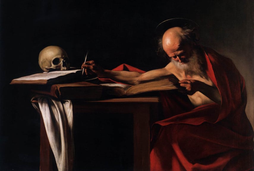
Saint Jerome Writing by Caravaggio is an excellent example of contrast in art. He used the chiaroscuro technique, which is the contrast of light and dark. The light areas help to focus the viewer’s attention on the subject, while the dark areas create a sense of depth. The limited palette of black, white, brown and red create further contrast and add to the sense of intensity and broodiness that the artist intended to create.
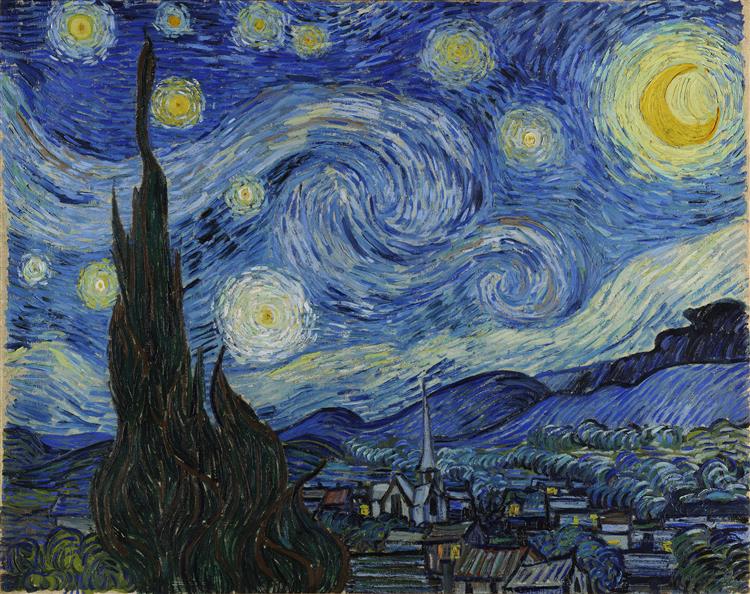
The Starry Night by Vincent van Gogh is another excellent example of contrast in art. In this painting, Van Gogh used a high contrast between the light and dark areas. This creates a sense of movement. He also used contrasting colours, such as the blue and yellow, to add to the glowing and swirling sense of observing the night sky.
Techniques to create contrast in an artwork
There are a number of established techniques used by the old masters, that you can try for yourself to create contrast in your paintings.
Chiaroscuro
Chiaroscuro is a technique that uses contrast to create the illusion of light and shadow. It is often used in figurative paintings, where the use of light and dark colours can give the impression of three-dimensionality.
The term chiaroscuro comes from the Italian words for ‘light’ and ‘dark’. Chiaroscuro paintings often make use of a limited palette, to give a further muted appearance.
Renaissance painters such as Leonardo da Vinci and Michelangelo used chiaroscuro to great effect in their figurative paintings.
Tenebrism

Tenebrism is a technique that uses very dark and light colours to create a sense of drama. It is often used in religious paintings, where the use of light and dark can create a sense of mystery or awe. It is closely related to the Chiaroscuro technique.
The term tenebrism comes from the Italian word for ‘darkness’. Tenebrism paintings often make use of a limited palette. With dark colours used to create shadows, and light colours used to highlight the subject. Often, areas of the face would be highlighted, with a dark background surrounding the subject.
Baroque painters such as Caravaggio and Rembrandt were masters of tenebrism, using it to create dramatic scenes that engaged the viewer’s emotions.
What effects can contrast create?

There are a number of ways that contrast can be used in art. Below are some of the most common:
To create a sense of depth: By using contrasting colours, values or textures, you can create the illusion of depth in a painting. This is often used in landscape paintings, where the use of light and dark colours can create a sense of distance. For example, distant hills will be more similar in tone to the sky, compared to hills in the foreground.
To focus the viewer’s attention: Contrast can be used to draw the viewer’s attention to a particular area of the painting. This is often done by placing an object in front of a background that is significantly different in tone.
To create a sense of movement: Use contrast to create a sense of movement in a painting. This is often done by placing contrasting objects in diagonal or curved lines and spacing elements out.
To create a sense of tension: Contrast can be used to create a sense of tension in a painting. Create this effect by using highly contrasting colours or values, with high saturation and dark shadows, or by placing objects in close proximity to each other.
Composition and contrast: How to plan an artwork
When planning your artwork, focus on one, two or three types of contrast. For example, you could create a painting with a limited colour palette, muted colours but a high value contrast. Or you could create a painting with large and varied colour contrast, with slightly lower contrast between values.
The more contrast and types of contrast in an artwork, the more dynamic and lively it will look. However, subtlety takes restraint and it’s often something beginner artists struggle with when composing a painting. To create a more harmonious and balanced feel, exercise subtlety by using contrast sparingly. This way you can be sure to make an aesthetically pleasing piece. However, many artists flout these compositional guidelines and create incredible artworks nonetheless! Remember, art has no rules! But, if you’re a beginner it can help to learn how to mix muted tones to create balance in an artwork. Then, when you feel comfortable with this, try using techniques to gradually increase the value contrast, saturation and texture.
The best way to plan the composition of an artwork, is to create thumbnail sketches in a sketchbook. Roughly shade where the lightest and darkest values will be, or quickly experiment with colour palettes until you find one you like.
Another option is to create a notan study. This is a two value study of black and white, that will help you see the broad value masses and composition of the piece more clearly.
Here are two points to consider when designing your composition:
Create a focal point
The focal point in an artwork is the subject or object that the viewer’s eye is drawn to first. Create a focal point, by the placement of the subject, or by increasing the contrast. Use harder edges around the subject’s form, use a higher contrast between highlights and shadows. Increase the saturation of an item of clothing, or paint with texture to make it stand out. These are all examples, so there are other ways to draw the viewer’s eye to a subject or object in a scene. Play around with these devices when you’re planning your own composition.
Space elements to create balance
The placement of elements can create a sense of balance, imbalance or asymmetry. For example, if you were to create a high contrast painting, with all the light focussed in one area, the viewer’s eye would be drawn to the lightest areas first and generally ignore the concentration of shadows. Think about leading the viewer’s eye in, so that they first notice the focal point, then other salient elements. The way the viewer’s attention is progressively grabbed by different elements in the painting is called rhythm. One way to do create a sense of rhythm in an artwork, is to use spacing between contrasted elements.
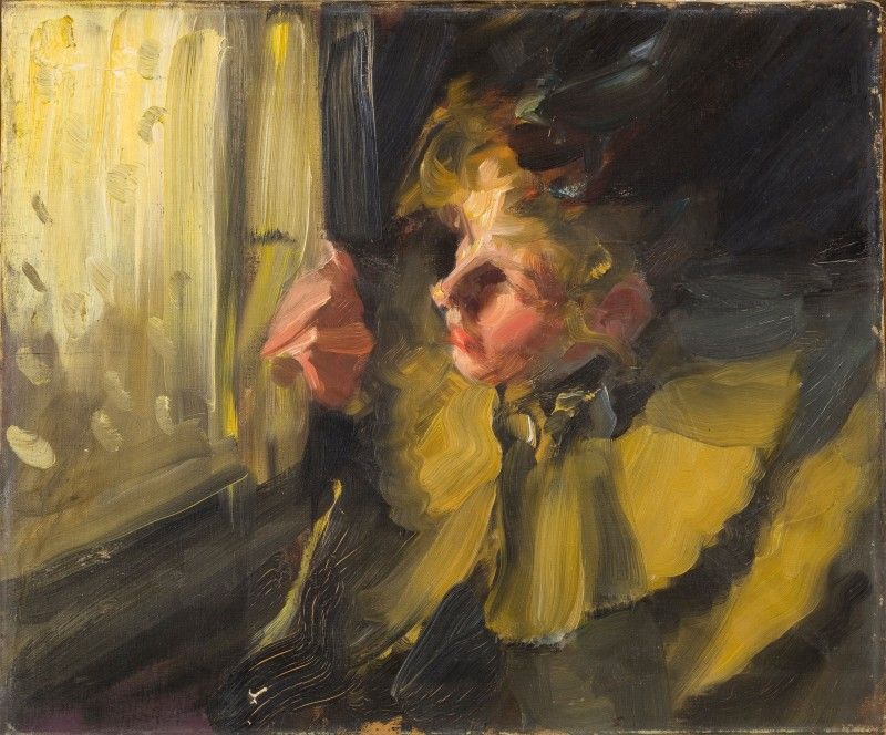
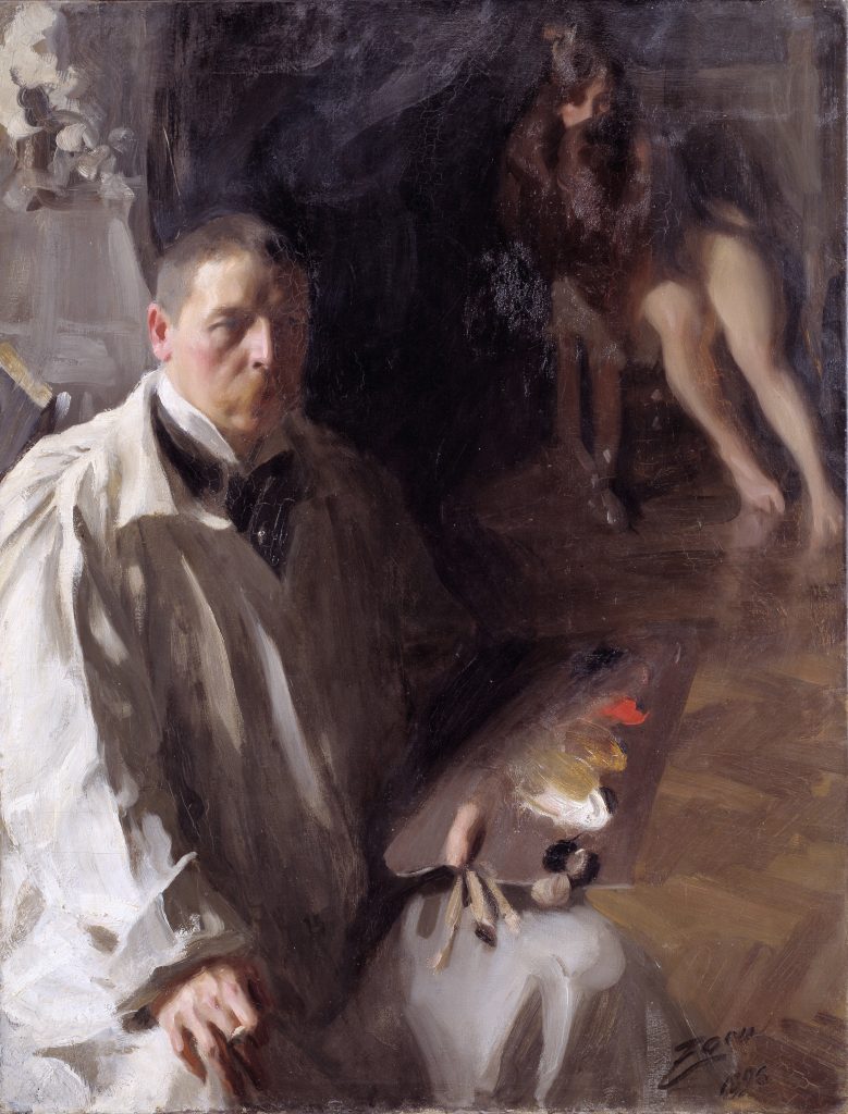
For example, in this painting by Anders Zorn, the eye is first naturally drawn to Zorn himself. The person in the background grabs the attention second, then back to Zorn’s palette. Zorn has intentionally positioned elements within the frame, so that the eye jumps from one subject to another. The palette, which appears highlighted and in the centre of the frame of the canvas is of particular importance. This is because it reveals Zorn’s famous limited palette, of titanium white, yellow ochre, vermilion or cadmium red, and ivory black.
Why is contrast in art important?
Contrast is important in art because it helps to create a sense of movement, tension and focus. It can also be used to create a sense of balance or rhythm in a painting. By using contrasting colours, values or textures, an artist can guide the viewer’s eye around the composition. This ultimately creates an aesthetically pleasing piece of art. It helps artists create meaning and depict their subject in the way that they intend.
Ways to create contrast in art: 5 ideas
Now you have an idea of what contrast is and how to use it, it’s time to get creative. Here are some ideas you could try to get you started:
Working on a black surface
Use black gesso or paint to prime your surface for oil or acrylic painting. This will make the whites in your painting pop, and any other colours you use will appear more vibrant. For coloured pencil or pastel drawing, choose a black paper to work on top of.
Paint with a limited palette
Choose two or three contrasting colours and stick to using just those throughout your painting. This can be effective in creating a harmonious colour scheme. By using a palette like this, you can create both colour and value contrast, with fewer tubes of paint.
Create a high contrast painting
This can be done by using a limited palette, as mentioned above, or by using a wide variety of colours. Vary the values by adding white or black to lighten or darken tones. You could also try using complementary colours to create additional contrast.
Use analogous colours with low saturation

Analogous colours are those that sit next to each other on the colour wheel, for example red, orange and yellow. Low saturation means using muted colours, rather than pure hues. This can be a subtle way to create contrast, by using colours that are different, but not too different.
Experiment with texture
Use a variety of mark making techniques to add different kinds of texture to your painting. Add a medium to your paint to thicken the mixture and retain brushstrokes. Heavy body acrylics paired with gel medium can help you achieve three dimensional marks that will create contrast by standing out from the surface.
For more drawing and painting ideas, check out our guides!
Finally
Contrast in art is a useful tool for artists to help convey meaning and make an artwork appear more interesting.
The important thing to remember is that there are no rules in art, so experiment and have fun!