
In this guide, well cover the topic ‘what colours make orange?’ Learn the colours that make orange, how to mix orange from different pigments and the shades of orange you can achieve from different mixes. We’ll also cover how to use orange in your designs to create stunning artwork.
Disclaimer: Fine Art Tutorials is a reader supported site. When you make purchases through links on this site, we may earn a small commission at no extra cost to you.
What colours make orange?
Orange is a secondary colour, meaning it’s made up of two primary colours, red and yellow.
Mixing equal parts of red and yellow together will create the standard orange hue. However, if you want to adjust the shade of orange you can mix more or less of each pigment to achieve a different shade of orange, for example, yellow-orange or orange-red.
Colour theory and colour wheels
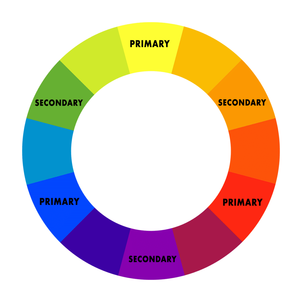
It gets a little more complex when we look at colour theory and different colour wheels in relation to mixing. The traditional colour wheel is the red, yellow, blue wheel. Where red, yellow and blue are primary colours. Then orange, green and purple are secondary colours.
The colour model that is most practical for artists to use as a reference to help them mix pigments is the CMYK model.

The primary colours on this model are cyan, magenta and yellow. The secondary colours on this model are red, green and blue. Then the tertiary colours include orange, yellow-green, teal, purple and more. Magenta and yellow mix to make red, and more yellow is added to make orange. This is based on how pigments act when mixed together.
Colour theory is a fairly complex subject, but it’s worth reading up on if you’re interested in mastering your colour mixing skills. Read our in depth guide on colour theory to learn more!
What is orange?

Orange is a wavelength of light on the visible spectrum. It has a wavelength of 600nm and a frequency of around 500 THz. The colour we perceive has a relatively low frequency, long wavelength and low energy.
In art, orange is a warm, secondary colour that is mixed from the primaries red and yellow. Depending on the pigments used and the amount of red or yellow used, artists will achieve different shades and tones of orange. For example, if artists use magenta, which is a type of red, they will have to mix a higher proportion of yellow to achieve orange, and the orange tone will appear cooler compared to if the artist had used a warmer pigment like cadmium red.
Shades of orange

On the colour wheel, orange ranges from light yellow-orange, to deep reddish oranges. There are countless shades of orange in-between, and artists have to experiment with different mixes to achieve the desired colour. Desaturated orange is just brown, to tone down a mix and decrease the saturation, mix it with burnt umber, or its complementary colour blue.
How to mix orange

Mixing orange is fairly straightforward, and doesn’t require complex formulas or ratios. Generally speaking, equal parts of red and yellow create the middle tone of orange. The amount of pigment can be increased or decreased to achieve lighter or darker shades.
To mix deeper oranges, you can add a bit more red, for example vermilion. If you want to create a more yellowish orange, then add more yellow into your mix. Cadmium yellow and lemon yellow are the yellows that generally produce a brighter tone of orange. Use white to lighten the mix and black or burnt umber to create orange toned shadows.
If you’re new to colour mixing, it’s advisable to get a palette of primary colours and learn to mix all the other shades and tones from these. This way, you will learn more about how different colours combine to achieve your desired paint mixes. You can do this by experimenting, mixing various amounts of red and yellow, white and either black or burnt umber to make a tonal range of oranges, tints and shades.
Pigments used to mix orange
Various types of yellow and red pigments can be mixed to make orange.
Popular red pigments include: cadmium red, vermilion, magenta and alizarin crimson.
Some popular yellow pigments include: cadmium yellow, cadmium yellow lemon, transparent yellow, yellow lake, Indian yellow, yellow ochre.
To understand what colours make orange and specifically if two pigments will make a type of orange mix that you intend to create, learn more about the properties of each pigment. For example, cadmium red is a deep opaque red with high tinting strength, cadmium yellow has similar properties. If you mixed the two, you would achieve a highly saturated and strong mid orange colour. However, if you were to mix yellow ochre and magenta, you would achieve a more muted and subtle orange tone, as yellow ochre is an earth colour and magenta has a higher level of transparency.
When choosing a palette of colours to work, it’s not necessary to include orange pigments. You can choose a primary palette of magenta, yellow and phthalocyanine blue, then broaden the palette with cadmium red, cadmium yellow and ultramarine. From these colours you can mix a wide spectrum of tones, including all the orange shades. If you’d like to learn more about how to choose a palette of colours for painting, read our guide on limited palettes.
Orange pigments
There are plenty of pure orange pigments available that manufacturers use in paint. So if you want to use a pure orange hue, without mixing red and yellow pigments to create it, there is that option available. There are benefits to using single pigment oranges, they can appear more vibrant on the canvas. Plus, if you use a lot of orange in your art pieces, you will save time mixing orange tones on your palette.
Some examples of single pigment orange colours are: cadmium orange, permanent orange, perinone orange, pyrrole orange.
Cadmium orange is a naturally occurring pigment made from the mineral greenockite. Industrially, it is made by modifying cadmium yellow with cadmium selenide. It has similar properties to cadmium red and yellow, in that it has a high tinting strength and dominates colour mixes. Pyrrole orange on the other hand, is a more transparent pigment, with a mid red-orange tone. This pigment is better suited to glazing.
Colour theory and mood
Colour affects mood and the feel of an environment. Orange is a bright, warm colour that can bring a sense of energy and movement to a space and to an artwork. It is also said to be a colour of optimism, adventure and success.
In artwork, orange can help to bring an extra layer of emotion and feeling. Using shades of orange in different parts of a painting or drawing will create balance as well as add interest and depth. Experiment with different shades of orange to see what works for your project!
Warm and cool colours
Warm colours are red, orange and yellow, cool colours are blue, green and purple.
Use warm and cool colours in art projects to evoke particular feelings and sensations from the viewer. For example, using a mixture of warm and cool colours will create a sense of balance, whereas only using warm colours will create a sense of intensity.
The warmth and coolness of colours are relative to the colours surrounding them. For example, a deep reddish orange will appear warmer next to a light, yellow orange shade. However, the light yellow orange shade will appear warmer next to a bright greenish yellow.
Another way to use warm and cool colours in art is to create a sense of depth. Colours described as cool, appear to recede in scenes, whereas warm colours appear to come forward. For example, distant mountains usually take on a cool blue tone, similar to the colour of the sky. This is due to atmospheric perspective, which makes them appear to fade into the distance.
Colour schemes and orange
Artists and designers select colour schemes in their work to create atmosphere, contrast and focal points. Use bright oranges, contrasted against a cool background to lead the viewer’s eye in and bring about salience in your design.
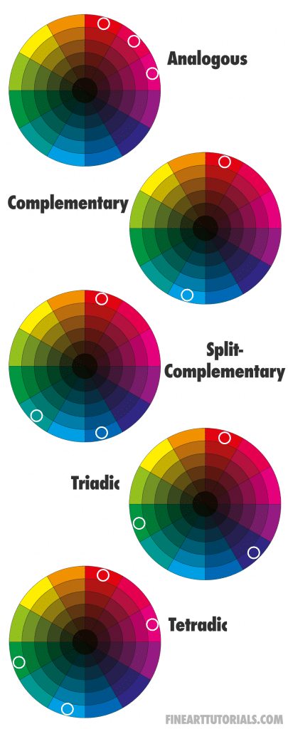
There are multiple different colour schemes, each with their own effects. For example, in a complementary colour scheme, artists will use colours at opposite ends of the colour wheel to evoke a sense of contrast in their work. The complementary colour of orange is blue. By using blue next to orange, each colour will appear brighter as they will stand out against each other.
One colour scheme that is great for creating balance in an artwork is the tetradic scheme. This uses four colours spaced evenly around the wheel, using two sets of complementary colours. The tetradic scheme has vibrancy, variety and contrast, the use of two sets of complementary colours appears harmonious.
How to use orange in art
Orange is an eye-catching colour, making it great for creating abstract artwork or vibrant pieces. It works especially well when used with complementary colours, such as blues and greens.
Orange can also be used to add interest to a painting or drawing. Using various shades of orange in different areas will create contrast, depth and balance unlike if a single shade was used. Experiment with different tones and proportions of red and yellow pigments to achieve the desired colour.
In nature, orange is associated with fire, autumn leaves, sunsets, butterfly wings and bright wildflowers. Where autumn leaves will appear more muted and earthy in tone, bright sunsets, wildflowers and fire colours can be incredibly bright and saturated. Think about how you will toggle the saturation of the colours to mix for landscape pieces.
Also, consider how orange can be used to create moods and feelings. Using a range of warm oranges and cooler tones will help the artwork feel balanced, with both tension and relaxation. In addition, think about how introducing other colours into the mix (such as reds or greens) can bring out different tones of orange.
Examples of orange in art

Pissarro uses a range of muted orange tones, browns and slightly brighter oranges to make the hats, clothes and lamp posts stand out. The tonal variety creates contrast and a sense of movement without being overbearing. The pops of green and yellow accents add variety to the piece.

Degas uses earthy, fiery orange tones to create a sense of warmth in his painting L’Etoile. The subject and focal point of the ballerina in the light coloured dress contrasts against these deep orange tones.