
Colour temperature can have a huge impact on the atmosphere and feel of an artwork. There’s more to using cool colours than just including blue, or purple in an artwork. Identifying and using colour accurately and intentionally in your artworks takes skill.
In this guide, learn how to use cool colours in art to create more realistic, impactful pieces and to change the mood of your painting. Learn how to identify cool colours and how to mix them to design balanced and harmonious compositions in your artworks.
Disclaimer: Fine Art Tutorials is a reader supported site. When you make purchases through links on this site, we may earn a small commission at no extra cost to you.
Cool colours definition
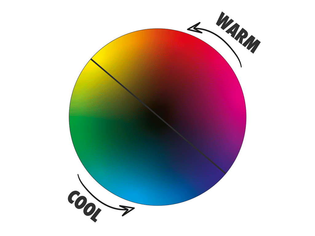
Cool colours are blue, purple and green in art. These colours are based on our associations with nature, such as ice, cold blue oceans and cold blue skies. Blue is the coolest colour and because the secondary colours green and purple sit next to blue, this makes them cooler as well.
Warm colours on the other hand are red, yellow and orange, these sit at the opposite end of the colour wheel compared to the cool colours. Warm colours are based on our associations with the sun, fire, and hot climates. Red is generally considered to be the warmest colour, although yellow and orange come a close second.
Colours with cool undertones
Colours sit on a spectrum and colour temperature is relative. These are both important features to remember when identifying colours.

Take the example of a red toned purple placed next to a blue toned purple. The red toned purple will appear warmer compared to the blue toned purple when they are seen next to each other. However, the blue toned purple will appear warmer compared to pure blue, when these two colours are seen next to each other. This is the effect of simultaneous contrast, where the context of the colours surrounding the colour in question, changes our perception of that colour. For example, in this painting by Monet, the red toned purple shadows of the haystack are brought forward and appear warmer, compared to the cool blue-purple shadows in the distant trees, which appear to recede into the distance.
Cool neutral tones

Cool colours that are neutral in tone consist of grey and similar shades on the wheel.
Brown is a warm neutral and is made by mixing all the primary colours together, with a high amount of red or yellow. On the other hand, grey is made by mixing all the primaries together with a higher proportion of blue in the mix.
Many painters will mix the cool colour grey by mixing black and white together. This is because the pigment ivory black is frequently used as black in mixes and ivory black is actually a very low chroma blue. So when you mix it with white, you will achieve a grey, that has cool blue undertones. However, our eyes perceive the colour black as the pigment absorbing all light waves of colour and reflecting none. This is how all primaries mix to make black.
Cool red tones

Although red is the warmest colour on the wheel, the colour magenta is considered a cool red. This is because it appears to have blue undertones and leans towards purple on the spectrum. To make the coolest, purest red tones, mix magenta with a small amount of ultramarine. This will create a purple tone or a very cool red tone, depending on how much ultramarine blue you added.
Despite this, magenta is actually considered a primary colour in pigment form, in the subtractive colour mixing model. This is because it cannot be mixed or made from any other colours on the spectrum. The primaries magenta and yellow mix to make red and orange. As you can see, colour theory is complex and nuanced, read our guide on colour theory to learn more!
To create cool red tones, you can use a high ratio of blue to red in the mix. Additionally, you can add black and/or white to your mixes, to change the chroma or perceived intensity of the coolness of the colour.
Cool yellow tones

Yellow is a primary colour that mixes with blue to make green and mixes with red to make orange. If you add a small amount of red to a yellow mix, you will make a warm yellow. So to make a cool yellow, add a little blue to the mix. To make the brightest acidic looking cool yellow, mix cadmium yellow with a small amount of phthalocyanine blue. These colours mix to make turquoise greens, but with a small amount of blue you can make the almost fluorescent yellow colour that veers towards lime green.
Cool blue tones

Blue is inherently a cool colour, but when you have multiple blues sitting next to one another in a painting, some of them will be relatively cooler than others. Cyan blues or blues that point more towards green on the spectrum are considered to be cooler in tone that blues that point towards red. So ultramarine, which has red undertones is warmer compared to phthalocyanine blue.
Cool pigment colours
Here are some of the most popular pigments that sit on the cool side of the colour wheel:
- Manganese Violet: A purple with red undertones that is semi opaque.
- Indigo: Transparent grey-purple blue. Great for stormy skies and seascapes.
- Ultramarine blue: One of the most popular blue pigments, it makes excellent purple tones when mixed with magenta.
- Cobalt blue: Semi opaque green blue.
- Phthalo blue: Considered primary blue in pigment form, this is a pure blue tone.
- Cerulean blue: Green blue that is more neutral in tone, creates nice teal and turquoise colours.
- Viridian green: Semi opaque, lower strength than phthalo greens.
- Italian green umber: Earth colour with a deep warm, brown green tone.
How to mix cool colours

To mix cool colours, you can start with a primary colour and add a blue pigment to alter the mix. Add more blue to make it cooler in tone or less blue to make it warmer. To brighten the mix, add white and to neutralise and darken the mix, add the complementary colour. Burnt umber and ultramarine blue mix to make a deep black, that appears less cool in tone than ivory black.
Magenta, titanium white, cadmium yellow lemon, ivory black and phthalo blue would make for a perfect cool palette with primaries, tints and shades. To broaden the palette and add warmth, opt for cadmium yellow, cadmium red, ultramarine and burnt umber.
If you’re new to mixing, it can be a learning curve. Check out our colour mixing guide for beginners to get up to speed and learn a process for matching colours from your reference.
How to use cool colours in art

Colour temperature serves to impart information about the image to the viewer. Information about the time of day, light conditions, time of year and temperature can all be inferred from a painting. Added to this, the effect of the mood that the artist is trying to create can be gleaned from the warmth and brightness of the colours and the contrast between the colours that are paired together.
To create balance in your painting, try to use cool colours alongside warm colours, with a mix of muted and saturated tones. Plan the composition of your painting in terms of the colours you use. First decide what you want the focal point of the artwork to be, then decide how you will create salience and lead the eye into that point. For example, the focal point could be a bright red ship on the ocean, the warm red will create contrast next to the cool blue ocean and instantly draw the viewer’s attention.
Cool colours in landscape painting
Use colour to create a sense of light and atmosphere in a landscape painting. One way to do this is alter the colours to create the appearance of atmospheric perspective. Objects in the distance will take on more of a cool hue and start to look closer in value and tone with colours in the sky. For example, brown tones will appear grey and bright red will take on a toned down purple hue.
Cool colour schemes

Artists can use colour schemes to evoke emotions or to showcase a particular style in an artwork. A colour scheme is defined by where the dominant tones of a painting can be arranged on a colour wheel.

For example, a complementary colour scheme will include colours opposite each other on the colour wheel. This scheme is a brilliant way of adding movement and dynamism to an artwork. If you use orange and blue next to one another in a painting, the contrast will make them both pop!

Analogous colour schemes involve three colours that are located next to one another on the colour wheel. An example of this is green, cyan and blue. An analogous colour scheme is found in this painting by Alfred Sisley, with cool purple shadow tones and bright cyan water.
Colour theory in relation to colour temperature
Colour theory is the description of colour, its applications and effect on the viewer. It’s important to understand colour theory, as it will accelerate your mixing skills.
Using cool pigment colours will help you achieve more balanced compositions that have less intense warm tones. Experiment with different pigments, proportions, and mixing techniques to discover what works best for you and your subject matter.
Cool colours also have a calming, soothing effect on the viewer. This makes them an excellent choice for creating more relaxing or serene scenes. Finally, cool colours are often used to create moods such as sadness or melancholy.
Whether you are creating bright and energetic scenes, or calm and serene landscapes, understanding the principles of colour theory will help you create more compelling paintings that fully resonate with your audience.
Finally
Overall, the key to using cool colours effectively is to find the right balance between warm and cool tones for your particular subject matter and style. With time and experimentation, you can develop a better understanding of how to use cool colours in your artwork for the desired effect.