
The essence of realism painting is in the colour. By capturing the light of a scene with realistic value and tonal shifts, you can create an illusion of realism before adding in any detail.
Disclaimer: Fine Art Tutorials is a reader supported site. When you make purchases through links on this site, we may earn a small commission at no extra cost to you.
Realism painting: How to get started
If you want to paint realistically, it’s a difficult feat. There are many different components that you have to tie together. The first is rendering a scene with realistic proportions, the next is mixing colours realistically and painting them in the correct place on your canvas, then finally you have to create the details.
Luckily, there are some things you can do to improve the way you use colour quickly and therefore improve at realism painting.
The key to painting with realistic colours is in creating subtle transitions in tone and value. By acquiring this skill, you can paint freely and spontaneously without worrying about the structure or detail too much and still produce an aesthetically pleasing painting. Many artists who have a mastery of colour paint loosely and omit detail once they have the foundations of their piece down. They still manage to make their paintings look realistic from afar.

Before you learn how to use colours realistically, it’s useful to understand the fundamentals about colour mixing. If you haven’t already, peruse the guide, then come back to this article—it will help you to develop your expertise.
What are some common mistakes beginners make in using colour?
One of the most common mistakes that beginner painters make when trying to use colour realistically is that they use colours in a more saturated form compared to how they would appear in life. Colours in real life settings are much more neutral than we may initially perceive.
Another mistake is overusing titanium white. Or using titanium white without mixing it with other colours in highlighted areas of the painting. Titanium white washes out mixes, it can make colours take on a more pastel appearance and even make them look chalky.
Be conservative with your application of titanium white. If you’re trying to mix colour for a lighter area, start with zinc white first, then slowly add in titanium. Of course, titanium will be necessary for some areas, but almost never applied straight from the tube onto the canvas. To achieve realistic high key tones, add a tiny bit of the mid value colour to tone the white down a little.
Learn a colour’s extended range

There are many ways to alter a single colour to change its appearance.
Saturation
The saturation of a colour is how vivid it is. A colour with high saturation could be described as a colour in its purest form.
The hue of a colour describes its dominant lightwave. So for example, the pigments ultramarine, cobalt and cyan would all be described as blue.
Tone
The tone of a colour can vary in lightness or darkness and saturation, but it won’t represent a colour in its purest or most saturated form.
Tint
Create a tint by adding white to the colour. The tints are the lightest areas of a painting and are normally a colour mixed with titanium white.
Because titanium white is an opaque pigment it will alter the opacity of the colour. It brings the tone forward in the painting as the light will reflect directly off of the first opaque paint layer.
Shade
This refers to the relative darkness of a colour. The value of a colour is how light or dark it is.
A shade is a colour mixed with either its complementary colour, or with black to darken the mixture.
When a colour is mixed in equal parts with its complementary colour, it makes an achromatic colour, but it will be more of a dark grey than black. To darken the mix, you can add extra black.
Start a painting with neutral colours
It’s easier to start with the more neutral tones and shades in your painting, then gradually increase the saturation and brightness as you progress.
If you start with your brightest colours, you can instantly overdo it. It’s more of a struggle trying to tone a whole painting down, and you’ll feel like you will have wasted a lot of paint by the end trying to cover the intense areas up. It feels much better to carefully add in highlights and bright areas as you go—you’ll realise with realistic painting that less is more when it comes to saturation. Plus, painting on a vivid backdrop for too long can strain your eyes and make you feel tired.
How to mix neutral colours
To create neutral tones and reduce the saturation of a colour, you mix complementary hues together. Complementary colours are those that appear directly opposite each other on the colour wheel.

Complementary colour pairs consist of one primary colour and one secondary colour (a secondary colour is made of two primaries). This means that a neutral mix will contain all three of the primary colours, in equal measures.
Using this knowledge, you can add a tiny amount of a complementary colour to the mix to tone it down. Add a little more to make cool greys, or warm browns.
If a neutral colour looks more like grey, this means it is a cool neutral and that it has more blue in its mix than red or yellow. If a colour looks more like a brown then it consists of more yellow or red than blue.
It’s important to note that you can reduce the saturation of a colour by adding grey or black to the mix, but this will likely give you some unwanted results. The result of your colour mix depends on the pigment you use for black and grey, but if you use Ivory Black, which is actually a very dark neutral blue, it will make your mixture muddy. This is because it has a high tinting strength, so the appearance of your mixture will be completely taken over by this pigment.
Create colour values
We’ve touched upon tones, tints and shades and how they relate to colour. What these terms have in common is that they describe the value of colour, or in other words how light or dark a colour is.
In a painting, value is relative. This means that the value of a colour in a painting can be judged based on the relative tones of the colours that surround it. The lightest colour in a low key painting (painted entirely in dark colours) may be the same as the darkest colour in a high key painting (painted entirely in lighter colours).
Think of the areas in your painting as transitioning in value and notice how these areas relate to one another.
Use colour to create distance
When looking at a landscape scene, you’ll notice that elements in the foreground appear bright and saturated, whilst elements far in the distance appear to take on a neutral blue tone that seem to fade as they get further away. You will have probably noticed this if you have been to any mountainous or hilly area, where the landmarks are large enough to be visible when they are miles away.

The reason for this is light scattering. As light passes through air, some of the light is intercepted and bounces off the molecules in the air.
Light that is high frequency such as blue or violet is more likely to be reflected by molecules than low frequency light waves such as red. Light refraction in the air also explains why we perceive the sky is being blue.
We don’t see violet because our eyes are far less sensitive to violet light than blue. When we look at distant mountains or hills then, we are not seeing blue mountains, but instead you are seeing the scattered blue light coming from the air between you and the mountain.
You can see how painters have understood the physical properties of light, air and land and portrayed it in their paintings for centuries.
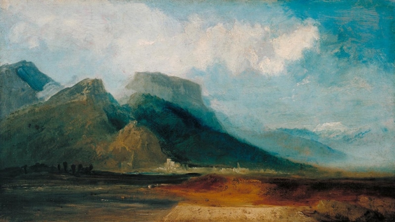
So how can you use this in your paintings? Firstly, you could create mixes of dark grey-blue for distant landmarks. Remember, the further away the landmark is, the lighter it will appear. If you are using the glazing method, you could create a very thin glaze of cobalt blue over the areas where you want to create distance.
For objects or subjects in the foreground, use a greater range of brighter colours. Create sharper details to bring them forward into view.
Simultaneous contrast: how colour can play tricks on us
Often, when we look at colours around us, optical illusions take place. A single colour or value in a reference is hard to pick out. The surrounding colours and values affect how we see it. This effect is called simultaneous contrast.
A colour that is dark in tone can be made to appear darker when a light colour is placed next to it. A neutral blue tone can be made to appear bright and vivid when its complementary colour orange is placed next to it. In addition, warm colours appear warmer when placed next to cool colours.
Here is an example of simultaneous contrast in action.

Painters can utilise this illusion to increase the appearance of colour and value contrasts in their work. By being aware of how our eyes can change the true appearance of colour, it will give you more command over using colours yourself.
Learn how to mix colour and match it to your reference
The biggest challenge when painting from a reference such as a photo, or from life is matching the colours you see to your canvas. It takes a lot of practice to simply look at something and be able to mix that exact colour each time.
There are steps you can take to aid you in the colour matching process, refer to the colour mixing process in steps to find out how.
Read up on colour theory
To really understand colour, how it relates to pigment and how colours interact with one another, read up on colour theory. It’s not essential to know all of the technical details surrounding colour theory, but having a basic understanding can revolutionise the way you use colour in your paintings.
How many colours do you need?
You don’t need too many colours for realism painting.
Try your hand at a limited palette, it will encourage you to learn how to use and mix colour better.
A limited palette can lay a good foundation for the colour you use in your art practice. To achieve realistic colours, you will need to be able to create the maximum range of hues that is possible to make from pigment. This means creating contrast in colour, value and temperature. Starting with the split primary palette will give you the most freedom in colour mixing, as you will be able to mix the greatest range of tones.
Here’s the split primary palette to help you mix realistically.
Create colour
- This is a warm red that leans towards yellow on the colour wheel. Pyrrole red is a good substitute for Cadmium, as it’s a primary red that is cheaper to buy.
- A primary red, it appears to have cool undertones straight from the tube, but mixes with yellow to make intensely vibrant oranges.
- This points towards red on the colour wheel, you can use it to create highly vivid purples.
- This is close to primary cyan, but mixes with transparent yellow to make high chroma greens.
- This is a very bright, primary yellow.
- A deep yellow with warm undertones. Hansa Yellow from M. Graham is a good substitute for Cadmium, as it’s cheaper.
Create values
- Titanium white is completely opaque, but it can make mixtures appear chalky.
- Zinc is a translucent pigment. Use this pigment to maintain the saturation of your mixes—it doesn’t give the ‘washed out’ effect that titanium white can. Over use of zinc in mixes can create a brittle paint film, however.
- Many artists use burnt umber instead of ivory black to create shade. Ivory black can make your colours look dull, desaturated and grey. Whereas burnt umber is transparent and warm in tone. So it can be used to create clean colour graduations.
Adjust values and tones at the end
Realism painting involves layers of adjustment. When the whole painting is finished and colours are dry, you may take a step back and notice areas that you want to fine tune. It is quite common for areas of the painting to appear duller and darker. This is where oil has ‘sunk in’ to the previous absorbent layers of dry oil, leaving pigment at the top, making it appear less bright and the values less contrasted.
What you can do at this stage is ‘oil out’ your painting. This refreshes the colours and reveals values in darker areas. This will make you see the painting more clearly before you go on to make any further adjustments.
Once the painting has a fresh veneer of oil, you can work to increase saturation, highlights, opacity or deepen shades. Whatever you see fit to make the painting more harmonious—consider the balance of the painting as a whole rather than the detail of single elements.
Mix colours realistically: Pin it!
If you’ve found anything on this site especially useful, you can make a donation to me through PayPal. I take a lot of time to research and write each topic, making sure each tutorial is as detailed as possible and I make all my content freely available. Any small donation (even the price of a cup of coffee!) can help me to cover the running costs of the site. Any help from my readers is much appreciated :).
Follow the link in the button below to support this site.
Feature image: In Plyos by Isaac Levitan