
Learn how to mix colours. Discover which pigments to use to achieve the greatest range of colour mixes. Plus learn how these colours combine to make different hues and tones on the spectrum. To improve your colour mixing skills—I outline a process to help you accurately mix the colours you intend from your tubes.
The first port of call is to learn a bit about colour theory and from this, choose a palette that will give you the ability to mix the largest range of colours with pigment. The next step will be to learn how these colours relate to one another using a colour wheel and how this corresponds to the pigments you are using. Then, learn how to study and perceive colour from your reference, mix, match and incorporate it into your painting. I’ll also give some mixing recipes for particular colours.
Disclaimer: Fine Art Tutorials is a reader supported site. When you make purchases through links on this site, we may earn a small commission at no extra cost to you.
Colour theory: the basics
By mixing the primaries, burnt umber and white, artists can create secondary and tertiary colours. They can also neutralise colours and make tints, tones and shades.
Combine the three primary colours in different quantities to make any other shade on the spectrum; primaries cannot be made by mixing other colours together.
In applications where people are mixing pigment to make different colours, it’s standard to use cyan, magenta and yellow as the primary colours.
Here are these primaries visualised and mapped on a colour wheel:

This colour model is far from perfect. From it, you get a varied range of shades, more than you would do from mixing just red, blue and yellow, but there are plenty of colours that are omitted from it. In other words, it does have a limited colour gamut.
For example, colours such as deep crimson and rich cobalt blue—the alternatives look muddy, not bright like they should.
Cyan, magenta and yellow are the three primaries that many artists use as a base, but to make the widest spectrum of highly saturated colours, you should use a warm and cool version of each primary. This way you can achieve clean mixes of your secondary colours, tertiary colours and other subtle tonal transitions.
Colours that are available in pigment form, whether they have been found in natural environments, or synthesised don’t perfectly correspond to all the colours we are able to perceive. However, we can find pigments that come close.
I have a more in depth guide on colour theory if you’re interested in learning beyond the basics.
Choose a palette of colours
The palette I suggest using is the split primary palette. The palette consists of six pigments to make hues and two (or three) to darken or lighten colours.
It includes pigments that closely correspond to the primaries cyan, magenta, yellow. This split primary palette also includes a deeper more rounded opaque red, a blue with cool violet undertones and a warm yellow.
To create hues & tones
- This is a warm red that leans towards yellow on the colour wheel. A cheaper alternative to Cadmium Red is Pyrrole. It has a similar colour profile and can be used as primary red.
- A primary red, it appears to have cool undertones straight from the tube, but mixes with yellow to make intensely vibrant oranges.
- This points towards red on the colour wheel, you can use it to create highly vivid purples.
- This is close to primary cyan, but mixes with transparent yellow to make high chroma greens.
- This is a very bright, primary yellow.
- A deep yellow with warm undertones. Use Hansa Yellow from M. Graham instead of Cadmium Yellow, if you want a cheaper option.
Create values (light or dark)
- Titanium white is completely opaque, but it can make mixtures appear chalky.
- Zinc is a translucent pigment. Use this pigment to maintain the saturation of your mixes—it doesn’t give the ‘washed out’ effect that titanium white can. Over use of zinc in mixes can create a brittle paint film, however.
- Many artists use burnt umber instead of ivory black to create shade. Ivory black can make your colours look dull, desaturated and grey. Whereas burnt umber is transparent and warm in tone. So it can be used to create clean colour graduations.
Additional extras
As mentioned before, there are limits to the CMY mixing model and colours such as crimson. You can substitute these colours if you feel like they would be essential to your palette.
Certain pigments have unique qualities that could be beneficial to your personal painting practice. Earth colours have transparent qualities and they dry fast, which is useful for painting the base layers of a painting. Burnt sienna is a useful pigment for painting a toned ground for all manner of subjects.
How to approach colour mixing
To mix a colour, you need to know how to describe it and its relationship to other colours on the spectrum. This way, when you come to pour paint onto your palette, you will know the approximate quantities to make the colour you want to make.
Hue
First identify the hue. This is, in a broad sense, the dominant wavelength of a colour, like red, orange, yellow, green, blue or violet.
The hue is a description of a colour in its purest form without taking into consideration other attributes such as tone and value. Any shade of colour can fall into one of the wavelength categories.
When you mix colour, the hue is decided and selected from your palette by first deciding which pigment is most appropriate to be the dominant colour. You may then add another colour to the mix. Then you decide what extra primary to mix in to create the colour bias. It may be a combination of all three.
Saturation
Next determine the saturation. This is how vivid the colour you are trying to match appears.
Look at the overall effect of the scene or subject you are trying to replicate, colours hardly (if ever) appear in their most saturated and primary form in real life settings, colours are often ever so slightly muted, even in the most brilliant light settings.
If you want to reproduce a realistic looking colour palette in your paintings, take this into account and make your colours more muted by adding an amount of the complementary colour to the mix.
Value
Then determine the value. This is how light or dark the colour appears. You can lighten or tint colours by adding white and darken or shade colours by adding burnt umber.
Opacity
An extra factor that you may need to consider, especially if you are using a medium like oil paint is the opacity of the mix. If you want your mix to be completely opaque, choose a pigment with low transparency, otherwise the colour of the top layer will be affected by the colours in the layers below.
Using oil, transparent colour is often layered beneath opaque pigments, to allow for more coverage and colour clarity in the top layers. However, transparent pigments can be used as glazes.
Colour bias
Every pigment has a colour bias. What this means is that when the colour of the pigment is plotted on a colour wheel, it will lean towards another colour. This is true of all colours we see around us. It’s a good exercise to describe colours you see in terms of their base tone and then the colour bias.
The relationships between colours
Use a colour wheel as a loose guide, to determine the relationship between different colours. The colour wheel will tell you the hue, the colour bias and how saturated the colours are.
The primary colours lie around the edge of the wheel and the hues in between are, in differing quantities a mixture between two or even three primaries. By working out the position of a colour you are trying to create on the colour wheel, you can roughly determine the quantities of each primary that are needed to make that colour mixture.
Colour groups
How to mix yellow

Yellow is a primary colour. You can’t mix colours to make a true primary.
You can however, alter the tone and bias by adding in other primaries or secondary colours. For example, you can make a cool, acidic lemon yellow by adding a touch of phthalocyanine blue and white.
Buttery yellows have a bias towards red and are slightly muted in colour. Mix in small proportions of red or magenta to achieve warm yellows.
Yellow mixed with burnt umber makes earthy, brown yellows.
How to mix orange

According to the CMYK colour model, orange is a tertiary colour, made with primary yellow and secondary colour red. However, according to the RYB colour wheel it’s a secondary colour.
You can make some brilliantly fiery oranges by mixing magenta and cadmium yellow.
For deeper oranges, mix cadmium red light and cadmium yellow.
For more muted oranges, mix lemon yellow which leans towards blue on the spectrum with either magenta or cadmium red deep. Or combine with a touch of cyan.
Create warm, ginger coloured oranges by mixing magenta with yellow lake pigment.
How to mix red

Red is a secondary colour not a primary according to the CMY colour model.
Mix two parts magenta to one part cadmium yellow to create a red hue.
Create a deep red similar to alizarin crimson by mixing magenta with transparent red oxide.
Mix with cyan to neutralise red.
To create fiery hues, mix cadmium red light with white and a little yellow.
How to mix pink

Mix magenta with white to create a range of cool, shocking pinks. Use zinc white mixed with a little titanium for the best results, as using titanium on its own can create a chalky, less saturated pink. This would be useful, however, if your aim is to make pastel pinks.
White and a red that leans towards yellow like cadmium red will make more salmon coloured pinks.
How to mix purple

To make brilliant purples, mix magenta and ultramarine.
Increase the amount of ultramarine for blue-purples. For dull purple mix with a small amount of yellow.
To mix deep, rounded purples, mix cadmium red and ultramarine together. Burnt umber is a warm earth colour that will both darken and neutralise purple for shadow tones. Alizarin crimson will mix with ultramarine to make dark, muted purples.
For example, to make the colour of lilac, mix a slightly higher proportion of magenta compared to ultramarine. Then neutralise it with a tiny amount of lemon yellow, then lighten the colour with titanium or zinc white.
Purple is a versatile secondary colour—use it in the highlights of florals or in deep shadows.
How to mix blue

Cyan, a type of blue, is considered to be primary. The closest pigment you can find to this is phthalocyanine PB15.
Mix blue with yellow to create blue-green hues and with red to create blue-violet hues. You can mix with orange to create grey.
How to mix green

A mid green can be made by mixing three parts transparent yellow with one part phthalo blue. This will allow you to begin with a light, cool mix.
From this you can make a range of green shades. Make bright greens by mixing in more transparent yellow and change the saturation by adding a tiny amount of magenta to the mix.
To get sap green, a deep leafy green that’s useful for colouring plants, the addition of more transparent yellow is required, a long with a touch of cadmium red. Keep adding the red until you have reached sap green. Alter this mix with burnt umber to achieve more earthy green shades.
To achieve a darker, more neutral and warmer green from the offset, mix yellow ochre or cadmium yellow and ultramarine.
How to mix neutral colours: toggling the saturation
Identifying the saturation of a colour is possibly the most difficult part of isolating and correctly identifying a colour. Colours are often more neutral in tone than we initially perceive.
In the subtractive model of colour, when the primaries (cyan, magenta and yellow) are combined in equal parts, an achromatic mix is created, close to black.
You can see in this subtractive colour wheel, that the nearer a primary colour gets to its complementary colour, the more muted in tone it becomes. Eventually, you could describe it as being more grey-blue than muted blue, for example.

To mix neutral colours, you mix complementary colours together. From this, depending on the amount of warm and cool colours you’ve added to the mix, you can slightly neutralise a hue to tone it down, or make cool greys, or warm browns.
Make black by mixing all three colours together. Deepen this black with Burnt Umber.
By mixing ultramarine, cadmium red and yellow together, a crisp and dark black can be made.
If a neutral colour looks more like grey, this means it is a cool neutral and that it has more blue in its mix than red or yellow. A colour that looks more like a brown will consist of more yellow or red than blue.
How to mix grey
Grey is simply a desaturated colour that leans towards blue, and appears cool. ‘Warm greys’ lean ever so slightly towards yellow on the spectrum.
Create grey by mixing ivory black with white. Alternatively you could use one part ultramarine, one part burnt umber mixed with white to make grey.
How to mix brown
You can make brown from primary colours by mixing all three together and then adding extra red and yellow.
You don’t need to mix your own earth tones, you can buy a variety of earth pigments in varying warmths and tones. Burnt sienna, for example, leans towards red.
How to mix colours: the process in steps
Step 1: Study your reference and isolate the colour you want to paint
The colour mixing process requires the painter to study the reference and isolate the colour they want to reproduce in their work. A colour in context is actually pretty difficult to isolate, as the surrounding colours can alter the appearance of the colour in question. This effect is called simultaneous contrast.

To make it easier, you could use a tool like Photoshop, or another photo editing programme. Use the picker tool to sample the colour from your photo reference. Just make sure that your document is in CMYK mode first.
If you aren’t painting from a photograph—you’re painting from life or on the field, or if you don’t have photo editing software, then you can use a tool to physically isolate colour. Use a viewfinder tool to look through to see the colour in isolation.
Another option is to focus on the colour and describe it. What’s the general colour category? How saturated is it? How dark or light is it? Doing this can advance your natural skills in colour perception.
Step 2: Find its place on the colour wheel
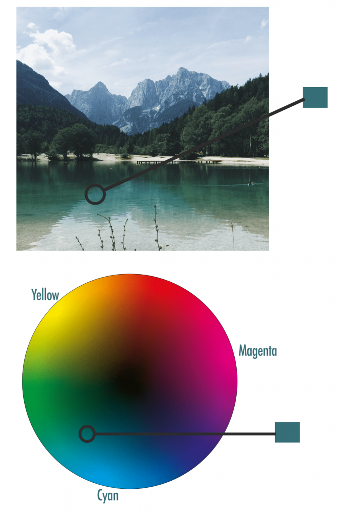
Locate your colour on the wheel. Its coordinates will inform you about the colours you should mix to make it. Describe its position on the wheel.
Step 3: Mix the corresponding pigments
You need to decide which pigments to use to, in the most efficient and cleanest way, get to your intended colour.
With the teal example above, the corresponding pigment to cyan would be phthalocyanine, with the pigment code PB15. For the yellow bias it would make most sense to use transparent yellow PY128 as it is the primary. This will make the cleanest mix.
Magenta PV19 could be used to neutralise the mix.
To create the value of the colour—in the case of the teal example, we had to increase the chroma—use a mix of titanium white and zinc white. Too much titanium would wash the colour out and make it chalky, but zinc is so transparent that it will not increase the chroma of the colour to what we need it to be, it would remain a deeper teal.
It’s only by using pigments that you will get to understand their working properties better. Also by looking at the tubes of paint, you can glean from them certain attributes like transparency and tinting strength.
Applying colour to the canvas: how to mix colours to create contrasts and harmonies
You use colour in art to create special effects, to evoke emotions from the onlooker.
One colour combination may unsettle the viewer and the next could make them feel peaceful or energised.
To create order, or to achieve a particular stylised effect in your painting, you could choose a colour scheme.
Colour mixing: use a colour scheme
Use a split-complementary colour scheme gives strong visual contrast, but is more harmonious than using complementary colours. It uses the two colours either side of the complementary colour of the base colour you have chosen. For example:
Analogous colours are three situated next to one another on the colour wheel, for blue, green and yellow. Use this combination to create colour harmony in a painting. As the colours are so similar, create variation in the saturation and values of the colours.
How to mix colours from a limited palette
Another way to create contrast and harmony in your work is by limiting your palette to just a few colours. Pick colours that give variety in warm and cool tones to give the appearance of variation.
The colours you pick for your limited palette should resemble the primaries to give you a full range of colour contrasts when you paint. Using too many colours in a painting can be overwhelming for the onlooker.
By limiting the colours in your palette, you can tie different sections together, overall giving a more muted appearance. You won’t be able to mix any shade on the spectrum by using a limited palette, but the colours you do choose will relate to one another more.
To create landscapes, still life or portraits with realistic tones, you will hardly ever need to use grey or black for shadows. Simply use contrasting colours already on your palette that you have used throughout your painting. It’s possible to make a variety of warm and cool greys for your shadows that will harmonise with the colours in your painting.
How to mix colours: Pin it!
If you’ve found anything on this site especially useful, you can make a donation to me through PayPal. I take a lot of time to research and write each topic, making sure each tutorial is as detailed as possible and I make all my content freely available. Any small donation (even the price of a cup of coffee!) can help me to cover the running costs of the site. Any help from my readers is much appreciated :).
Follow the link in the button below to support this site.
The information that Fine Art Tutorials gives is “priceless “. I am so thankful that I found Fine Art Tutorials website.
MLN
It is a very helpful tutorial for a beginner like me. Many Thanks.
I have to re-read all the information again. It sound very good Emily!