
Whether you want to mix the deepest shadows, or add some depth and contrast to your work, knowing what colours make black and how best to mix it is an important part of developing your colour mixing skills, which will help you to master any kind of painting project.
In this guide, discover what colours make black and how to mix black tones from primary pigments. Plus learn some techniques on creating colour harmony, so you can create balance in your artworks by using shadow and contrast.
The primary pigments make black

The primary colours most people are familiar with—red, blue and yellow—can be combined to make every other colour imaginable. But did you know that you can also mix these primary colours together in equal parts to make black? It’s true! Magenta, cyan and yellow (also known as the three primary pigments) can be combined to produce a deep black hue.
Why do primary pigments make black?
So why do these primary colours combine to make black? Well, when two or more different pigments are blended together, they absorb each other’s light instead of reflecting it back. This absorption creates darker tones that eventually turn into black.
Burnt umber and ultramarine make black

But there are other ways to mix black paint as well. For example, one method is to mix burnt umber and ultramarine pigments in equal amounts. The result is a deep and rich pure black paint that is perfect for achieving the darkest shadows in your painting. The black shadows in the headland in this seascape painting were created using burnt umber and ultramarine.
Black and the colour wheel

The colour wheel is a tool used to arrange the primary colours, secondary colours and tertiary colours in a circular arrangement. The primary colours—red, yellow and blue—are placed at three points on the wheel. Combining two of these primary colours creates a secondary colour like orange and mixing all three primary colours together produces black. If you want to learn more about the different colour wheels and how they can be used by artists, check out our colour theory guide. To learn about how to mix colours accurately using the colour wheel as a reference, read our colour mixing guide.
Mixing different shades of black
Mixing various combinations of red, yellow and blue results in different shades of black. These coloured blacks (or chromatic blacks) may appear differently depending on the amount of each colour that is mixed in. For instance, a black may appear more brown in tone, if it has more red or yellow in the mix compared to blue. This makes the tone appear warmer.
However, with more blue pigment in the mix, the final outcome will likely appear a cool grey.
This is why it’s important to understand how to mix your own black paint using the primary pigments rather than relying solely on pre-made black paint from tubes or jars. Doing so gives you more control over the final outcome of your artwork and allows you to create deeper, richer shadows that can make your paintings come alive! By mixing your own black tones from the colours already on your palette, you can make more harmonious shadow tones, compared to using a different pigment straight from the tube.
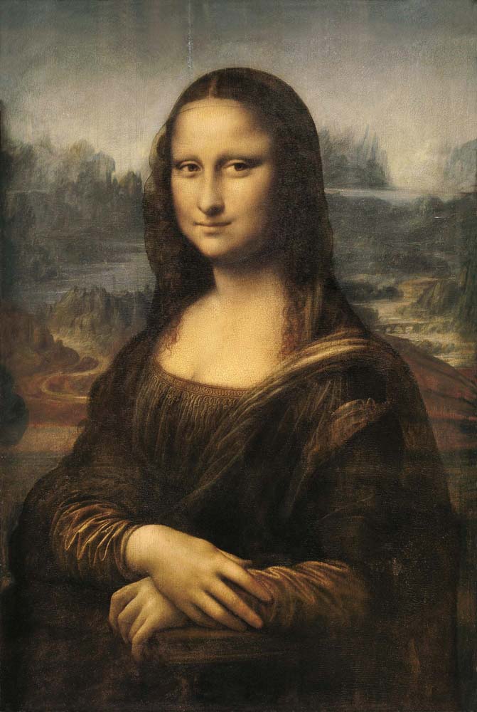
For example, soft shadows on the face in a portrait painting, may appear warmer in tone. Analyse your reference before mixing the colour to make it appear more realistic. The shadows on the face and hands of the Mona Lisa appear as a dark, low chroma brown. This can be mixed with slightly more red and yellow compared to blue. Leonardo da Vinci would have likely used earth pigments for shadow tones as well, such as umber.
Different black pigments and their properties
Black is a crucial colour for any artist—it can be used to create strong outlines and contrasts, as well as create depth and shadows. But not all black pigments are created equal. Different types of black come with their own unique properties and characteristics that can affect the outcome of your artwork. Here’s a quick overview of some common black pigments:
Mars Black
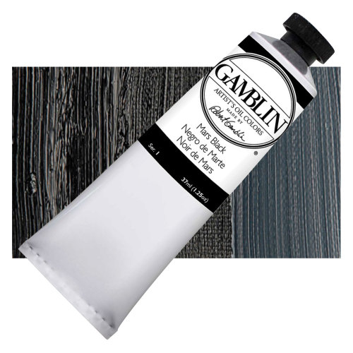
Mars Black is an opaque, deep black pigment made from ground iron oxide. It is one of the strongest blacks available in terms of covering power and opacity; however, it can be slightly more difficult to mix due to its thick consistency. When used lightly, it produces subtle shades of grey, making it ideal for creating nuanced transitions between colours in your artwork.
Ivory Black
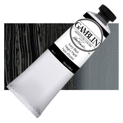
Ivory Black is a slightly lighter version of black made from charred animal bones. It’s particularly good at producing clean lines and intense contrasts when combined with brighter colours like white or blues. Although Ivory Black is considered a true black pigment, it can appear as a low chroma blue when tinted.
Benefits of mixing your own black tones

One of the most important elements to consider when painting any artwork is the use of shadows. Shadows can help create a sense of depth and space, as well as add focus and volume to certain areas of the painting.
Mixing your own black tones allows you to control the hue, saturation and darkness level of your blacks according to your needs. This gives you more control over how your shadows look and feel, allowing you to create realistic looking artworks that are full of rich contrast and depth.
Creating shades by mixing colours already on the palette is another great way to create shadow tones. This method allows you to take advantage of colour theory and use it in combination with basic contrast techniques for a more harmonious painting overall. For example, if you have a red in your palette, try mixing it with blue or yellow for various shades of red-browns or brown-blacks that better simulate natural lighting. Doing this can also help bring out other colours in the painting, creating an overall more balanced composition.