
Composition in art is defined as the planning and arrangement of various visual elements. It describes how these elements relate to one another to elicit a particular effect.
The visual elements that can be arranged are line, shape, colour, value, texture, form and space. Arrange these visual elements within the structure of the artwork to communicate meaning and intent.
Composition in art is subjective. However, artists can use compositional techniques to create unity, balance, rhythm and movement to establish context and convey meaning. Consider how you want to compose the painting before you begin. The finished artwork will likely appear more harmonious and you will be more likely to achieve the desired effects.
Disclaimer: Fine Art Tutorials is a reader supported site. When you make purchases through links on this site, we may earn a small commission at no extra cost to you.
Why plan composition in art?

A good composition draws the viewer in and catches their attention. Typically, artists will naturally have a ‘good eye for design’ and position elements in an aesthetically pleasing way. Whether that is at the point when they are taking a reference photo, or drawing the outline for a painting.
There are many instances where planning a composition first can be helpful. For example, you can change the photo by editing it in a program like Photoshop. One quick tactic I occasionally use is that I crop images so that the top two thirds of the photo is dominated by the sky, leaving a strip of land or sea in the bottom third. Alternatively, make a series of thumbnail sketches. Shuffle elements around in each little sketch, until you settle on the most attractively composed version.
When drawing or painting from imagination, or when combining multiple references, it’s essential to plan the composition to make the piece as successful as it can be. Not only will you have to unify the subject with the surroundings and the light source, you will have to map out how it will all fit together. By creating a few thumbnail composition sketches first, it will save you from making potential mistakes in your final artwork.
Compositional elements
First we’ll look at the different elements that make a composition. These elements all elicit certain effects that can be achieved by arranging shape, space, colour, line, form and texture in different ways and by employing certain compositional techniques.
When artists are aware and mindful of these particular elements when planning a piece, they begin to have much more control over the design and impact of the finished painting.
Balance

Balance in art describes how elements are spaced to create a sense of harmony. If the subjects of the painting are all concentrated in one area, it creates a sense of imbalance. If you were to move one of these elements to the other side of the canvas, it would balance the elements out. A symmetrical arrangement of elements will create harmony, whereas asymmetry will create dynamism.
Focus
A focal point is probably the most important compositional principle to consider before starting a painting. What will the most dominant feature of the painting be and which element will immediately demand the viewer’s attention?
It could be that this element is made salient through its placement (i.e. where our eye is automatically drawn). The salient element could have a contrasting colour to make it stand out. Alternatively, the element could have more texture than all the other elements in the painting.
An obvious thing to do is to place the focal point in the foreground, compared to all other elements that appear distant. The illusion of distance can be created by making foreground lines and details sharper and more contrasted. This is compared to more distant objects which will have soft edges and colours that are similar in value.
Movement
How do you turn a painting from looking flat, to looking full of life? You need to add movement.

Create movement with geometry and form—Van Gogh’s trees always appeared as if they were swaying in the breeze. Lines radiate from objects, making them appear alive and as if they are connected to other elements in the piece.
Other devices that can create a sense of movement are, body position of a figure, texture, or a geometric composition, such as elements being arranged in a triangle formation.
Contrast
Contrast is the difference in tone, value and colour between different elements. Use high contrast between values to create dramatic effects, or keep the differences to a minimum to create a sense of subtlety. Chiaroscuro is an Italian technique developed by Leonardo da Vinci, whereby bold contrasts are used in shadows.
Pattern

Symmetry and repetition of lines or colours creates patterns in artwork. By repeating elements, you can tie components that may otherwise appear disparate together. Pattern creates cohesion in artwork. In this painting by Singer Sargent, harmony is created through the repetition of the flowers.
Proportion
Proportion describes how parts of a composition relate to other parts and to the whole in terms of their size. This creates the appearance of scale. For example, in my painting of the French Alps, the mountains appear large in comparison to the smaller rocks at the peak. These proportional differences tell the viewer about the size and context of the elements in the scene.
Rhythm
This is to do with how dominant elements fit together and the pace at which each of these components is viewed.

Leading lines direct the viewer around a painting. Shape, positioning and colour creates flow and tempo. In this painting, Arizona Mesa by Edgar Payne, rhythm is created by directing the viewer from the red rocks of the canyon, to the figures in the foreground. The brightly coloured rocks force eyes to linger and eye movement to slow. Foreground figures are placed in the bottom left third, where eyes are automatically drawn, causing our attention to shift. This is the effect of a painting’s rhythm. It’s how elements are combined to consecutively grab the viewer’s attention and create an order of dominance.
Unity
How do the visual elements fit together? You can create contrast and unity simultaneously in a painting. A lack of unity is more to do with feeling like a component is out of place.

In this artwork, Hassam creates unity with the quality of light, use of values, a triadic colour scheme and with the consistency of line and form.
Compositional techniques
So how do you put all this information to practice and create an aesthetically pleasing composition in art? A compositional technique is a description of how the artist manipulates these compositional elements to create a unique image.
There are certain ways of using these compositional principles to arrange visual elements that have been proven to create pieces that appear aesthetically pleasing.
Use compositional techniques to sharpen your perception of some of the devices at work within different artworks. This will in turn give you the tools you need to help create a more powerful composition. However, don’t let these rules dictate your process or stop your creative flow! Sometimes it’s just as important to create based on intuition as it is to create images based on predetermined frameworks.
Geometric composition
This relates to the idea of arranging elements in such a way to bring structure and order to an artwork. The canvas is divided into sections, such as thirds and elements are then arranged to fit into the intersections. The purpose of a geometrical composition is to draw different elements in a picture together. This is how artists can show the relationship between subjects and objects and demonstrate salience to a viewer.
A common facet of a geometric composition is the use of spatial dividers. The dividers are used to create distinct but linked sections of an artwork. This can work well for a composition that lacks a single focal point.

Some examples of spatial dividers are triangles that are used to segment areas of the canvas. Other spatial dividers are arcs, S-curves, straight or diagonal lines.
The rule of thirds

The rule of thirds is perhaps the most common compositional technique in art and photography. An artists’ surface is divided into thirds, both vertically and horizontally. Then the subject is placed at one of the points where the lines intersect.
This technique serves to bring order to an artwork, create balance and adequate negative space around a subject. The focal point of the painting can be placed at the point where eyes are naturally drawn. Canvases can be divided mentally, or measured and drawn on. This particular technique can be used with any subject—an example might be to line up the horizon with the bottom third intersection of the surface, then place a tree on the left-side vertical third.

The golden proportion is a geometrically constructible ratio that frequently appears in nature and it also has influences in art. It’s a little more complex than the rule of thirds, but if you enjoy taking a mathematical approach to art, it’s an interesting concept to read up on. Check out this article from Draw Paint Academy for more about how to use the golden proportion to design your artworks.
Rule of odds

This is the idea that the composition will appear more visually pleasing if there are an odd number of elements, rather than an even number of elements.
Think of negative space

Negative space in art is the empty space surrounding the subject or an object. This could be the background colour, an area of sky, or landscape that is out of focus behind the main subject.

By simplifying an artwork and using negative space effectively, paintings can exude dramatic minimalism and emphasise the focal point. Paintings with too many elements can appear busy and confusing for the viewer, with the focal points not obvious.
Simplifying the image

Simplify an image by taking out all that is unnecessary. Scenes in real life often appear cluttered. Simplifying is quite a nice concept for us artists, as it means less time spent detailing every single object in sight! Analyse your reference or scene carefully and consider which elements have the greatest impact on the overall design of the piece. For example, if you are painting the ocean, you may decide that painting just one surfer on the barrel of the wave instead of three, would allow the viewer to focus on a single person’s experience.
Symmetry
A symmetrical composition has inherent beauty. This could be a natural symmetry, for example, a still lake reflecting a sunrise. However, pure symmetry can sometimes make an image appear unvaried and monotonous, so artists can opt to break the symmetry by placing a subject, like a bird or boat off centre on the water.
Framing element

A framing element acts to lead the viewer’s eye to the focal point of the piece. The frame usually takes up at least one or two corners of a canvas and the intent is not to distract from the main subject. It almost acts as a negative space, usually darker, more blurred or more muted in tone than the primary focus. A framing element can have textures of its own, a good example is a tree framing a distant mountain view, where the mountain is the main subject.
Interpreting the reference

With knowledge about the different rules and techniques in composition, interpreting the reference to create a painting will feel more intuitive, whether your first step is taking a photo, or finding a spot outdoors to set up your plein air easel. For example, you can photograph a scene to give adequate space around objects to create a feeling of balance, or you can point the camera at a subject, so that the subject is framed to make for a more interesting composition. When painting en plein air, you can spend some time looking at your scene and moving around until you find the best lighting, angle and composition.
Editing a photo reference to improve composition
If you’re working from a photo reference that looks off balance and askew, there are ways to edit it in Photoshop. Having a more accurate photo reference can help you to better envision the appearance of your final painting.

The simplest way to alter the composition is to crop the image. For example, by cropping this photo, balance is achieved.

In the first image, there was too much space on the left, but by cropping, the image looks more symmetrical. It’s a subtle difference, but I chose to simplify the scene by removing unnecessary snow and aligned the tree and fence with the rule of thirds. It makes for a standard composition. Another more advanced method to fix a composition by filling in blank space, is by using the content aware tool.
You could also use the blur tool, or clone stamp tool to remove clutter from an image, to simplify its appearance.
How to plan composition in a painting
There are a number of methods to plan and test compositions before you commit to applying paint. Then there are more methods you can employ to implement them in your final piece. It’s useful to plan the composition carefully for larger works and commission pieces to ensure that you will be as happy as you possibly can with the final outcome.
Notan and value studies
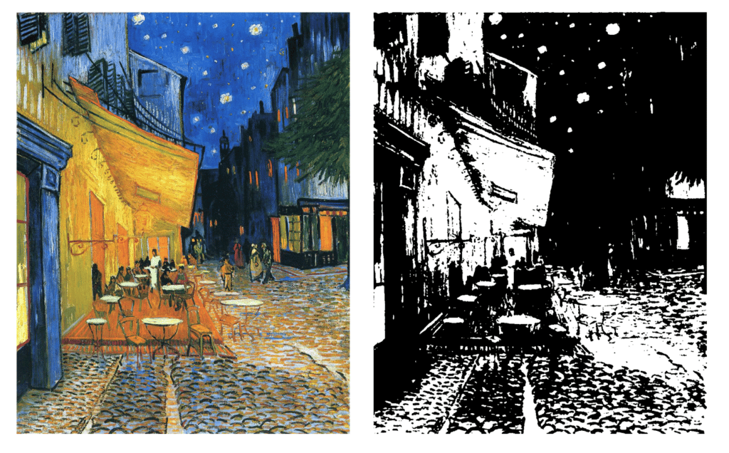
Notan can help you to reduce your image to just black and white values. By creating a notan, you can see the broad shapes, values and masses in the image, without colours or tones confusing the picture. This will allow you to arrange the line, shapes and spacing accordingly, to create a more balanced design. For example, from this notan study of van Gogh’s Café Terrace at Night, the focal point of the terrace areas is created with light values. Then, the viewer’s eye is lead in towards the sky and the darkest values in the distance. It’s this arrangement of the shape and form that creates the rhythm in the piece.

A value study is different from a notan study. The artist will draw the image with a full value range. This can be helpful in determining the accuracy of the values and the contrast and whether the contrast should be increased or toned down to create a more harmonious image.
Thumbnail sketches
Grab a sketchbook and roughly draw out a series of small boxes (a few inches in diameter) in the same proportions as your canvas. Then fill the boxes with the main elements that will feature in your artwork. You could do this in a sketchbook, with some graphite pencils, or coloured pencils.
Feature your main subject and secondary subjects and any other important features like horizon lines. Omit small details and instead focus on positioning, proportion, values, whitespace, balance and other compositional devices you want to include. Looking at the broad picture, you can consider whether to include a geometrical composition, like a triangular, or S formation.
Create a small mockup
Gouache is a wonderful medium that is fast drying, easy to clean and set up. You can work quickly at a small scale. Get a photo sized watercolour paper and a small square brush and test the placement of different elements and colour combinations.

Another way to create a mockup of a painting, is creating a digital painting. With a program like Photoshop and a graphics tablet making digital paintings is easy—create a new artboard, pick your colours and brushes and start sketching! You could also use an app like Procreate with an iPad to quickly mockup the painting and test colour combinations.
Create a grid

If you have created the perfect mock-up sketch, or if you’ve spent time editing a reference photo and you want to ensure accuracy in your final piece, create a grid and scale it up to the painting. Use grid lines and reference points to guide how you place different elements in the image.
For example, you could use Photoshop to create a mockup and set the artboard to have the same aspect ratio as the canvas you will be working on (i.e. 2:3). Then create a grid in Photoshop of four segments width ways and six segments vertically. Next, draw a grid with the same proportions out on the canvas, with four segments going across and six segments up. The squares in Photoshop will act as reference points for all the major parts of the drawing or painting.
Start with a sketch

Before committing to laying down the paint, or heavy pencil lines, complete a light sketch. This way, you can be sure about the structure and proportions of the piece before you think about colours, values, edges, details and all the other features that make for a good painting. The placement of elements is like the skeleton, once you know everything is in the right place, you can fill it out in a way that makes it come alive.
Start with the abstract

To approach turning the reference into a painting, start by looking at the abstract masses in the reference or your composition sketch. It’s important to consider how shape and colour will interact before painting detail. It can be helpful to start with the blocking-in technique, where painters start by blocking out the abstract shapes and colours they see in their reference, which keeps the focus on the big picture and the composition as a whole, rather than focussing on disjointed details from an early stage.
Begin with an underpainting

An alternative method to starting a painting with the blocking in method, is starting with an underpainting. The purpose of the underpainting is to establish values before colour is added. The relative light and darkness of areas of a painting help to create focal points in the composition. For example you can create areas that are similar in tone, that will fade into the background for the viewer, but the subject may have features that appear more contrasted against this background. The underpainting is a great opportunity to map out the structure of the piece. It doesn’t have to be detailed—many artists will complete an underpainting as a sketch for example, with thinned oil paint.
The underpainting technique can be more detailed too, as some artists will paint a background colour of a neutral earth colour, then paint where the shadows and highlights will go with titanium white and burnt umber.
Look at the whole picture
A good tip to focus on the effect of the image as whole rather than focussing on unnecessary details is to regularly step back from the artwork. Look at how the different elements in the piece relate to one another. Question whether the eye is drawn to the focal point effectively, if the piece is well balanced and if the proportions are right. If you’re a beginner painter, it’s useful to remind yourself to do this every now and again to check that your painting is on the course you intend.
Plein air composition tips
When out painting on location, it can be much trickier finding a good composition in a scene. This is due to changing light and weather conditions. A good tip is to take a photo of the scene you want to paint outdoors. If you don’t get to finish it, you can come back to it and finish it in the studio.

Another tip is to get a ViewCatcher, which can help frame an image and give a sense of focus and perspective when looking at a scene.

Nothing compares to the feeling you can get from painting en plein air. Colours, light and extra sensory information can contribute to you creating a more atmospheric piece.
Colour composition in art
Considering how a painting is structured can greatly improve the overall effect of the artwork, but colour and value are just as important. Plan the colour composition by considering how different colours interact, whether they harmonise or contrast. If you’re fairly new to painting, check out our guides on colour theory, colour mixing and how to create colour schemes in art.
Create a sense of peace, or a sense of dynamism by carefully selecting or altering colour combinations. Use colour temperature, or saturation to unify elements in a painting. Alternatively you could paint in a high key (light tones) to bring elements together. Use contrast between light and dark, or similar values and different values to create emphasis and rhythm.
Rules are there to be broken
Rules in art aren’t supposed to be constraints, they are there to guide artists. Once you have practised creating artworks with typically ‘good’ composition, try flouting some of these maxims. You can do this to create unease and tension in a piece. Think of works by Hieronymus Bosch, his paintings are notoriously cluttered, chaotic and dark. However, he used art to create a sense of unrest, to shine a negative light on behaviours, practices or systems he saw as immoral.
Further reading & courses
Edgar Payne: Composition of Outdoor Painting. This book is on the expensive side, but Edgar Payne was a master of composition in outdoor painting. He goes into extensive detail about different compositional principles in his book. It is illustrated with his paintings (in black and white) to provide helpful examples, to show values and masses.
Advanced composition techniques: take a mathematical approach to composing a painting and begin to perceive the geometry on the canvas to create balanced and harmonious artworks.
Take a composition class on Skillshare: In this course, JW Learning goes into detail about how to develop a composition to convey meaning.
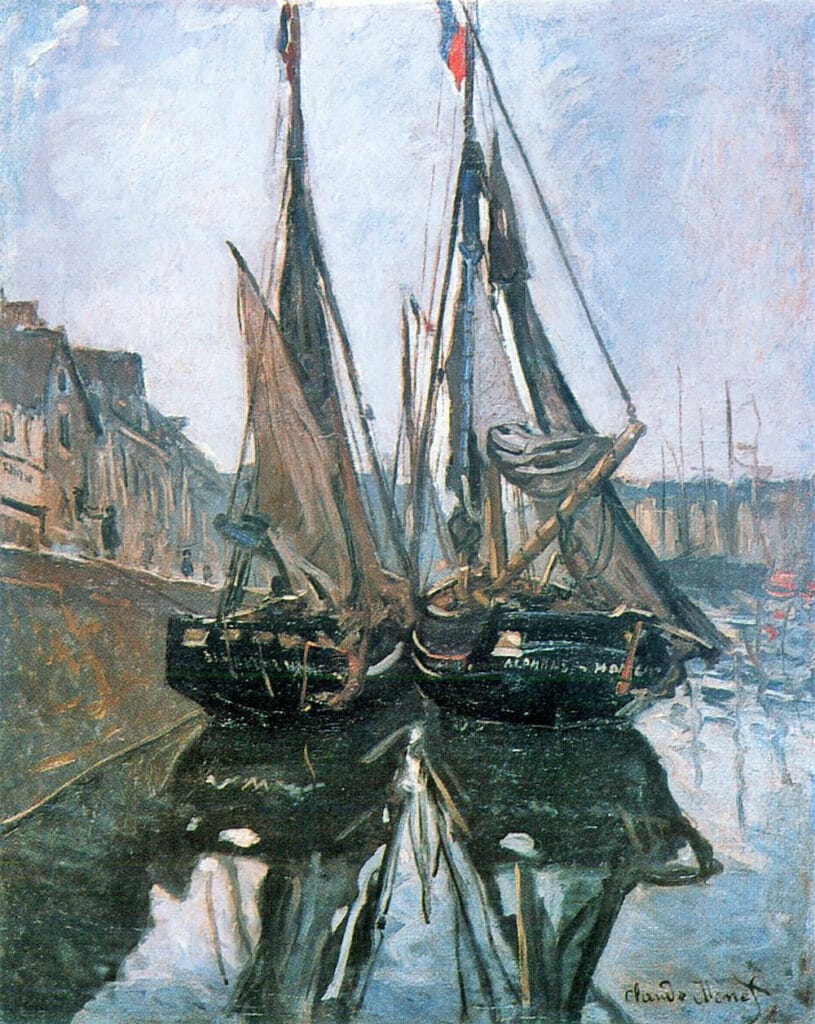
Feature image: Sunset on the Seine by Claude Monet
If you’ve found anything on this site especially useful, you can make a donation to me through PayPal. I take a lot of time to research and write each topic, making sure each tutorial is as detailed as possible and I make all my content freely available. Any small donation (even the price of a cup of coffee!) can help me to cover the running costs of the site. Any help from my readers is much appreciated :).
Follow the link in the button below to support this site.
Hi Emily, thank you so much for organising my approach to the task. You are an inspiration!
All of this makes a lot of sense.
I appreciate your research.
Lisa Lee Peatce