In this guide, learn all about the Chiaroscuro technique. About the famous artists who used the technique and how to create Chiaroscuro in your own paintings.
Disclaimer: Fine Art Tutorials is a reader supported site. When you make purchases through links on this site, we may earn a small commission at no extra cost to you.
Chiaroscuro definition
Chiaroscuro (pronounced key-uh-roh-skuh-roh) is an Italian word meaning “light-dark.” In art, it refers to the use of light and dark elements to create a sense of volume and depth.
Artists often use the term to describe paintings that have a strong contrast between light and dark elements.
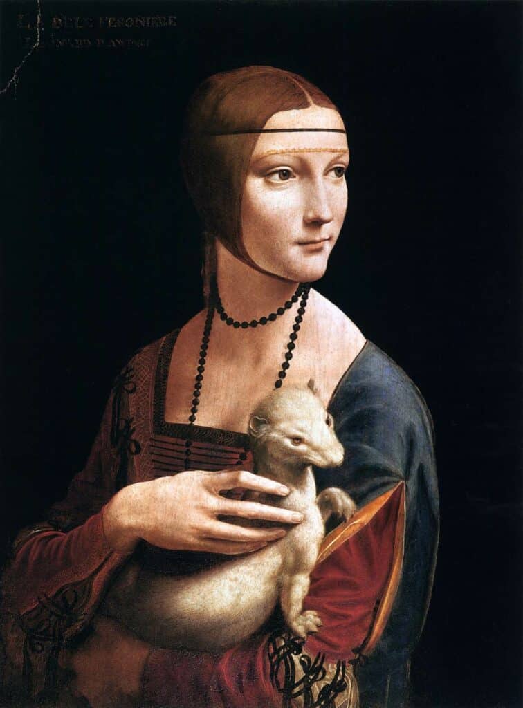
The technique is often used in paintings, drawings, and even photography. Artists who are well-known for their use of chiaroscuro include Leonardo da Vinci, Rembrandt, Caravaggio, and Johannes Vermeer.
Chiaroscuro history
The Chiaroscuro technique has been used by artists for centuries. One of the first examples can be seen in Leonardo da Vinci’s painting, “The Adoration of the Magi.”

This is an unfinished painting by da Vinci, painted in 1480-1482, during the Renaissance art movement. In the painting, da Vinci uses light and dark colors to bring focus to Mary, child and the Magi. Mary is framed by onlookers who are in shadow. The use of Chiaroscuro makes the figures in the painting appear to be popping out of the frame. Da Vinci used this technique across many of his artworks, including charcoal pieces, using chalk to highlight the brightest tones.
During the Renaissance period and with the advent of the development of oil painting, artists began using the glazing technique. This is where separate layers of transparent paint are built to darken colours and alter previous layers of colour. This painting technique allowed artists to gradually increase the contrast of a painting, layer by layer.
Artists that adopted oil paint were able to render three dimensional forms in a more realistic style. The glazing technique meant that colour layers would quickly darken, allowing artists to achieve deep blacks and rich shadow tones.
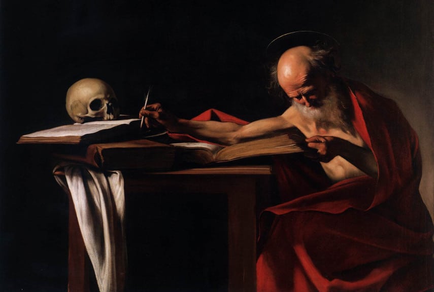
Many painters were inspired by da Vinci’s technique and during the Baroque period of the 17th century, artists such as Caravaggio and Rembrandt were known for their use of Chiaroscuro. Caravaggio further popularised the Chiaroscuro technique in his Baroque paintings, creating strong contrasts between light and shadow, to increase the dramatic effect of the scenes.
Chiaroscuro artists and examples
Caravaggio was an Italian artist who used strong contrasts of light and dark to create a sense of drama in his paintings. One of his most famous paintings is “The Calling of Saint Matthew.”

In this painting, Caravaggio uses light to draw the viewer’s attention to the central figure of Saint Matthew. The use of light and dark also highlights the figure of Matthew, who is being called upon by Jesus to become an apostle.
Rembrandt was a Dutch artist who is well-known for his paintings that make use of Chiaroscuro. One of his most famous paintings is “The Night Watch.”

In this painting, Rembrandt uses light to create a sense of dynamism in the commissioned group portrait of a militia company. The subjects are depicted in candid poses, appearing as being fully equipped and ready for march. This contrasts to other militia group portraits of the time, where they were typically painted posing and in a line. The two main subjects, highlighted with the use of light values and positioning are the captain of the militia group and his lieutenant.
Chiaroscuro painting tips
Now that you’ve seen some examples of Chiaroscuro, you might be wondering how to create the effect in your own paintings.
Determine the light source
Use a strong light source: The most important element of Chiaroscuro is the contrast between light and dark. So, you’ll need to determine the light source and decide upon the main focal points that will be highlighted to create the effect. Choose to use one, or multiple light sources.
Create composition sketches
Create several composition sketches before you start. This way, you can plan how the elements will fit together to create a sense of balance. Plan where the main focal point will be and how the light will be hitting the subject, then plan how you will lead the viewer’s eye into the painting, to create your desired effect.
Create a value scale
Before you start painting, it’s helpful to create a value scale. This will help you map out the different tones of light and dark in your painting. You can use a value finder, or make one yourself, with black and white paint and the scale of tones that fall in between these values.
Start the painting with the midtones
Once you have your value scale, you can start painting the midtones of your painting first. Then increase the contrast with consecutive layers of paint. This tip mainly works for painting mediums like oil or acrylic, or drawing mediums that can be easily erased, like charcoal. If you are using coloured pencils or watercolours, it’s best to start with the light tones, then gradually build up the dark areas. Starting with the midtones will give you more control over the final outcome of the painting, however if you start with a dark underpainting then work in the light sections you will be sure to create a dramatic appearance in your final artwork. How you start a painting is your own personal preference!
Deepen the shadows
Once the lighter midtones are established, work on deepening the shadows. If you’re using oil or acrylic paints, you can build up the shadow tones with layers of glaze. Focus on the edges and halftones between light and dark areas, some edges between elements will appear soft, while others will appear hard and more distinct. Create soft edges using the blending technique, to make it appear as if shadows are blurring into the midtones.
Finish with the details and highlights.
These could be the highlights on a person’s face, or the sun shining through a window. Titanium white is an opaque white that can be used for the brightest highlights and tints in a painting. Get a detail brush, like a sable rigger, or a round brush for the finest details.
Chiaroscuro techniques
The glazing technique is especially conducive to painting with a Chiaroscuro style. Glazing is the process of adding thin layers of transparent paint on top of an already dry layer. This technique allows you to control the values by slowly build up the contrast.
Another painting technique that is fantastic for creating a chiaroscuro effects is the underpainting technique. Start with a monochrome underpainting of grey tones, which is also called a grisaille. Use either black or burnt umber for the shadows and white for the brightest highlights. In this layer, you can establish the full value range of the painting. Once that’s dry, you can start glazing in the lights and darks. Remember that consecutive layers of glaze will darken the appearance of paint, so only add the glazes in areas where you want to change the colour profile or deepen the shadows.
Chiaroscuro purpose and effects
The purpose of Chiaroscuro is to model the forms of three dimensional objects. However, it has other purposes, such as being used as a compositional element, to draw attention to a focal point in the painting. For example, if the background is mostly made up of dark tones, bring the viewer’s attention to the foreground and to the main subject by rendering them in light values. The other purpose of Chiaroscuro in paintings is to create a sense of drama or tension in a painting. Artworks with high contrast between dark and light values can have an effect on the atmosphere of the piece as a whole.
Chiaroscuro vs Tenebrism
It’s important to note that Chiaroscuro is often confused with Tenebrism. Tenebrism is a similar technique that also uses light and dark elements, but the contrast is much more extreme. It could be described as a form of Chiaroscuro, where the meaning and intention behind the paintings are different. Tenebrism relates to the Italian term ‘tenebroso’, which means gloomy.

Chiaroscuro the technique of using light and dark values. These values can complement one another, create a focal point or balance in the piece. Whereas Tenebrism is the use of light and dark values with the intention of creating drama and unrest.
In a Tenebrism painting, you would have areas of complete blackness and areas of complete whiteness, with fewer middle tones.
One of the most famous examples of Tenebrism is Caravaggio’s “The Calling of Saint Matthew.” The purpose of the high value contrast in tenebrism paintings is to embody the sense of tension felt by the subjects. The light in the painting appears harsh, as is the case with many of Caravaggio’s Tenebrism paintings.
Finally
Now that you know the difference between chiaroscuro and tenebrism, you’re ready to start experimenting with the technique in your own art!