
In art and specifically in colour theory, colours are described as having various different attributes, such as value, saturation, chroma and hue. Value is one of the elements of art—the fundamental building blocks that create an artwork. The other elements include line, texture, colour, space, shape and form.
When artists observe and accurately describe colour in life settings, it allows them to mix colours and represent their subject or scene more accurately. Value is just one aspect of colour, but it is an important one. By learning how to mix colours with accurate values, artists can create more realistic and successful paintings.
Value in art is defined as how light or dark a colour is. Values are used in art to represent light and shadow. These light and dark tones can be measured in a scale, with the lightest value being white and the darkest value being black. Every colour has a value that will fit in that scale irrespective of the saturation and hue.
The values influence the structure and composition of a painting. Value is important in art because it can help to create the illusion of light, depth and volume. It can also help to create mood and atmosphere in an artwork.
Disclaimer: Fine Art Tutorials is a reader supported site. When you make purchases through links on this site, we may earn a small commission at no extra cost to you.
The value scale

Denman Ross invented a value scale in 1907 that artists still use today. It is a scale of 9 values, ranging from white (1) to black (9). The greyscale values between white and black are given names such as ‘high light’ ‘low light’ and ‘mid value’.
Use a value scale to determine how the highlights and shadows in your artwork relate to one another.
Greyscale and value finder
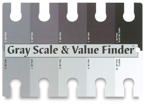
Use this greyscale and value finder to match colours on the card to the colours in your artwork. Simply hold the value card up to the painting or drawing, and compare values in your artwork. Use it whilst mixing colours, or cross reference the values in your painting to values in your reference.
Create a value scale yourself
If you want to make your own value scale, it’s really easy! All you have to do, is draw 9 equal boxes in a row. Then paint or draw one end with black and either leave the other end blank, for white or paint it with white. Value 5, in the middle is your mid tone, so mix the black and white in equal measures to create this value. Next fill in the intermediate values, start with 2 and work your way up to 8, increasing the darkness for each step of the scale.
How does value relate to colour?

A colour can be described by its hue, saturation and value. The value of a colour is simply one aspect of it.
Hue refers to the colour itself, for example red, blue or green. Saturation describes how pure the colour is, so a highly saturated colour would be very bright, whereas a low saturation colour would be more muted.
Value is the relative lightness and darkness of colour irrespective of saturation and hue.

A single colour will have a multitude of different values. For example, pink can be mixed with white to create light tint. Likewise, blue can be mixed with black to create a dark shade with a low value. All these variations of pink or blue can be measured in their relative lightness or darkness, so that they fit onto the value scale, between the lightest colour and the darkest colour.
How to paint with accurate values
Highlights will have the lightest values in an artwork and shadow tones will have the darkest values in an artwork. However, values are relative. In most artworks, values hardly ever appear as pure white or pure black. It’s more likely that the lightest highlights in a drawing or painting will be rated as a 2 on the Denman Ross scale and the darkest value around an 8. That is because highlights and shadows in life settings almost never appear as true white or black.

Monet was an impressionist painter and he often painted with saturated and surreal looking colours as a stylistic device. However, the values in his artworks are accurate, which gives the scene realistic structure and form. As you can see from the graphic, Monet hardly used extreme values in his work. The lightest value isn’t white and the darkest value isn’t black. The midtones in the reflection of the trees in the water appear darker than the trees themselves, as they would in life settings.
Learn to perceive value relationships in a reference
The middle values make up the bulk of an artwork and creating accurate values is in focussing on tonal masses and how the values relate to and therefore transition into one another.
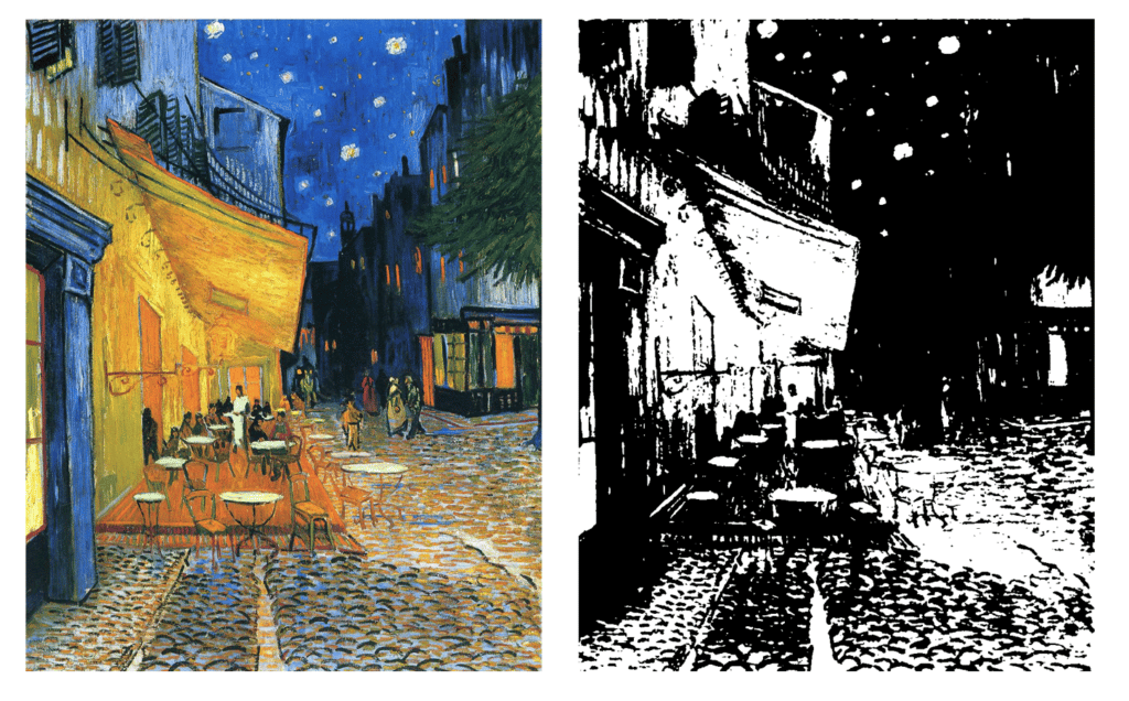
One trick that can help you determine values in a reference image, is taking a photo of your subject or scene, then applying a greyscale filter to the image. This will enable you to see the values of the elements clearly, without the extra information of hue or saturation.
The greyscale value finder can also help with determining values in a reference, or from life. Hold the scale up to your reference and find the darkest value, then compare it to the values on the card. Do the same with the lightest highlight.
Values and colour mixing
An essential part of painting with accurate values is learning how to mix colours effectively. Part of this is in understanding pigments and how to darken and lighten colours.
How to mix shadow colours
In oil, acrylic and gouache painting different pigments have different qualities. For example, there are a number of different black and earth colour tones that will darken colours. Each pigment has a different intensity, transparency and colour temperature which can affect how colours mix together.
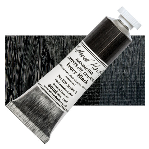
For example, the pigment ivory black is cool in tone and is actually a low chroma blue. It is also semi transparent and has high covering power. This means that ivory black can be overbearing in some colour mixtures and will not always make the cleanest colour gradations. However in paintings with cool shadow tones and high contrast, it would be suitable, it mixes to make blue-greys.
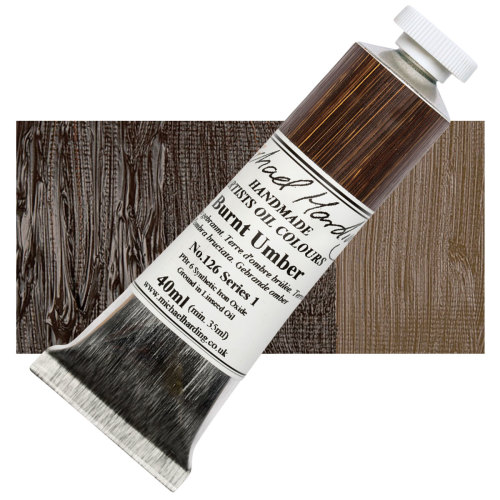
Another pigment of note which is great for mixing shadow tones and darker values is burnt umber. Burnt umber is a transparent brown coloured pigment, so it is warm in tone. It doesn’t have an ultra high covering power so it can be used to create clean colour gradations in portrait paintings or in paintings with warmer toned shadows. If you want to make pure black with burnt umber, mix in some ultramarine blue.
Mix highlight colours
To tint colours, mix them with white. There are two main types of white that artists commonly use for light value tones, that is titanium white and zinc white.
Titanium white is an opaque pigment and has a high covering power. It will increase the opacity of colour mixes and can have a tendency to desaturate colours when a lot is added. Zinc white on the other hand, is transparent and has a low covering power, so it subtly lightens mixes, maintaining the saturation and transparency. Mix the two different white pigments together to balance the features out.
Value composition in painting and drawing
When creating any successful art piece, it can be helpful to plan the composition before you start. Even if you are painting from a reference, you may want to think about moving some of the elements around to create a sense of balance and therefore a more aesthetically pleasing image. The values in an image can function to draw the eye in, create a focal point and even to create a sense of dynamism in an artwork. Think about the effect you want to create and how you will compose the values in the artwork to achieve this desired effect.
Composition sketches

Before you start, grab a sketchbook and a pencil and create a few thumbnail composition sketches to plan your painting. Consider the structure and layout of the image and how the values are arranged. Your sketch doesn’t have to be detailed or accurate, the purpose is to map the different elements out in a way that makes sense for you.
It can help to draw a border around the thumbnail and divide the thumbnail up into thirds so that you can align your subject into one of the intersections to adhere to the rule of thirds.
Value studies
A value study is a small drawing or quick painting that attributes values to different compositional elements in a painting. Artists can plan the tonal range and value contrast in a sketchbook before they commit to putting paint to canvas. It’s similar to composition sketch, however more emphasis is put on establishing accurate values. You can choose to work on one of the composition sketches you have made and turn it into a value study.

Value studies are an optional exercise that can be done after a few composition sketches have been made and once the artist has decided on the placement of the different elements. These planning steps aren’t necessary, but if you’re creating a large piece for a commission, or that you will be showing in a gallery, it is often worth spending time planning to optimise the look of the final outcome. In the mountain painting example, I worked from the first composition sketch, then created a value study in Photoshop.
When drawing a value study, focus on the broad shapes of your subject or scene and look at the tonal masses in the reference. Decide upon the arrangement of dark shadows, midtones and highlights in the image and what will grab the viewer’s attention.
Another approach for painting with accurate values is to create a series of value studies. This involves painting the same subject matter multiple times, using different combinations of light and dark tones each time. Not only does this help you to hone your skills in mixing accurate values, but it also allows you to experiment with different ways of arranging the lights and darks in a painting to create different effects.
Value studies do not have to be detailed, instead think about where the tonal masses will be positioned.
Notan
Another type of value study that artists create are notans. A Notan is a two or three value study that simplifies the tonal masses of an image to just black and white. Artists use notans in the planning stage of a painting, as they can help you see the design of the spacing and shapes in the artwork better.
Value techniques in painting
There are a couple of techniques and approaches you can use in painting to help with achieving more accurate values and using value contrast to create intentional stylistic effects.
Start with midtones and tonal masses
Establish a mid tone and slowly increase contrast as the drawing or painting progresses. This is an excellent approach to drawing and painting that can be used with almost any art medium. It is a widely used approach in charcoal drawing, where charcoal can be lifted from the paper to reveal highlights. Equally, if you were gouache, acrylic or oil painting, you could start with tonal masses, build textures, emphasise shadows then build highlights.
Try this approach if you often find that you go overboard with creating contrast in values in artwork. By starting with the tonal masses and midtones, it will encourage you to be more reserved with the shadow and highlight tones. Instead, you can practice gradually increasing contrast as the artwork progresses.
It’s a little different for watercolour painting, where artists rely on the white of the paper for highlight tones. With watercolour painting, artists work light to dark, which often leaves values appearing high-key, giving a delicate appearance.
Underpainting: grisaille
Underpainting is technique in which an artist sketches out the composition with a monochromatic paint colour, usually with black and white or burnt umber and white. This provides an excellent foundation for building up layers of colour and glazing transparently over the top. It will help you to map out the tonal range in an artwork by establishing values in the first stage.
Grisaille is a type of underpainting that uses grey tones, with black and white pigment. It can be used to great effect for creating stunning paintings with realistic values. To try this approach, start by sketching out your composition then painting over the top with a series of grey tones, varying the darkness and lightness. Once you are happy with the tonal values, you can start to add colour over the top, either by glazing or painting opaquely.
This approach can be used for any subject matter and is especially effective for painting portraits. Bear in mind that layers of glaze will darken the underpainting, so either paint the underpainting in slightly lighter values than you anticipate your finished result to be, or paint opaque highlights at the end.
Chiaroscuro
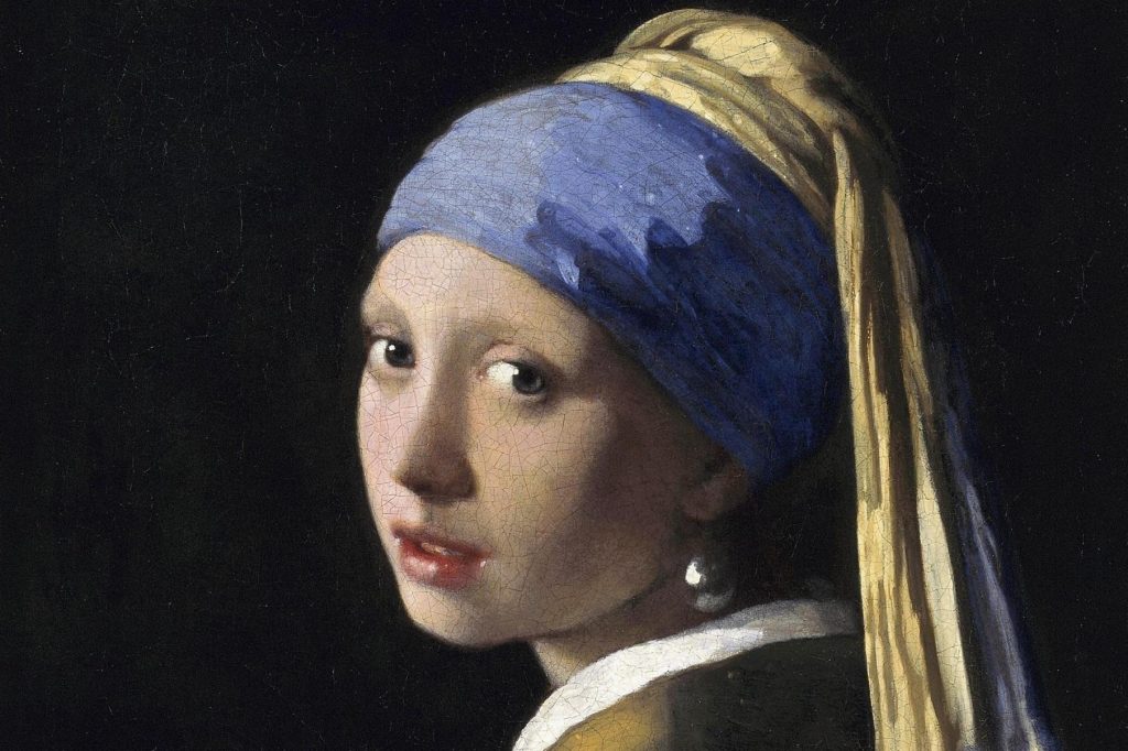
A technique used by old masters such as a Johannes Vermeer, chiaroscuro is the contrast of light and dark tones in a painting. It can be used to create intensely contrasted images. The term chiaroscuro comes from the Italian for ‘light’ and ‘dark’.
How to achieve dark values in a drawing
To darken the values of shadow tones in a drawing, apply heavy pressure with a soft pencil. If using graphite pencils, consider getting a 6B or 8B to achieve ultra dark tones. There are a number of other pencil drawing techniques that artist use to create a value range, such as stippling and hatching.
Charcoal allows pencils artists to achieve dark, matte black tones. Graphite has a more silvery grey shade to pencil marks, and when artists apply heavy pressure, the graphite marks can appear shiny and reflective. However, when drawing with charcoal, you don’t get any of these problems. If you are a pencil artist who wants to achieve highly contrasted drawings, charcoal is a great option.
Value in art glossary
Tone
The lightness or darkness of a colour.
Value
The degree of lightness or darkness of a colour.
Shade
A hue with black added to it, making it darker.
Tint
A hue with white added to it, making it lighter.
Saturation
The purity and intensity of a colour.
Hue
The name of a colour (red, blue, yellow, etc).
Chroma
The degree of saturation or purity of a colour. For example, grey is a low chroma colour and blue in its most saturated form is a high chroma colour.
Low-key
A colour scheme featuring mostly dark colours.
High-key
A colour scheme featuring mostly light colours.
Value contrast
The greater the difference in value, the greater the contrast. Value contrast can be used to create a sense of depth and volume in an artwork. It can also be used to create a sense of movement or rhythm. A highly contrasted painting will catch a viewer’s attention and have an intense appearance. Whereas, artworks that have less value contrast appear subtle and muted.
When mixing paint, it is important to think about the values of the colours you are using. If you want to create a high contrast painting, you will need to use colours with very different values. For example, black and white have the highest possible value contrast.
If you’ve found anything on this site especially useful, you can make a donation to me through PayPal. I take a lot of time to research and write each topic, making sure each tutorial is as detailed as possible and I make all my content freely available. Any small donation (even the price of a cup of coffee!) can help me to cover the running costs of the site. Any help from my readers is much appreciated :).
Follow the link in the button below to support this site.