
This is a practical guide on colour theory for artists.
In this tutorial, firstly learn some of the different terms in colour theory to understand exactly what they mean. Then we’ll look at some of the different colour models to help us understand how colour is perceived. As this also helps us to choose pigments for our palette and artworks.
Finally we’ll look at how to create colour schemes in art and how to mix colour step-by-step.
Disclaimer: Fine Art Tutorials is a reader supported site. When you make purchases through links on this site, we may earn a small commission at no extra cost to you.
What is colour theory in art?
In art, colour theory is the description of the practical applications of colour.
Colour theory provides guidance and direction about how colour is perceived, how it is applied in different mediums and the visual effects of colour combinations.
The visual effects can include how it might be received by onlookers and the psychological effects it can have.
The benefit of reading up on colour theory as an artist, is that it can help you to become quicker and more accurate at mixing colour.
It can also help you to see and describe colours more precisely and therefore understand the relationship between colours better.
To some extent, it will give you control over the sort of feelings you can evoke in the viewer, by having an awareness of the effects of different colour combinations.
By learning colour theory, you will have a greater command over your medium of choice, giving you the ability to create the effects you intend with your artwork.
When artists use colour, they are thinking about what colour schemes they are creating, by using colour temperature, harmony and contrast in interesting ways.
Colour theory: Glossary

It really helps to learn the jargon associated with colour theory. You might have an abstract idea of some of these concepts, but naming these colour theory terms will make the ideas more concrete in your mind. It will make you better able to use them in practice too.
Hue
The hue is a description of a colour in its purest form without taking into consideration other attributes such as value, tints, shade or saturation.
The hue describes the dominant wavelength of a colour, whether it is red, orange, yellow, green, blue or violet. So for example, you may pick up a tube of ultramarine paint which is blue, but has a bias towards violet. The hue would be blue, as this is the most dominant wavelength of the pigment.
Any shade of colour that you might describe, i.e. ‘plum’ or ‘coral’ can be categorised by its dominant wavelength. In the case of these examples, plum would be violet and coral would be red.
Saturation
The saturation is how intense and vivid the colour appears. Another way to describe it, is the
“relative colourfulness of light, independent of its brightness”. – Munsell.com
Colours in real life settings hardly (if ever) appear in their most saturated form. They are often slightly muted, even in the most brilliant light settings.
The saturation of a colour can be toggled on your palette by mixing it with its complementary colour. Complementary colours are those that are positioned opposite each other on the colour wheel, for example yellow and purple or red and cyan. When mixed in equal measures they become achromatic, in pigment form, they will become grey or black.
Tints, tones and shades
These terms apply specifically to colour mixing in painting.
A tint is a colour that has been lightened by mixing it with white.
A tone is a colour that has been neutralised, by mixing it with a small amount of its complementary colour. Tone describes the lightness or darkness of a colour.
A shade is a colour that has been darkened. This doesn’t always mean it has been mixed with black, as black paint can make mixtures look muddy and off. It could mean that it has been mixed with a little earth pigment like burnt umber, or with a significant amount of its complementary colour.
Value
The value is a measure of how light or dark the colour appears. You can lighten or tint colours by adding white and darken or shade colours by adding burnt umber or its complementary colour.
Colour bias
Every pigment has a colour bias. What this means is that when the colour of the pigment is plotted on a colour wheel, it will lean towards another colour. This is true of all colours we see around us. It’s a good exercise to describe colours you see in terms of their base tone and then the colour bias. Try it now with the objects around you in your room. It will really help you when you come to select pigments to use in your paintings.
Colour temperature
Put simply, colour temperature refers to how warm or cool a colour is. Many artists visualise the colour wheel as being split into cool and warm colours. Magenta all the way around to yellow is warm, and purple round to green is cool. Each primary colour has a temperature and the temperature lies in the colour bias. This can help you with mixing, as by labelling a colour as warm or cool you can ensure that you are mixing pure colours.

Colour temperature has more to do with our own associations than anything else. There is the consensus that people associate red with warmth because it’s the colour of fire, or of a sunset, whereas we associate blue with being cool as it is the colour of ice and the sea. Yellow is more neutral in its purest sense, but when it has a bias towards blue ( e.g. cadmium yellow lemon) it becomes cool and with a bias towards red (e.g. cadmium yellow deep) it becomes warm. Following this logic, a warm blue has a bias towards red (ultramarine) and a cool blue has a bias towards yellow (phthalo blue). Then a warm red has a bias towards yellow (cadmium red light) and a cool red has a bias towards blue (magenta).
Gamut
A gamut is a range of hues and tones that fit within a particular colour spectrum or model.
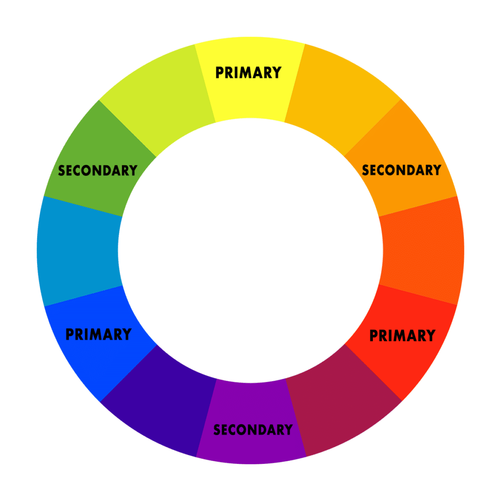
Primary, secondary and tertiary colours
A primary colour is a colour that cannot be made from a combination of any other colours. It forms the base from which other colours are mixed from. Primary colours are actually different depending on the medium you are using. You may have learned in school that the primaries are red, yellow and blue. These primary colours are based on the widely accepted RYB colour wheel and are based on the photoreceptors in our eyes and therefore how humans perceive the world. Based on the red, yellow blue colour wheel, orange, green and purple and considered secondary colours. Then the tertiary colours are yellow-orange, yellow-green, teal, blue-violet, violet-red, red-orange.
In pigment and print form, the primaries are cyan (a type of blue), magenta (a form of cool red) and yellow, this set of primaries is based on the CMYK colour wheel, used by designers working in print and artists. This colour wheel looks a little different compared to the RYB colour wheel:

It was once thought that from primary colours, any other colour on the spectrum could be mixed. However, this is not the case as any three ‘primary colours’ of light, or of pigment can mix a limited range of hues, called a gamut. For this reason, artists will often not paint from a limited palette of primary colours, but include additional pigments that fill the gaps.
A common addition that is used to augment a palette includes crimson, which is impossible to mix from cyan, magenta and yellow. In the medium of giclée printing, printers will increase the range of the CMYK gamut with spot colours.
Secondary colours are made by mixing two primaries. Based on the CMYK model, these include red, blue and green. There are six tertiary colours. Tertiary colours are combinations of primary and secondary colours, in the CMYK model, they are: orange, yellow-green, blue-green, blue-cyan, magenta-red, and violet.
The relationships between colours
These terms all have one thing in common, they describe the relationship between colours. When you imagine any single colour, it’s not a colour alone. It is a shift towards or away from a primary on the colour wheel. By looking at a colour on the wheel, you can tell which primaries are used to make the colour in question, which colour it leans towards and how saturated it is.
Use a colour wheel as a loose guide, to determine the relationship between different colours. The colour wheel will tell you the hue, the colour bias and how saturated the colours are.

The primary colours lie around the edge of the wheel and the hues in between are, in differing quantities a mixture between two or even three primaries. By working out the position of a colour you are trying to create on the colour wheel, you can roughly determine the quantities of each primary that are needed to make that colour mixture.
Colour models—choosing the right colour wheel
It’s important to learn about different colour models to understand how the model you use will vary depending on what is used to create the colour. The CMYK model uses pigment and print to make colour (traditional applications), the RGB model uses pixels of light to make colour (digital applications). Then there is also the traditional RYB colour model which we were all taught about in school, which describes how we perceive colour. I’ll describe both the CMYK and RGB models, because these both have practical applications in art and design, so you can be sure you are using the correct one.
By understanding the colour models, it will help you to make the right decision in choosing colours for your palette—to use the fewest colours to achieve the greatest range of hues when mixing. Understanding the colour wheels and where different hues sit on them in relation to other colours will form the basis in your understanding of colour mixing.
Firstly, though, we should understand the limitations of the models. We are foremost limited by the way we can perceive colour, then again by the mediums that allow us to recreate colour.
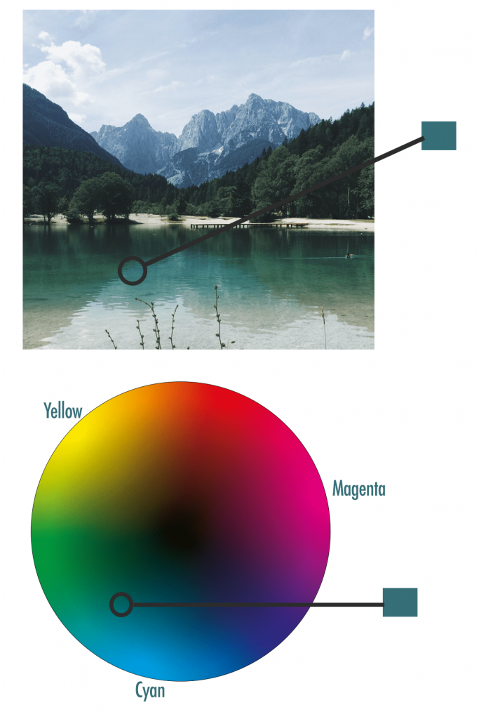
This is the spectrum of colours the average human eye can see compared to two colour models:
All hue variations and relationships shown in the two colour wheels that describe colour application fit within the gamut of what is perceivable by the human eye.

Now we’ll move on to the two wheels that illustrate the difference in how colour is formed, when using different applications.
Colour wheels for different applications
The colours we are able to perceive is the broadest perceivable spectrum. From this spectrum, we can create a narrower range of colour, because in the case of traditional (i.e. non-digital) mediums, we are limited by the pigments that are available to us. In this post, I mainly use the CMYK model as an example, due to the fact that it has the most practical applications for traditional artists.
CMYK (Cyan, Magenta, Yellow, Key)
The CMYK model is used to describe colour that has covered a physical (i.e. non-digital) surface. The colour will either be made from dyes or pigment. The applications of this colour model are specific to traditional design, printing and art.
The primaries that make the largest gamut of colour in printing and in painting are Cyan, Magenta, and Yellow.
Here’s the full spectrum of colours made with these three colours:

This is called the subtractive colour mixing model because you subtract the light from the surface you apply the colour to when you mix the colours together on it. The more that the contrasting colours are mixed together, the darker the mix will become, eventually getting mixes of cool and warm greys. If you mix all three in equal amounts, you will get a shade pretty close to black.
‘Key’ in the CMYK model is black. The combination of cyan, yellow and magenta makes an achromatic mix, but it’s not pure dark black. In printing, key is added to intensify the black. In painting, you could use burnt umber, or ivory black, or you could choose not use anything to deepen your blacks.
If you are scanning and creating prints of your artwork, you will have to have the digital file you created from the scan in CMYK mode in order to print in the correct colour profile. You can ensure the file is in the correct format using Photoshop, this way, you will be able to see the artwork as it will print and make any corrections you need to before sending it to the printers or doing it yourself. Printing isn’t cheap, so make sure you get this right, otherwise you could be disappointed when the prints come out.
It’s also useful to be familiar with this model when it comes to painting—many people assume the primaries are red, blue and yellow and, if they choose to use a limited palette, the resulting colour mixes they get from this are not as varied as they would be with cyan, magenta and yellow as a base.
RGB (Red, Green, Blue)

We see colour in waves of light, so mixing red, green and blue light in different intensities creates the gamut of hues we use in digital design, screens, projectors. The primaries in this model then, are red, green and blue.
The more of the different coloured lights you add together, the brighter the mix becomes. When the three primaries in this model are mixed, white is created. This colour model is reserved for computer monitors. It is called the additive model.
This is important to know about if you are scanning your artwork for the screen, either to share on social media or on your website. You will have to ensure the colour mode of the file is in RGB, otherwise colours can appear duller and not the hue you intended them to appear. The file types can be adjusted in Photoshop.
Which colour wheel should you use in art?
As we are not limited to using only the primaries cyan, magenta and yellow in painting and we can add more pigments to our palette to augment it and create a wider gamut. For example, by adding ultramarine to your palette you can create a high chroma blue-violet, that is brighter than the colour you could have mixed from cyan and magenta.
The CMYK model isn’t the perfect model to use for mixing pigment, but it provides a reference to help artists create the largest range of colours from their pigments.
Colour theory: Choosing a colour palette

Use the split primary palette to create the widest range of hues from the fewest colours. The palette includes the purest primaries in pigment form (cyan, magenta, yellow) and warm or cool versions of each primary to give variation in colour temperature and to fill the gaps to create colours that the three ‘primaries’ alone would not be able to achieve. You can also add in extra pigments to create more intensity versions of colours you have mixed.
There are pigments that closely correspond to the colours cyan, magenta and yellow. They are phthalocyanine PB15, Magenta PV19 and Yellow PY128.
Oil painting colour palette
Split primary colours
- Quinacridone Magenta PV19: (primary magenta—cool in form but mixes to make vibrant oranges)
- Cadmium Red Light PR108: (deep red, leans towards yellow, more rounded in mixtures). Substitute this for Pyrrole if you want a cheaper alternative.
- Phthalo Blue (primary cyan) PB15: (primary cyan, mixes to make vibrant greens)
- Ultramarine Blue PB29 (blue that points towards violet)
- Transparent Yellow PY128 (primary yellow)
- Cadmium Yellow PY35 (deep, rounded yellow). A cheaper pigment that you can use in place of Cadmium Yellow, is Hansa Yellow by M. Graham.
Create values
- Titanium White: Titanium white is completely opaque, but it can make mixtures appear chalky.
- Zinc White: Zinc is a translucent pigment. Use this pigment to maintain the saturation of your mixes
- Burnt Umber: Burnt umber is dark, transparent and warm in tone. Use this colour to create clean colour graduations.
Augment your palette with additional colours
Of course, you don’t have to restrict yourself to using just a few colours in your palette, you can just use these as a basis to achieve a full CMYK spectrum then add pigments as you please. Many artists choose not to use primaries, but that depends upon their subject and the effects they are trying to create.
Permanent Alizarin Crimson has brilliant applications in landscape painting. Use it to create harmonious shadows in foliage. Earth pigments such as burnt sienna are transparent and fast drying, making them perfect for toning your canvas.
Note also, that using black in your palette can have a detrimental effect on the purity of your colour mixes. Instead of making deep and transparent shades, it can make the colours look flat and dirty. Try using the pigment burnt umber instead to create a three dimensional look that doesn’t sap the saturation from your painting.
How to mix colour using the colour wheel
Hopefully the section on colour models has helped you understand the relationship between colours a bit more. In art, the applications of colour theory are in isolating colours in a reference, placing them on a wheel and mixing them from paint.
Colour mixing is a central part of colour theory. When mixing colour, we can use the colour wheel as an aid to help us to map certain colours we’ve seen from our reference, then determine its relationship to other colours on the wheel.
You can buy your own colour wheel here.
There are some easy steps to mixing colour. Here are the basics:
Step 1: Study the colour from your reference

Your reference could be from anything, it could be from a photograph, from life, or from your imagination.
It’s a real skill being able to study a reference and isolate a colour. This is because all colours exist in context.
What can help you is focusing on the colour, then describing it. What is the hue, its colour bias and saturation.
There are tools that can help with this. If you are looking at a photo on the computer, you can use a photo editing software such as Photoshop. With the colour picker tool you can isolate that colour and see where it sits on the CMYK colour wheel.
If you are painting from life, either from a scene outdoors, or from a subject, then you can get a viewfinder tool to help you isolate the colour from the surroundings. From there you can easily match it to a colour on the colour wheel.
Step 2: Map the colour onto your wheel
Map the colour you see in your reference on the wheel. Use your description of the colour and the primaries around the edge of the wheel to help you navigate. What is the dominant hue? And what is the colour bias? What is the saturation?
When you feel confident with your placement, it’s time to choose the pigments and mix the colour.
Step 3: Choose corresponding pigments and mix
You need to choose pigments to efficiently and cleanly make your intended colour.
It takes practice to mix colours without wasting paint. The first step is to note the dominant colour and its bias. Then choose pigments accordingly.
For example, say you are trying to mix a teal which is essentially a medium-low chroma green-blue. You need to choose a blue pigment that leans towards yellow on the wheel and a yellow that leans towards blue.
To make the turquoise, you would need two parts cyan to one part transparent yellow. Then add more yellow if required. Then add a little bit of magenta to neutralise the mix.
You would also need to mix in a little bit of white. Try adding zinc first as this will increase the lightness but not wash out the colour as titanium would.
Mixing neutral colours
The tone of a colour is often more neutral than we initially perceive.
A good tip for painting in realistic colours, is to start by painting the neutral tones. Then slowly increase the saturation and brightness as you progress. This way you won’t overdo it from the start. And you won’t have to work on toning the painting down for the rest of the session.
To mix the neutral colours, then, you simply mix complementary colours together. These are the colours that appear opposite one another on the wheel. Magenta is opposite green, cyan is opposite red and yellow is opposite violet.
Using the three primaries, you can make warm or cool greys, browns and shades close to black. By mixing ultramarine, cadmium red and yellow together, a crisp and dark black can be made.
If a neutral colour looks more like grey, this means it is a cool neutral and that it has a bias towards blue. If a colour looks more like a brown then it consists of more yellow or red than blue.
Colour schemes
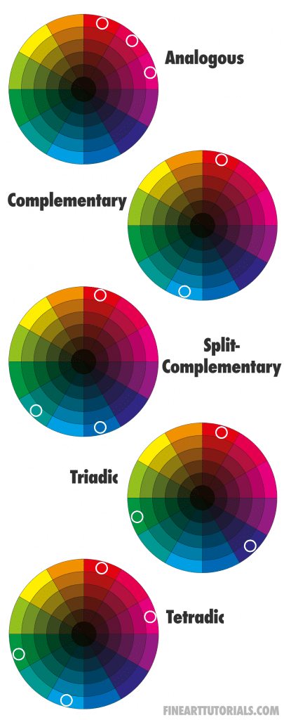
Another central part of colour theory is how colours combine and interact with one another. When artists and designers create their works, they use colour with intention. By doing this they know they can trigger certain reactions in their viewers.
There are five colour schemes that allow artists to achieve harmony in their designs. These colour schemes are based on viewing colours on a colour wheel like this:
- Analogous: the three colours that are located next to one another on the colour wheel.
- Complementary: directly opposite each other on the colour wheel, these are contrasting colours.
- Split-complementary: analogous colour scheme, with the middle colour missing and the contrasting colour in its place.
- Triadic: the three colours that are equidistant from one another on the wheel to make a triangle shape.
- Tetradic: two complementary pairs form a rectangle shape.
Use these schemes in designs or in paintings to create an aesthetically pleasing appearance.
Colour theory: How to use colour
Think about the effect you want to have on people. And the feelings or maybe particular memories you want to evoke.
You could stick with either a warm or cool palette, increase the saturation of the hues, or only paint with contrasting colours. The more you plan your composition in this way, the larger effect your piece will have on the viewer. It will be more likely to stand out as something unique.
For example, creating an artwork that uses some saturated hues and a complementary colour scheme will really catch the attention of the viewer, but may be uncomfortable to look at for too long. The artwork would be the centrepiece of a room. Painting with a more muted analogous scheme would likely fit in with more interior settings. When the artist is considering making artwork work saleable, they could think about how their final piece would look in different room spaces.
The psychology of colour
Colour psychology is the study of colour as being a determining factor in a behavioural or emotional response from a person.
However, a person’s response to a colour could vary. The response depends upon the interaction of the colours in question, the onlooker’s individual differences, the context in which it is viewed and current social trends
In a study put forward by Bottomly and Doyle, who looked at the effect of colour used in design, they categorised different colours on their sensory-social effects and also the functions they can have when used in day-to-day settings.
Overall it’s been found that people have the following associations:
- Blue: serenity, peace
- Green: nature, growth, health
- Yellow: optimism, clarity
- Orange: cheerful, energy
- Red: intensity, excitement
- Magenta: creative
Read our colour schemes in art tutorial to learn in depth how to create your own striking colour combinations.
Colour theory for artists: Pin it!
If you’ve found anything on this site especially useful, you can make a donation to me through PayPal. I take a lot of time to research and write each topic, making sure each tutorial is as detailed as possible and I make all my content freely available. Any small donation (even the price of a cup of coffee!) can help me to cover the running costs of the site. Any help from my readers is much appreciated :).
Follow the link in the button below to support this site.