
Designers plan the colour schemes they want to use before they start designing, to create consistency, evoke emotions from the onlooker, or to showcase their signature style. Fine artists can use colours schemes in their work too—a well thought through palette can take a painting from looking good, to spectacular.
If you don’t paint realistically by matching colours from a reference, it can be useful to select and plan colours before you pick up your paint brush. This way you can control the outcome of the piece and to an extent, the effect it will have on the viewer. Even if you do paint realistically, you can subvert norms and create a more painterly look by choosing a more surreal but harmonious colour scheme.
This is an interesting approach to creating an artwork—most artists won’t fore plan a colour scheme before they start painting. However, you can create a pleasing effect by choosing colours that harmonise, or try and hold the onlooker’s attention by using complementary colours.
Using colour in this way, you can create a piece that is completely unique and evocative of a mood you are trying to portray. By understanding the different colour schemes, it can help you to be much more intentional when mixing and combining colours in your artworks and aware of the effect your work might be having on people.
A colour scheme is a set of different colours, which are defined by their arrangement on the colour wheel. Each scheme can have different uses and different effects, and these schemes have been used by famous artists throughout history.
I’ve outlined below some of the most commonly used and popular colour schemes…
Disclaimer: Fine Art Tutorials is a reader supported site. When you make purchases through links on this site, we may earn a small commission at no extra cost to you.
How to use colour schemes effectively
Although you will be limiting the colours you use in your painting, you don’t have to limit the tonal range. By this I mean that you can alter each colour to make areas less saturated, darken them to make shades or mix them with white to make tints.
When working with a bold colour scheme, experiment by using different amounts of each colour type. You don’t need to use each colour in equal parts. For example, if you are using a complementary colour scheme of blue and orange, by making the painting mostly shades of blue (dominant colour), then having one orange feature, you will make the orange feature more salient—it stands out because there is less of it. Play with effects like these and see what you like.
Another tip is to include both warm and cool colours in your painting, to bring variety and balance to the piece. By repeating the hues in a painting, you will create unity, but unity needs to be balanced with the variety of value range and a mix of saturated and muted tones in order to appear balanced.
Colour schemes
Monochromatic
In a monochromatic colour scheme, the artist will use just one colour to create a piece. You can use the extended range of the colour to create contrast in your artwork. The colour can be altered so that it varies in saturation, tone, tint and shade. Use titanium white to lighten the colour, and its complementary colour to create shades and neutral tones.
I used a monochromatic colour scheme in this mountain painting. By mixing ultramarine, burnt umber and white I created a deep indigo blue and all its tonal variations. I added white to create tints and burnt umber to create the shadows. The shadows in the reference photo were more grey in colour. However, I increased the saturation to make them more blue so that these areas would harmonise with the colours in the sky.
Analogous colour scheme

These are the three colours that are located next to one another on the colour wheel.
Because the colours are so close to one another, the effect will vary depending on the side of the wheel you pick the colours from. For example, you can create quite an intense effect by choosing warm colours such as red, orange and yellow, or a serene effect by choosing purple, blue and green.

The colour scheme in this painting by Alfred Sisley is analogous. He uses neighbouring colours of greens and cooler blues to the cyan blue of the sky and lake.
Complementary colour scheme

Directly opposite each other on the colour wheel, these are complementary colours. Use this to grab the viewer’s attention and create contrast. You can create strong and vibrant effects by using this colour scheme—it’s certainly the most arresting, so try to tone down the colours to create more neutral variations of each hue.
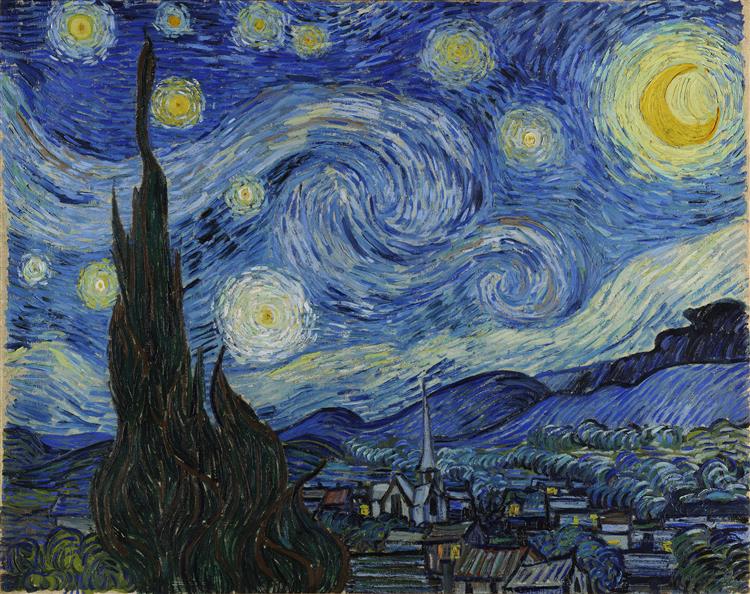
The dominant colour here is blue, with pops of bright orange to create contrast. Van Gogh has increased the saturation of the yellow in the moon, stars, lights and yellow-green of trees to complement the purple-blue of the night sky.
Split complementary colour scheme

Analogous colour scheme, with the middle colour missing and the contrasting colour in its place. In other words it uses a base colour with two colours either side of its complementary colours. The two colours at the opposite end of the colour wheel.
This is a colour scheme that creates harmony whilst also creating contrast.
Yellow-green and cyan are close to each other on the colour wheel, but not next to each other. Claude Monet pairs these two harmonious colours in the foreground and background (the acidic green of the grass and the cyan hill) to create depth. The contrast of the red trees livens up the painting. The impressionists really were the masters of creating attractive colour schemes.
Tetradic colour scheme

Four colours evenly spaced around the wheel to make a square shape. Use this scheme to create a feel of balance in your painting.

Here Van Gogh creates a sense of balance by avoiding the use of complementary colours, but instead using colours spaced evenly around the wheel. The red and magenta of the book and blossoms balance with the yellow-green and blue-green of the table and wall. This particular painting is more muted, rather than saturated which creates a calming effect.
Triadic

The three colours that are equidistant from one another on the wheel to make a triangle shape. This scheme also creates balance, but with a more limited palette.

The red, yellow and purple-blue colours in the top third of the painting form a triadic colour scheme in this work by Koloman Moser. Colours used in this way catch the attention of the viewer, it’s not as harmonious as other schemes, but striking.
How to paint with a colour scheme
If you want some tips on how you could go about planning a successful colour scheme in your painting, here are just two methods you could use.
Method 1: Create a colour scheme using Photoshop
By using Photoshop, you can achieve the most accuracy when creating your colour scheme.
Have a play around in Adobe Color, you can adjust colour harmonies in the colour wheel. If you like a selection you’ve made, save it to your libraries.
Upload the photo reference you want to paint to Photoshop. Then you can go and pick colours from your reference and replace them with colours you’ve chosen in Adobe Colour by using the Image>Adjustments>Replace Colour tool.
Or go to filters>camera raw. Use the colour grading tool to toggle the dominant hue in the highlights, shadows and mid-tones. Once you know where the tools are in Photoshop and their function, using the program feels intuitive.
You can also use the colour mixer tool to increase the saturation, luminance and colour itself.
Method 2: Using a colour wheel
If you don’t have Photoshop, or if you’re painting from life, you can use a colour wheel as a reference point to choose and mix colour.
Even if you’re painting from life and want to change the colours of what you see in front of you, I would recommend taking a picture of the scene with your phone, then putting the image in greyscale. This is so that even if you change the colours when mixing, you can still gauge the value (the relative light or darkness) of the colour to create your tones.
Mix tonal variations of the colours you selected—which will be lighter, darker or less saturated. Look at your reference and try and distinguish these lighter, darker and less saturated areas. On your canvas, place the colours with the corresponding values.
The most important aspect of a painting, to achieve a realistic likeness is value. Portray the tones, shades and highlights accurately and your painting will come together nicely. If you only think about creating accurate hues, rather than their relative light or darkness, your painting will likely not work as well.
Colour schemes in art: Pin it!
If you’ve found anything on this site especially useful, you can make a donation to me through PayPal. I take a lot of time to research and write each topic, making sure each tutorial is as detailed as possible and I make all my content freely available. Any small donation (even the price of a cup of coffee!) can help me to cover the running costs of the site. Any help from my readers is much appreciated :).
Follow the link in the button below to support this site.