In art, complementary colours are the colours furthest away from each other in hue. They come in pairs—every colour on the colour wheel will have a complementary colour.
Artists and designers will place complementary colours next to each other to increase the contrast. This makes the other colour appear more vibrant. Using a colour with its complementary colour, will emphasise them both, making them stand out to the viewer.
In this guide, learn what complementary colours are and how to use them to improve your compositions.
Disclaimer: Fine Art Tutorials is a reader supported site. When you make purchases through links on this site, we may earn a small commission at no extra cost to you.
Complementary colours definition
Complementary colours are pairs of colors that are on opposite sides of the colour wheel. Artists use them together to create a high level of contrast. It’s a type of colour scheme that puts colours that are most dissimilar in hue together.

Artists often use complementary colours in their work to draw attention to specific elements, emphasise particular features and create focal points.
Using these colour combinations can also help make other colours appear more vibrant or brighter by comparison. For example, bright red can be made to look even more vibrant when placed next to a complementary green colour.
Overall, complementary colours are an important tool for artists and designers looking to add drama and visual interest to their work.
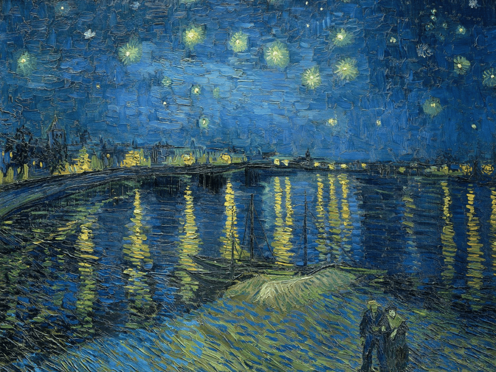
Complementary colour of blue

The complementary colour of blue is orange or red, depending on the shade of blue.
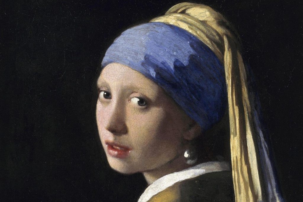
Some of the most famous examples of complementary colours using blue and orange are Vincent van Gogh’s “Starry Night”, Pablo Picasso’s “Les Demoiselles d’Avignon” and Vermeer’s “Girl with Pearl Earring”.
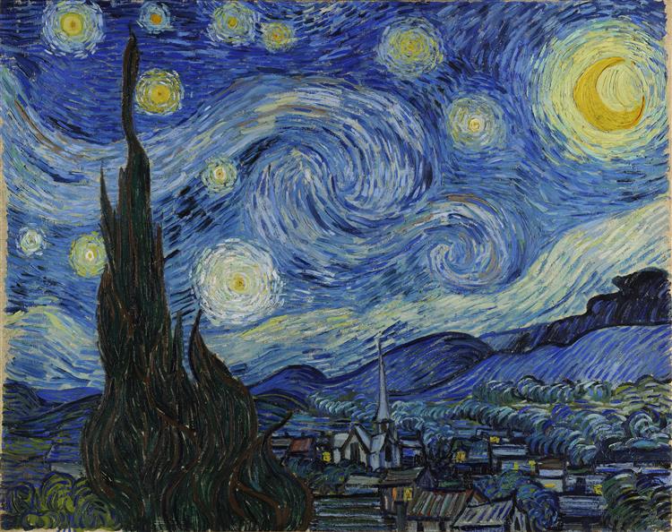
Van Gogh uses purple toned blue to paint the deep night sky. He painted pops of orange and yellow stars, which appear luminous against the darker background. Similarly, Picasso uses bright oranges and cyan blues to create a sense of movement in his painting. The colours also draw the viewer’s eye towards the central figures in the scene.
Complementary colour of red

The complementary colour of red is green.
Green is a secondary colour and depending on the shade of red, whether it’s magenta, or leans more towards orange, the complementary colours range from cyan blue to a medium grass green.
Landscape painters often use alizarin crimson in shadows, to complement the green tones of the grasses and trees.

Some notable examples of paintings that use red and green in complementary colour schemes is Van Gogh’s “Paul Gauguin’s Armchair” and Paul Gauguin’s “Still Life with Mangoes and Hibiscus”.
Complementary colour of yellow

The complementary colour of yellow is purple. It’s a purple than leans more towards blue on the wheel. Red toned purple sits opposite to a very light and pale lime green on the CMYK wheel.

Complementary colours yellow and purple can be seen in many of Van Gogh’s works. He used complementary colours in his landscapes and still life paintings. For example, in his famous “Irises” painting, he uses contrasts the purple of the flowers with specs of yellow in the background.
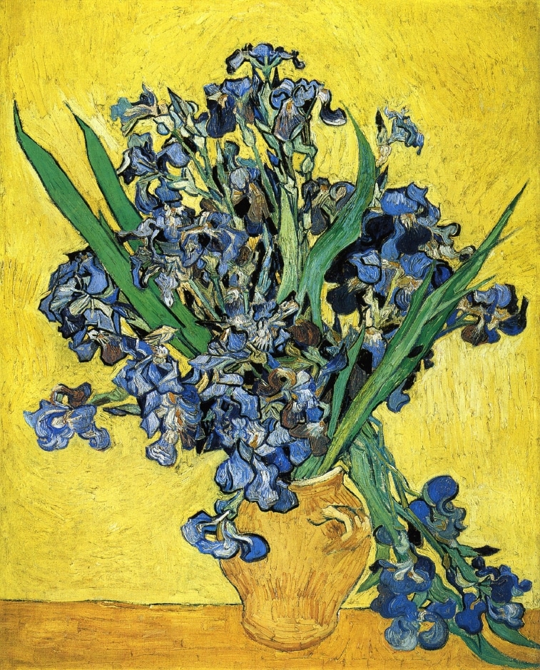
In his “Still Life with Irises” painting, he painted the whole background yellow to accentuate the purple flowers even more.
Complementary colours list

Magenta: Green
Yellow: Purple
Red: Cyan
Orange: Blue
Turquoise: Pink
Complementary colour scheme
By planning the colour composition and colour scheme in a painting, you can create dynamism and a sense of movement in your piece. For example, if you’re painting a mountain in icy blue tones, you could create a focal point by painting a skier wearing a bright red or orange jacket.
By using colour schemes in your painting, you can dramatically improve the appearance of the work. Take it from looking good, to having a striking appearance and a sense of vibrancy in the whole composition.
Warm and cool colours
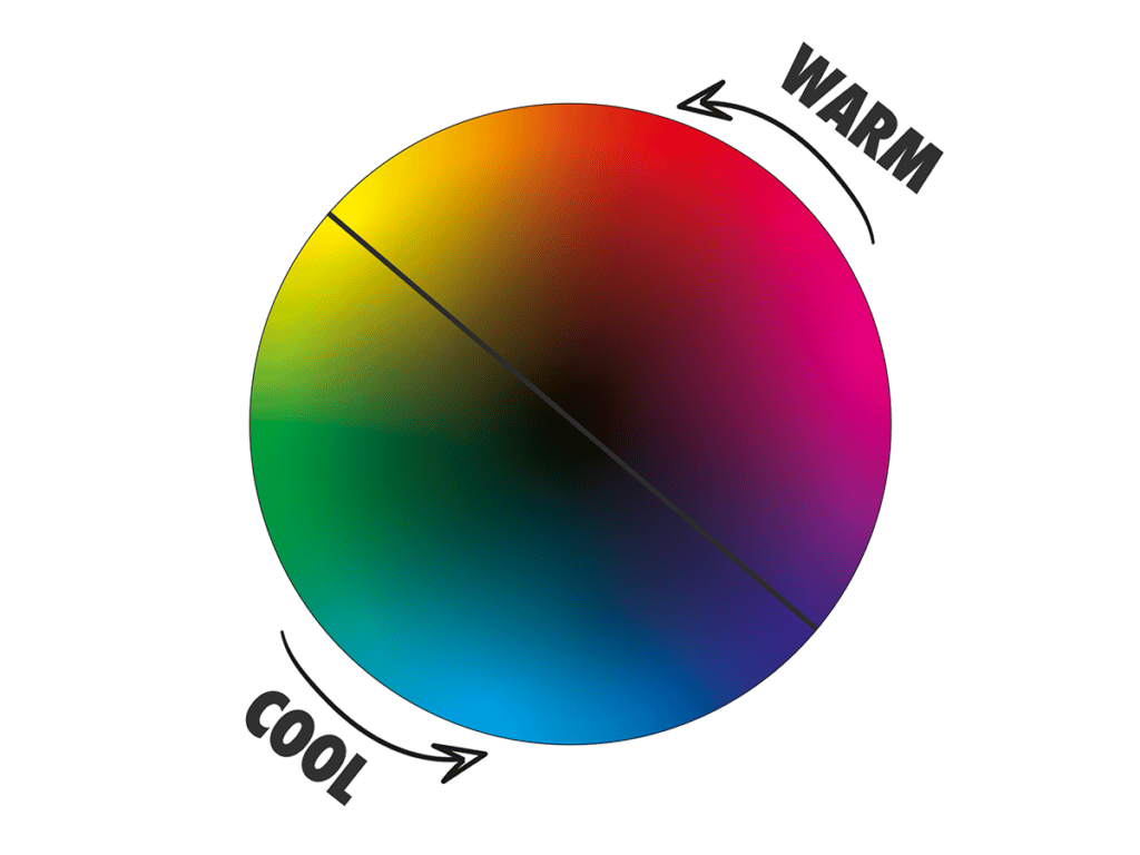
Warm and cool colours are terms used to describe the different types of colours in a colour wheel. Cool colours consist of blues, purples, and greens, whereas warm colours are typically made up of red, orange, and yellow.
One common way to use warm and cool colours is to contrast or balance tones in a painting. For example, if you’re painting a still life in warm red floral tones, you could balance it out by painting an object, such as a book, in cool blue hues.
Complementary colours are pairs of warm and cool colours, which is another reason why they work so well together in paintings and design pieces.
Another common way to use warm and cool colours is to create depth in your piece. By using warmer colours towards the foreground of your painting, and cooler colours towards the background, you can create a sense of dimension and movement in your work. Warm colours like reds, yellows, oranges and pink naturally appear closer in an artwork, compared to blues, greens and purples which appear to recede.
Colour contrast

Colours have lots of different descriptions: shade is a colour that has been darkened with black, tint is the colour with white added and tone is a desaturated version of the colour.
Colours can contrast, not only in their hue (i.e. red, orange, blue etc) but also in the saturation and value.
Artists can use complementary colours in a more subtle way, by pairing saturated and desaturated colours. This is a way to use complementary colours in a more muted and elegant manner, that doesn’t demand attention.

A great example of using complementaries, one saturated and one toned down is in this painting “Haystack” by Monet. The dark reddish purple in the shadows contrasts with the bright lime green grass, creating variety in the painting. The effect also gives off a sense of heat and the impression of bright, midday sun.
What are the effects of using complementary colours?
Complementary colours used together in an artwork appear dynamic, full of energy and contrast.
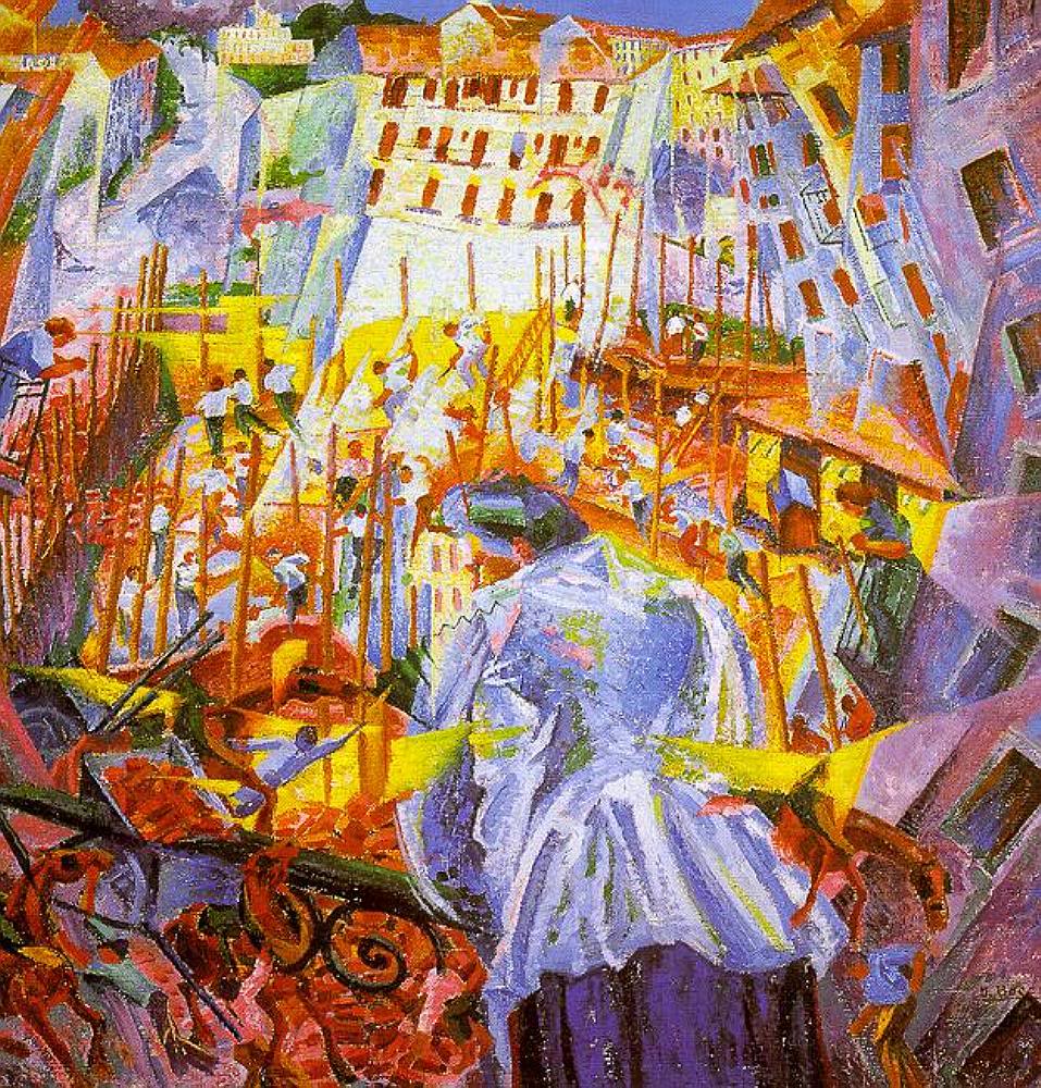
This painting by Umberto Boccioni is colourful and restless, the intention was to create a sense of chaos. As the person in the painting is opening their window to the business of the street below. The cool blues and purples in the houses and the person, which have a calming effect on the viewer, contrast with the bright yellows and red tones of the street. This gives the painting a sense of liveliness.
Other effects of using complementary colours also include heightened visual interest and depth, increased contrast, and stronger highlights and shadows.
You can use complementary colours together for emphasis, in a more subtle way, by using the toned down version of the colours, or using the complementary colour sparsely next to the focal point.
Mixing complementary colours

If you mix complementary colours together, you will create a neutral colour. This is because when you mix all the primary colours together, you achieve grey, black or brown, depending on the dominant colour. Because complementary colours will consist of a primary colour on one side of the wheel and a secondary colour on the other side of the wheel (which is a mix of the two other primaries), all primaries will be included in the mix and therefore they will all neutralise one another.
You can mix complementary colours in varying amounts to tone colours down slightly. For example, if you add a small amount of orange to a blue pigment, you will achieve a more muted blue. Muted colours appear more realistic in paintings; colours hardly ever appear in a highly saturated form.
If you’re stuck with colour mixing and you want a comprehensive guide on the subject, check out our colour mixing tutorial. In it, you can learn a process for how to mix and match colours accurately from a reference.
Primary, secondary and tertiary colours

Primary colours have secondary colours as their complementary colours and tertiary colours have other tertiary colours as their complementary colours.
Magenta, cyan and yellow are the primaries as pigments; they’re primaries because you can’t mix them from any other combination of colours. They are the starting points for mixing other colours
The complementary colour of cyan blue on the CMYK colour wheel is red. In the CMYK subtractive colour model, red is considered a secondary colour and magenta is considered a primary. This may seem counter intuitive, as we’re taught that red is a primary colour. However, magenta and yellow mixes to make red, and magenta cannot be made from any other colour on the wheel. This makes magenta (a shade of red) the primary and the red that leans more towards yellow the secondary colour.
Complementary colours painting examples
“The Night Cafe” is an 1888 painting by Van Gogh. Van Gogh used the complementary colours red and green to create a sense of tension in the painting. The colours clash, and appear almost jarring, as a backdrop against drinking patrons in the cafe. In a letter to his brother, Theo van Gogh, Vincent wrote: “I have tried to express the terrible passions of humanity by means of red and green”. He also describes the painting as “one of the ugliest I have done”. This highlights how complementary colours can work against each other, as well as work well together.
Another example of complementary colours in a painting is in Edgar Degas’ “Ballerina and Lady with Fan”. The ballerina is the focal point of the painting, being placed the the third right hand intersection on the canvas and painted with a bright orange dress. The warm orange tones brings the figure forward against the muted background, the cool blue dresses of the other ballerinas and the purple-blue toned fan of the lady in the front.
Other colour schemes
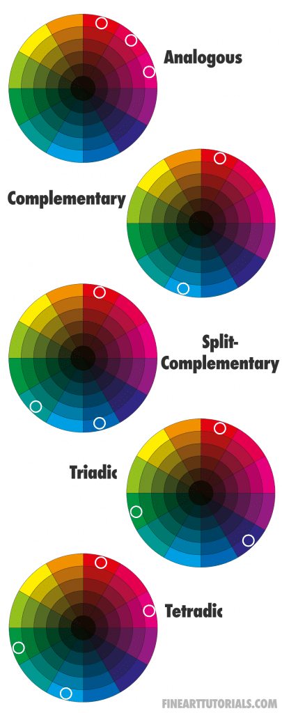
The complementary colour scheme is just one type of colour scheme, there are several others. For example, a monochromatic colour scheme involves only one colour on the wheel and its extended range. The extended range means all the tints, tones and shades of that colour. So if your colour in question was blue, it would include light blue, grey blue and dark blue.
The tetradic colour scheme includes four colours that are spaced evenly around the colour wheel, to make a rectangle shape.
Other colour schemes can appear more harmonious and balanced compared to complementary colours schemes which can appear striking and dynamic.
Colour theory and complementary colours
In art, colour theory is the description and applications of colour. It describes the effects that colours have on our moods and emotions, the relationships between colours and how they can be used to evoke a particular response or feeling. Studies into colour theory have been done to understand the way colours impact us psychologically. Red is an intense colour that is often associated with feelings of passion or anger. Yellow is a bright colour associated with feelings of energy and happiness. Yellow and purple complement each other well, as purple is a serene colour and the yellow offsets the darkness.
Finally
If you want to try painting with a complementary colour scheme, create a few composition sketches and play around with different combinations to see what works best for your unique style!
Also note that while complementary colours are often considered the most dynamic and striking, there are many other colour combinations that can be used to evoke a particular mood or feeling. Experiment with different colour schemes and think about how you will arrange elements to create a focal point in your painting. Make sure to choose a colour scheme that complements the composition and atmosphere of the painting you are creating.