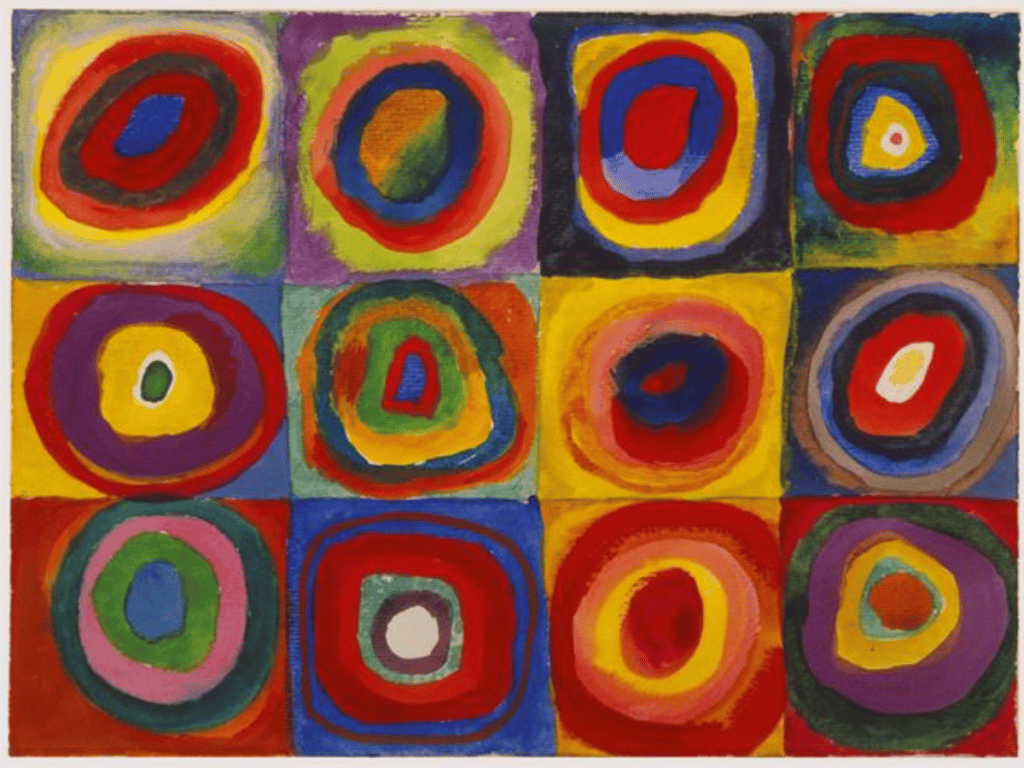
Colour is one of the seven elements of art, the building blocks that make a painting, drawing or sculpture. Its scientific basis is in the way in which humans perceive wavelengths of light reflected into our eyes, but colour also has a long and rich history of use in art, from ancient cave paintings to the vibrant works of modern day.
In this article, we will explore colour in art and its properties, how colour is organised in colour wheels, schemes and pigments, as well as how artists use colour as an element of art to compose artworks with intention.
Disclaimer: Fine Art Tutorials is a reader supported site. When you make purchases through links on this site, we may earn a small commission at no extra cost to you.
What is colour in art
Colour is defined as the perception of light reflected into our eyes. It can be described as a spectral composition made up of wavelengths within the visible spectrum that our brains perceive and interpret colour from. In art, colour is used to create emotion, atmosphere and beauty as it can evoke feelings in viewers or draw attention to certain aspects of a painting.
The science of colour
Isaac Newton made the discovery in the 17th century that white light is composed of different wavelengths of colours. The colours that are made up of these single wave are called the spectral colours. The wavelengths of colour are red, orange, yellow, green, blue, indigo, violet. This is where the famous mnemonic ROYGBIV comes from. Newton’s discoveries lead to more research and findings, including that we see colours from objects, due to the way they emit, reflect, or interfere with light.
Properties of colour
Albert Munsell found a way to define, systemise and organise colours. He came up with the Munsell colour system, which describes colour as having three properties: hue, colourfulness and luminance.
- Hue is the colour itself, and can be described as red, orange, yellow, green or blue, indigo or violet.
- Colourfulness is the level chromaticity of a perceived area. This refers to the purity or intensity of a colour, independent of its brightness and free from black, white or grey. It relates to chroma and saturation.
- Luminance is how much light passes through, is reflected from or is emitted from an area. In art, we describe the representation of luminance as value, in how light or dark the colour appears on a scale from 0 to 9, according to the Denman Ross value scale. The higher the value, the darker the colour and vice versa.
Primary, secondary and tertiary colours
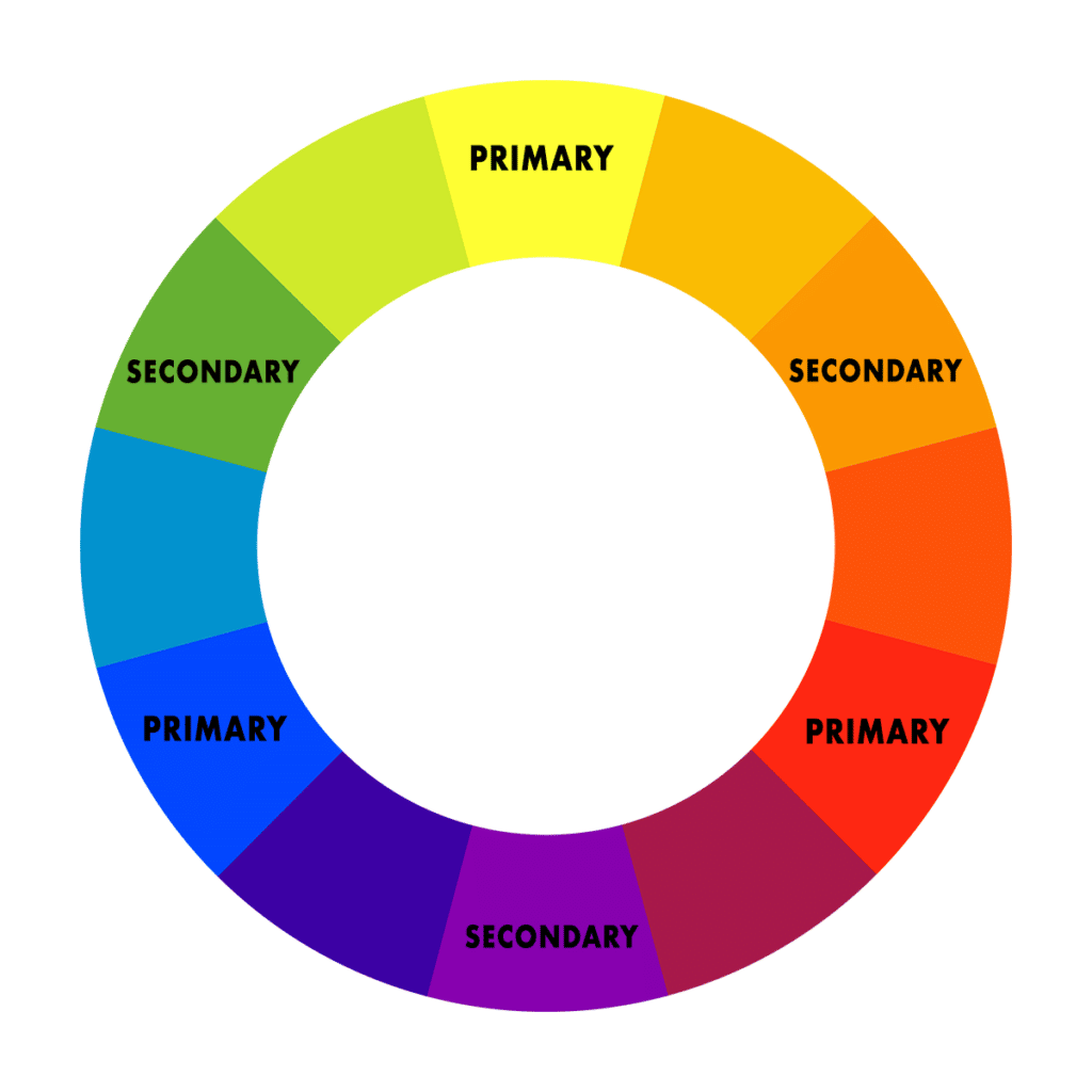
Primary colours are red, blue and yellow. These colours cannot be made by mixing any other colours together and are the foundation for all other colours and tones. All other colours come from these three primary colours.
Secondary colours are orange, green and purple and are created by mixing two primary colours together in equal parts. Tertiary colours are created when a primary colour is mixed with a secondary colour in equal parts.
Colour space
Depending on the colour wheel artists use, the primary colours can look a bit different. The red, blue, yellow colour wheel is based on the wavelengths of colours and photoreceptors in our eyes.
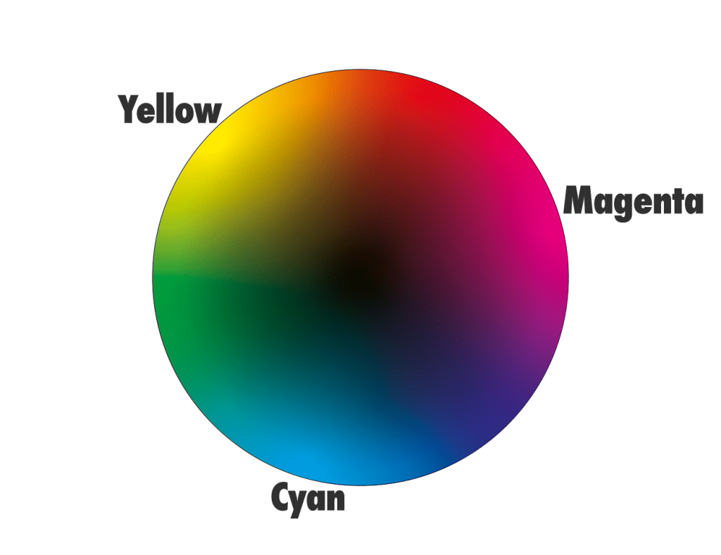
However, if you are mixing colours from materials such as pigments, you will use the subtractive colour model. This means using the CMYK colour space to do so. Artists and printers use this colour model to mix and represent colours perceived in life. The primary colours according to this model are types of red, yellow and blue, they are: cyan, magenta and yellow.
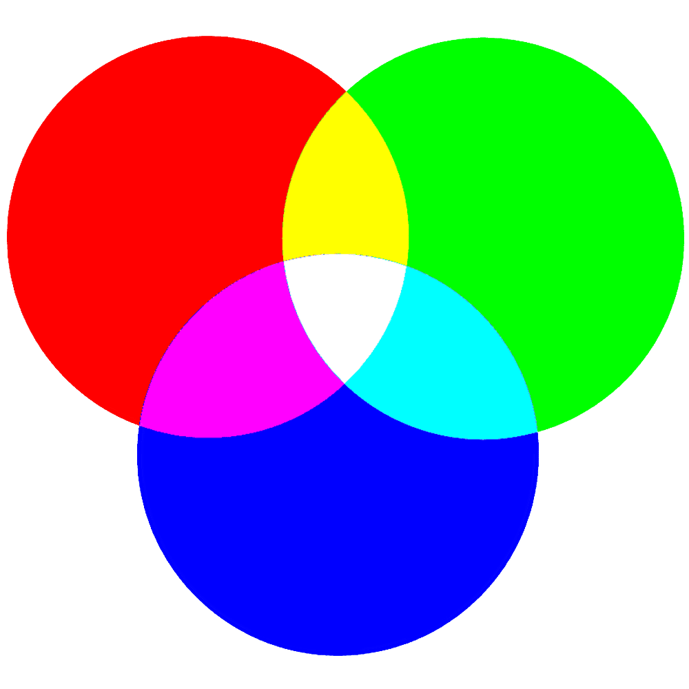
Then if you are mixing colours using light (i.e. on screens for digital design), use the additive colour model. This colour model describes how light mixes and produces colour. The additive primary colours in this model are red, green and blue. Additive colour starts with black, then adds red, green or blue light in differing amounts to create the hues in an image.
Colour wheels
Artists and designers use colour wheels as a tool to determine which colours will work best together in an art piece. The colour wheel arranges all the colours into a circular shape, showing how the colours interact with one other. It helps to identify colour harmony and can be a powerful tool to create colour schemes.
A colour wheel can be a helpful tool to aid the mixing process when producing artworks. The CMYK colour wheel is the most useful to traditional artists, who work with physical rather than digital media. You can buy one, or make one yourself!
Colour mixing
Artists use the CMYK colour model to help them accurately combine pigments and mix colours to create hues, tones, tints and shades. It can help, when analysing a reference to try and isolate the colour, then locate it on the wheel. From the location on the colour wheel, the artist can decide which pigments to mix and how much white or black to add.
Pigments
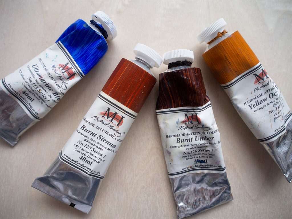
Pigments are materials that colours are made from and are used by artists to create colour in their work. They can be made from natural sources, such as minerals, or synthetic sources, such as chemical compounds.
The palette of pigments an artists chooses will influence how the painting turns out. Most artists will choose to paint with a palette of primaries, as this provides the greatest chromatic range. This will include versions of red, blue and yellow. Then artists will also have one pigment to create highlights and one pigment to create shadows. Titanium white is an opaque white that is perfect for creating light mixes. Ivory black and burnt umber are popular pigments for creating shadows. Burnt umber will provide a warmer, more translucent and therefore gradual darkening of colours compared to ivory black.
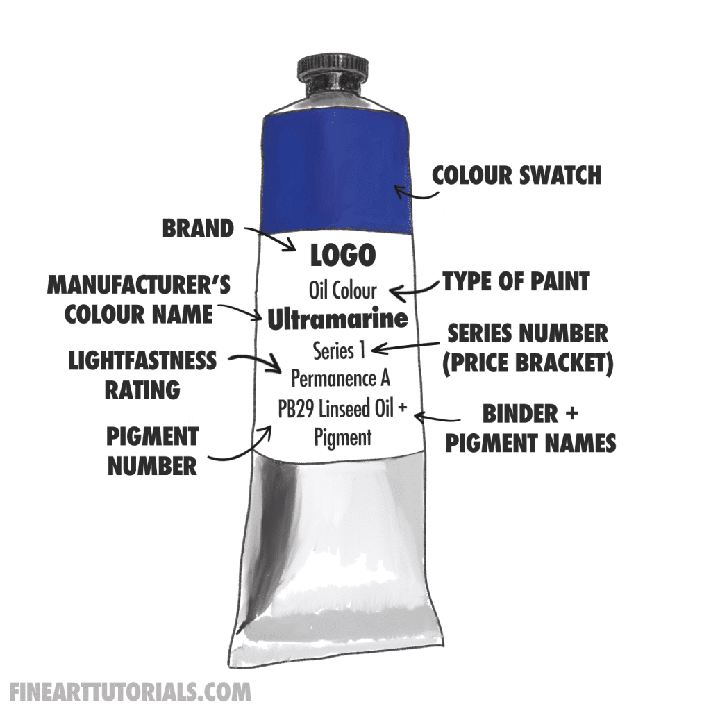
Each individual pigment has its own properties. You can find the properties of a pigment on the paint tube, including its lightfastness rating, which represents how resistant the pigment is to fading over time when exposed to UV light. Then you can also find out about whether the colour is a single pigment or mix of multiple pigments, the tinting strength (how dominant the colour is in a mix) and the transparency of the pigment. Pigments all have their own applications and benefits. For example, a translucent pigment will be an excellent choice for those working with the glazing technique.
Colour temperature
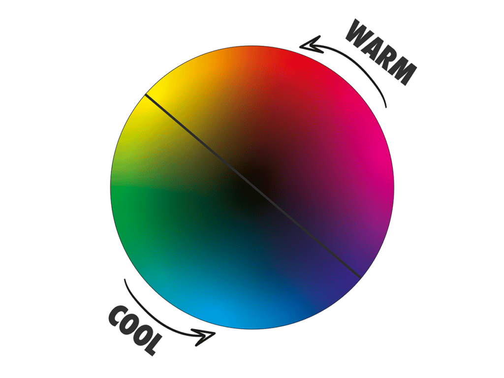
Colour temperature is an important colour theory concept. It relates to colour in terms of warm and cool hues, where a colour can be described as either warm (yellow, orange, red) or cool (purple, blue, green). This colour relationship is used by artists to create colour harmony in their artworks.
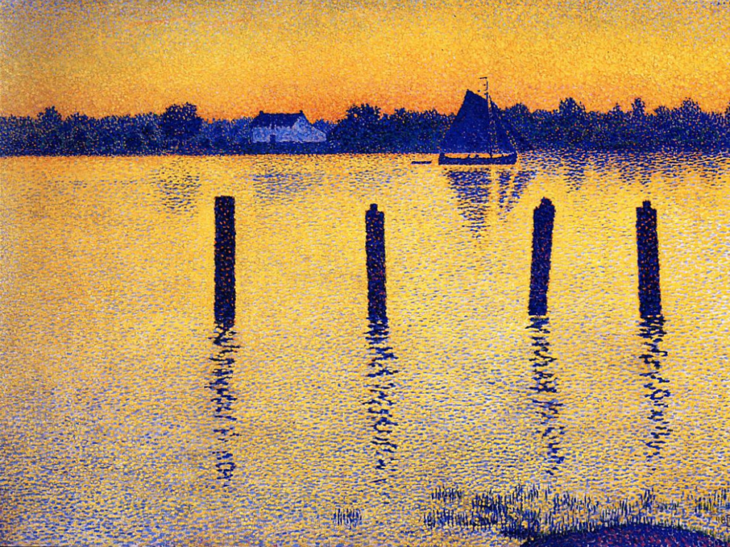
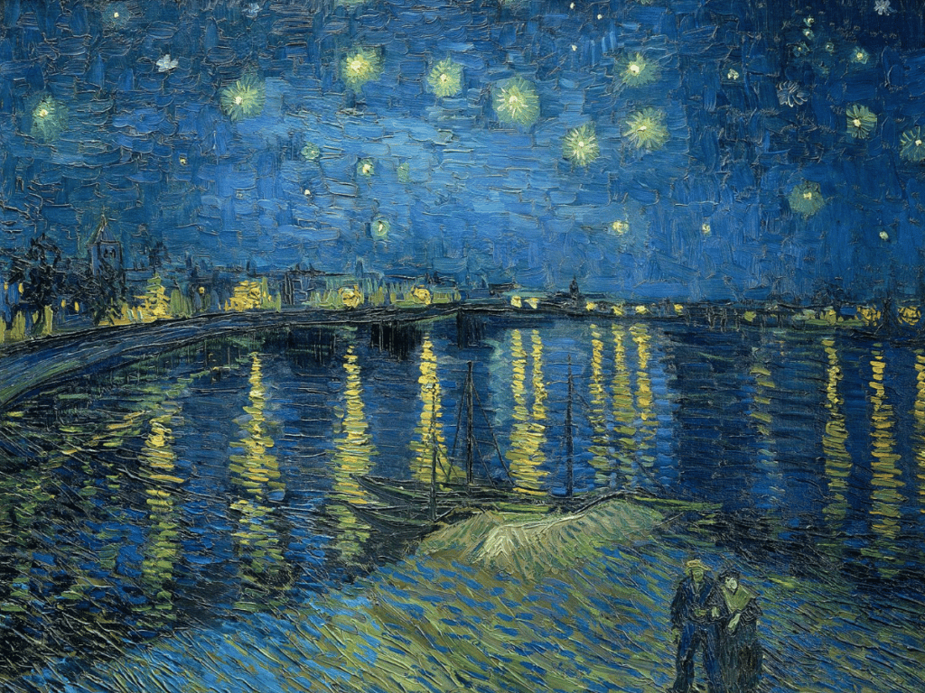
Warm colours will appear to advance in space, while cool colours will appear to recede. This colour temperature effect can be used in art to make a painting more interesting and dynamic. ‘Sailboats on the River Scheldt’ exudes dynamism, with contrasting warm and cool colours. Artists could use warm colour tones for the foreground objects and then cool colour tones for the background. This effect also relates to the phenomenon of atmospheric perspective, where objects in the distance appear lighter and more blue.
History of colour in art
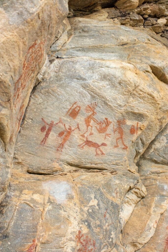
The use of colour in art dates back to prehistoric times and has been used for centuries as a means of telling narratives, conveying symbolism and expression. Iron oxide, which has a deep red tone, was one of the first pigments ever used. Around 40,000 years ago people began using this red pigment which was found in iron oxide rich soil to create cave paintings.
Throughout the history of art, colour has evolved along with new technologies and ways in which pigments can be produced on a mass scale. In the Renaissance period, natural earth pigments were an important colour source and were ground up to create colour pigment.
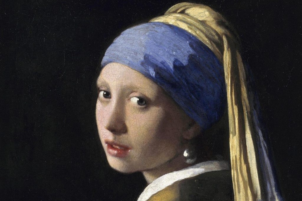
The blue pigment lapis lazuli, which comes from a semi precious stone originating from Afghanistan, was rare, costly and used to signify wealth and opulence. The pigment itself was used from the 13th century onwards in Western art, you can see in it many famous paintings, including ‘The Girl with the Pearl Earring’ and ‘The Virgin in Prayer’ by Giovanni Battista Salvi da Sassoferrato. In the 17th century, the synthetic pigment Prussian Blue, which was discovered by accident began to be used as a substitute for the expensive Lapis Lazuli.

By the 19th century, French Ultramarine was synthesised, along with a wide variety of other new colour pigments. For this reason, the Impressionist artists such as Monet, had a whole new rainbow of colours to add to their toolbox, to use to create beautiful artworks.
Colour schemes
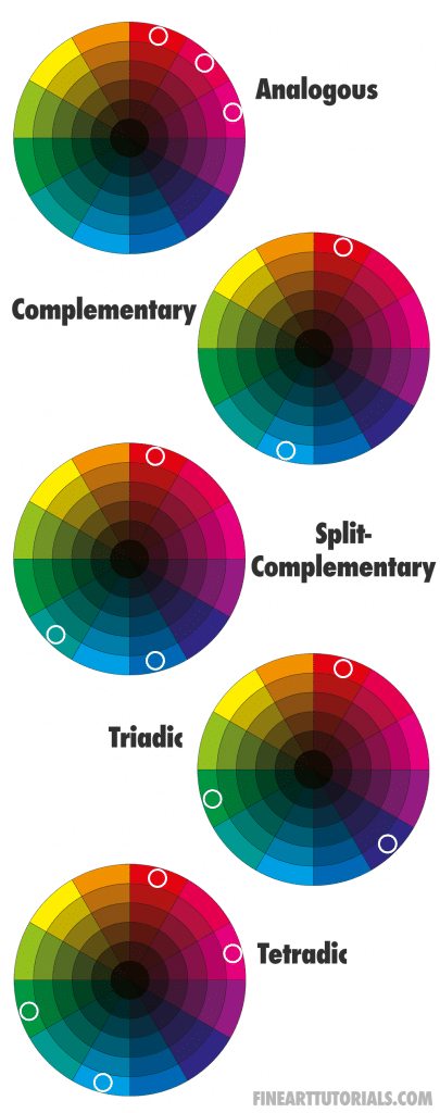
Colour schemes are arrangements of colour that can be used in artwork to create balance and harmony. Popular colour schemes include monochromatic, complementary, triadic, analogous and split complementary.
Complementary colours, which are the two colours opposite one another on the colour wheel, include: red and green, orange and blue, purple and yellow. These are the hues that are most dissimilar from each other and therefore provide the most contrast. Many famous artworks use this scheme, as it creates emphasis and dynamism in a composition.
Colour theory
Colour theory is a set of principles that govern how colour interact with each other and how colour affects our perception. It is used to determine colour harmony and how colour can be used to create a desired effect in an artwork.
How artists use colour in art
Colour is an invaluable tool for artists as they can use colour to bring emotion, atmosphere and beauty into their work. They can also use colour to convey messages and ideas or draw attention to certain aspects of the artwork. It can be used to create colour schemes, add contrast and depth, or evoke feelings in viewers.
Colour harmony
Colour harmony is also important in artwork as colour can clash or create an imbalance if not used correctly. To create harmonious colour combinations, artists will limit the variety of colours used. A limited palette, or limited range of colours will appear more orderly and unified in appearance.
Additionally, to create harmonious colour compositions, artists should consider how they balance saturated and muted tones. Then they should also consider how they will balance and arrange warm and cool colours.
Elements of art
Colour is one of the seven elements of art which include line, shape, texture, colour, value, form and space. Together these elements form the building blocks and work together to create a successful piece of artwork.
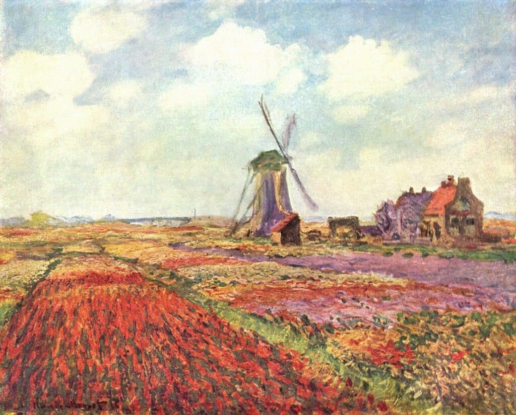
Each element has its own set of characteristics and when used in combination, can create a powerful impact. Colour varies in saturation, hue, value. It can be warm or cool, light or dark. Depending on the specific attributes of a colour, it may bring contrast or unity to a composition. For example, a more saturated colour has more inherent visual weight than a muted colour. This means that the viewer’s attention will be drawn more to a saturated colour compared to muted tone. You can see this in the way that the red tones stand out in the Tulip Fields painting by Monet. However, artists often use saturated colours more sparingly than muted tones, to draw focus to the saturated colours without overwhelming the viewer.
Principles of art
The principles of art are balance, unity, harmony, variety, emphasis, rhythm, proportion, scale and movement. These are the compositional foundations of an artwork. The elements of art are the building blocks that affect how the principles of art make the artwork look and feel.
For example, colour can be used to create a sense of balance in a composition. If a painting is dominated by cool colours such as blues or greys, adding a colour of the opposite temperature, such as oranges or yellows, will balance out the colour scheme and create harmony.
Conclusion
In summary, colour is an important element of art that influences how artwork looks, feels and communicates with its audience. It is essential for an artist to understand colour, colour theory and colour harmony in order to create successful art. With the right knowledge and practice, colour can be a powerful tool for creating artwork that stands out from the crowd.
The use of colour in art is a never-ending journey of exploration, experimentation and learning. There will always be something new to discover and colour is what makes art extraordinary.