
There are lots of options when choosing colours for your limited palette.
The set of colours you choose will depend upon the effect you want to create, your subject matter and your chosen medium.
Using a small but diverse selection of pigments in your paintings can bring many benefits to your art practice. A limited palette will enable the viewer of your piece to see organisation and harmony in your work.
You can use a limited palette in oil painting, acrylic, watercolour and just about any medium to mix a diverse range of values and tones.
Disclaimer: Fine Art Tutorials is a reader supported site. When you make purchases through links on this site, we may earn a small commission at no extra cost to you.
What is a limited palette?
Painting with a limited palette can mean selecting the fewest paint tubes possible to create the widest range of tones on the spectrum.
It can also mean choosing the smallest quantity of pigments that are required to create a range of colours that fit with effect you want to create in your artwork.
Usually, no more than six different colours will be included in a limited palette. This doesn’t include the pigments that create tints (white) and shade (black or burnt umber).
The pigments you select for your palette will depend on your aims for the piece. For example, if your aim is to create muted tones, but intense contrasts in colour temperature for use in portraiture work, you could use the Zorn palette of yellow ochre, blue black and light red.
However, if you want to create as many colour and tonal variations as possible using the fewest tubes of paint, you will need to select variations of primary colours.
What are the primaries in painting?

The primary colours in pigment form are types of blue, red and yellow. They are cyan, magenta and yellow.
With these three primaries, you will still only be able to achieve a limited range (gamut) of colours.
There are many deep and vibrant colours that will be omitted from the mixing range of these three pigments.
This is why many artists start with a limited palette, then augment it by adding colours they would not otherwise be able to mix from the primaries, such as crimson.
The six colour limited palette then, is each primary colour in its warm or cool form. This includes: blue that points towards red (warm), blue that points towards yellow (cool), red that points towards blue (cool), red that points towards yellow (warm), yellow that points towards red (warm) and yellow that points towards blue (cool).
By using six pigments, you use the fewest colours possible to create the greatest range of hues. Therefore enabling you to make better colour contrasts than you would be able to if you were using fewer than six.
Limitations start to occur by using fewer than six different pigments.
Even with six primary tubes, artist will be limited by this palette choice. Not every hue can be made in its most vibrant form.
All of the palettes listed in this guide use a colour that has a dominant hue of a primary, either blue, red or yellow. As from this, you can create contrast in hue, shade and temperature. For example, the Anders Zorn palette is vermilion (red hue), ivory black (blue hue) and yellow ochre (yellow hue).
Should you use a limited primary colour palette?
If you want to achieve realism in your work, using the six colour limited palette would probably be the most helpful to you.
It would also suit you if you like to create many variations of vivid colours and don’t want to be constrained in any way by the colour you can create.
However, many artists work in a far more reductive manner, using colours which give them a smaller, more restricted colour wheel to play with, but allow them to capture mood and emotion, rather than using colour realistically.
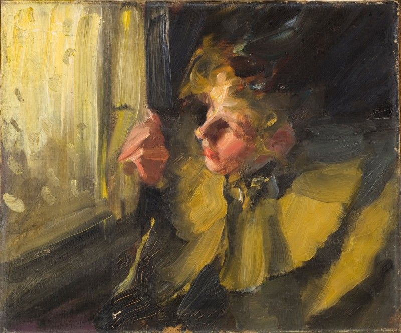
The use of alternative limited colour palettes can also unify areas of the artwork that might otherwise appear separate. For example, in this piece:

Regardless of the palette you select for your painting, the colours will give you a contrast in warm and cool tones.
This is so that even if your colours don’t create true representations of how your subject appears in real life, it will emulate their effect.
Instead, the painter will use value (how light or dark a colour is) to elucidate the structure of the piece. This way, the artist can be creative with their palette choice, but still create the definition of their subject.
Why use a limited palette?
Use a limited palette to create harmonious colour combinations
You can create wonderfully harmonious paintings with a limited palette.
As fewer pigments are being used, the colours mix to produce a visual combination that seems to come together seamlessly.
You’ll look at one part of the painting and see how it relates to another completely disparate section, by using the contrasting colours on your palette to neutralise one another.
With a limited palette, the artist is encouraged to use more subtle colour graduations.
Use a limited palette to cut art supply costs
Another benefit of using fewer paints is that, aside from it costing you less, the tubes themselves take up less space. If you’ve ever wanted to venture outdoors and paint plein air, you will need considerably less space in your bag for paint if you use a limited palette.
Painting with a limited palette improves colour mixing skills
Using fewer pigments to create a wide variety of colour is a great training exercise. You learn so much about colour and the relationship between different objects and their corresponding values from mixing different tones and hues from scratch.
It actually forces you to plan the composition of your piece in relation to the colours you are using, thinking carefully of each tone and value transition. You can create the colours you want by mixing, meaning that you don’t have to compromise and just opt for the closest manufactured tube.
Doing all the mixing yourself won’t just improve your skills at colour matching from your reference, but it will actually transform your perception of colour in what you see around you.
An artist’s palette is personal to them and is usually a signature of their practice and style. For experienced artists, they will often have started using a standard limited palette to learn how to mix colour, then added a unique set of colours that work for them.
If you’re considering trying to paint with a limited palette, there are some standard colours you can use to begin to work from, then you can alter this palette as your skills develop.
I’ve outlined a number of different palettes you can choose from below, with examples of the range of colours you can achieve from each.
What are some examples of a limited palette?

This can vary depending on your chosen medium and subject. Also on the effect you want to create.
For almost every palette, you will need the addition of white and burnt umber or black to create values:
- Titanium White or Zinc White
- Titanium is opaque and has the strongest covering power.
- Zinc is translucent, can be brittle used on its own, but doesn’t make colours ‘chalky’.
- Use the two in combination for more balanced highlights.
- Burnt Umber
- Burnt Umber is preferred by many artists over ivory black. The reason for this is that the earth pigment, which has reddish and yellow undertones can be mixed with ultramarine blue to make an intensely deep black.
- To create a warm or cool shadow, just add either more burnt umber, or ultramarine. Another reason to use burnt umber over black is that the colour is more transparent. In creating transparent, fast drying shadows, you apply this as part of your first layer of paint.
- Ivory Black
- Use this with the Anders Zorn palette, or cool monochromatic palettes.
- Ivory black has cool, bluish undertones. It is more difficult to modify the colour profile without making it appear darker, whereas there’s more leeway in modifying burnt umber.
- If you’re looking for a cool, solid black, this is the one to go for.
- It can actually be used as a neutral blue in some palettes that don’t require vivid blue hues.
- The problem with using black is that it can make colours appear dull, whereas burnt umber won’t do this.
The split primary limited palette in oil paint
The most widely used limited palette is this. From it you will be able to create the greatest range of hues when compared to other limited palettes. This is called a split palette, whereby the artist uses a warm and cool version of each colour, to achieve high chroma and a range of hues—using this palette will mean you can create a high amount of colour contrast in your paintings.
- Quinacridone Magenta PV19: (primary magenta—cool in form but mixes to make vibrant oranges)
- Cadmium Red Light PR108: (deep red, leans towards yellow, more rounded in mixtures) substitute this for Pyrrole red
- Phthalo Blue (primary cyan) PB15: (primary cyan, mixes to make vibrant greens)
- Ultramarine Blue PB29 (blue that points towards violet)
- Transparent Yellow PY128 (primary yellow)
- Cadmium Yellow PY35 (deep, rounded yellow) or substitute this for Hansa Yellow from M. Graham
How to paint with a palette of three colours in oil
The concept of using only three primary colours is imperfect in painting. There are no pigments that have been found, or made that sit exactly in the place of a true primary on the colour wheel.
If you’re using just three colours, keep in mind, you won’t be able to mix them to make any colour you want. Some hues, like oranges and purples may not come out as being as vibrant as they could be. That said, there are pigment mixes that come close.
This three colour palette has other drawbacks, namely in the sense that you will have to do a lot of mixing to achieve the colours you want.
The focus of finding a limited palette to suit your painting practice is not in attempting to use only colours that are closest to primary colours, but in finding the colours most suited to what you’re trying to achieve. Different combinations of primaries can give equally appealing results, no matter if the combination you are using is close to being true primary or not. Think about what will make a good painting, not which colours are closest to primary.
The primary triad is a high chroma palette, so if you’re looking for a palette with more harmonious colours, then look to either the landscape or portrait sections.
Primary triad

- Transparent Yellow PY128
- This comes in as a mid yellow when mixing with both reds and blues to make oranges or greens.
- It creates incredibly clean mixes and is, as the name suggests, transparent.
- Quinacridone Magenta PV19
- This is your primary red colour as it is the most versatile pigment which creates vibrant oranges and equally vibrant purples. It leans towards blue in its pure form and can create vivid pinks when glazed over white.
- Phthalo Blue (primary cyan) PB15
- A pigment with high covering power.
- This is a mid value blue.
One warm, one cool pigment

This palette is surprisingly versatile. You have one warm and one cool colour, both pigments appear dark in their purest forms, but are transparent.
Rich values and tonal variations can be created that give the illusion of colour and depth.
You can choose any combination of cool and warm pigments, but the following three palettes work well:
1:
2:
3:
Monochromatic

Here I used the same palette of burnt umber, ultramarine and white to create a monochromatic effect.
You can choose any single pigment and pair it with black or burnt umber to achieve a range of values.
Limited palette for portraits
To paint a portrait, it’s possible to use a primary palette. Skin tone is hard to mix and beginners often oversaturate their tones.
A tip for beginners is to make their tones much duller than they might think.
Often new painters will try to paint a cheek or lips with red pigment that hasn’t been neutralised and it turns out looking artificial. If however, you want to achieve softer skin tones then there is a palette that you can create a nice base tone with and use darker neutrals to tone it down.
Portrait painting requires a more muted colour palette, so using a muted red, muted yellow and two different pigments to balance the colours and tone them down works well.
Portrait palette:
- Yellow Ochre
- Yellow ochre can be used along with titanium white and cadmium red to create a base tone for the skin.
- Raw Umber
- Raw umber has blue-yellow undertones, so this can be used to cool the mixture down and in the shadows of the piece. Use it to make brown in the shadows or in the skin tones.
- Cadmium Red
- This can be mixed with titanium white and other neutralising colours to create highlights and accents.
- Ivory Black
- Ivory black has blue undertones, mixed with titanium white it makes a neutral blue. Mix this with the cadmium red to neutralise tones in the lips and more colourful parts of the skin.
An alternative palette, that uses muted colours for a softer effect is:
- Naples Yellow
- A warm yellow that’s brighter and more intense in colour than the earth pigment yellow ochre
- Vermilion
- A brilliant orange-red. Perfect for lip colour. Add it to brown tones to create warmth.
- Titanium White
- Ivory Black
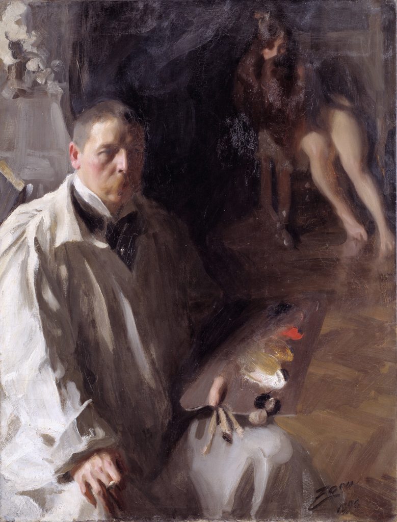
The Anders Zorn palette

Anders Zorn, the Swedish artist famously painted with a limited palette. The interesting thing about his palette choice was just how few colours he chose to paint with. His palette wasn’t vivid, but he achieved pure colour mixes. His palette choice was:
- Yellow Ochre
- Ivory Black
- Vermilion or Cadmium Red
- Titanium White
He reveals his palette in one of his paintings:
Limited palette for seascape paintings

I paint mostly seascapes and I mostly use the primary triad palette. Sometimes I incorporate some Cobalt Blue for the sky, or use Ultramarine to achieve more intense violet-blues.
Here’s an alternative seascape palette:
- Transparent Yellow
- Primary yellow mixes with cyan to make turquoises and teals.
- Cadmium yellow light
- The colour coordinates of this variation of cadmium yellow point towards green, making it suitable for mixing sharp and clear greens in combination with the blues in this palette.
- Alizarin crimson
- Mix with blues to create violet blues and violet blue-greys. It is useful for sunset sea paintings.
- Cadmium red light
- Mix with yellow to create a muted orange that can be used to neutralise blues to make a blue-grey palette
- Phthalo blue
- This may be the most essential colour for seascapes and the one you will use the most.
- Ultramarine blue
- Study the sea carefully and you’ll find that sometimes the light plays on it to make it look as if it has purple undertones, especially in deep water.
- Ivory Black
- Ivory black will work better than burnt umber to mix with and darken blues and also to create a range of muted blues.
Limited palette for landscape paintings
Your palette will depend on the landscapes and seasons that you are painting. If you are painting plein air in the summer, you will want to have colours that enable you to create a variety of greens and have brighter colours for flowers. For landscape painting, you won’t need black, but burnt umber to achieve muted earthy tones. Here’s a limited palette for landscapes:
- Cadmium Yellow
- This is an ever so slightly warm pigment in its medium value, similar to butter. This colour is great for summer flowers, fields of hay or creating warmth.
- Transparent Yellow
- Mix to make varying shades in foliage. This is a transparent and clean in masstone and bright in tint.
- Cadmium Red
- Use this for warm sunsets, bright flowers. Red is the least necessary colour in landscape painting for the most part. Other reds such as Quinacridone Magenta or Vermilion can be used in its place.
- Alizarin Crimson
- This is a transparent red that points towards blue on the spectrum. It’s especially effective when used to neutralise greens in foliage or in the shadows.
- Cobalt
- Ever so slightly cool blue, brilliant for use in sky, snow and lake scenes.
- Ultramarine
- Use this warm blue to create dark and grey coloured greens, also for use in deep lake scenes or intensely blue skies.
Some optional extras for landscape painting, that can be beneficial to facilitate in mixing greens and deep earthy reds are:
- Burnt Sienna
- This one is for desert painters. Burnt sienna also works wonderfully in autumn scenes, forestry and as an imprimatura for almost any subject. It’s an incredibly bright earth pigment that you could also use as a replacement for red.
- Sap Green
- Deep, earthy and mossy transparent green that leans towards yellow.
- You can mix this colour using your base palette, but it can be useful to have a premixed tube on hand.
- Yellow Ochre
- Beautiful in golden sunsets and autumn scenes.
Landscape limited palette demonstration
In this gouache landscape painting, I used a limited palette of five colours, in addition to ivory black and white. To achieve the colour of the yellow grasses, brown rock on the mountains, green bushes and bright blue sky, I used yellow ochre, viridian green, burnt umber, ultramarine and cyan (plus ivory black and titanium white). These colours are available in the Winsor & Newton gouache introductory set, but you’ll have to add individual tubes of titanium white and burnt umber to get the full palette. In the video tutorial, I explain how I achieved the different colour mixes.
Monet’s impressionist palette

Monet’s paintings are brilliantly colourful and luminescent. He seemed to pick up on the subtle tones in the shadows and light of a landscape and emphasise them with his vibrant mixes. The vibrant colour mixes he was able to achieve was mainly down to the fact that he used a limited palette, mixing the fewest pigments together to achieve a particular tone.
- Cadmium Yellow Light (cool)
- Cadmium Yellow Medium (warm)
- Alizarin Crimson (cool and transparent)
- Cadmium Red Light (warm)
- French Ultramarine (cool)
- Flake White
It is also suggested in James Heard’s book Paint Like Monet, that he would have used secondary green pigments such as Viridian to facilitate the mixing process in some landscape pieces.
Using extra pigments for special purposes
Certain pigments have particular unique qualities. In using them, you can achieve an effect that you would not be able to achieve by mixing two colours together. For example, if you are using the six colour warm and cool palette, you might not have a transparent deep red suitable for glazes. In this case, you could use alizarin crimson.
The variation in transparency and drying times of pigments, and even the binder they have been mixed with can make them more favourable to use.
Although many artists have been famed for using limited palettes, such as Anders Zorn, it’s important to note that their practice wouldn’t have always been restrictive.
There’s evidence to suggest that Zorn used a multitude of different colours across his painting career, as reported by the Museum Director of the Zorn Collection in Mora, Sweden. In his studio, tubes of cobalt blue were found and in a few of his paintings, it’s clear that he used a mixture of different blues and greens.
So whilst he would have used his limited palette for some of his works, he would have strayed from doing this at times too.
The best thing to do is experiment to find what works best for your practice and most of all, to have fun with it.
Finally
As you can see, there are just so many viable pigment combinations to make a palette, even if you’re trying to cut the number of colours you use down.
The main point is that you understand the properties of the pigments you are using, whether they lean towards being cool or warm, how transparent they are, their tinting strength and any other attributes they may have that will affect how they mix with other colours.
Use this knowledge to your advantage to master colour. I’d advise you to learn more about mixing colour and colour theory too.
If there are any colour palettes you especially like using, let me know in the comments!
Limited palette: Pin it!
If you’ve found anything on this site especially useful, you can make a donation to me through PayPal. I take a lot of time to research and write each topic, making sure each tutorial is as detailed as possible and I make all my content freely available. Any small donation (even the price of a cup of coffee!) can help me to cover the running costs of the site. Any help from my readers is much appreciated :).
Follow the link in the button below to support this site.
Can a limited palette be used in abstract painting?
Yes absolutely—you could use a limited palette to create harmony in an abstract artwork
My brother recommended I would possibly like
this website. He was once entirely right. This post truly made my day.
You can not consider just how much time I had spent for this info!
Thank you!
נפלא
מועיל ,מאפשר ללמוד הרבה
כל הכבוד בהערכה
רותי כהן
Appreciate this post. Will try it out.
Based on the teaching of Kevin MacPherson, I am now using a limited palette of Cadmium Lemon, Permanent Alizirin Crimson, and Ultramarine Blue, as this triad seems to have the largest “reach” for possible colors. I then add full strength special pigments on rare occasion, such as Quinacridone Violet, Pthalo Blue or Green, Cobalt Teal, Cobalt Violet for special cases where I need a strong POP of color. Also, I occasionally use Cobalt Blue and/or Cerulean Blue for a wider range of full strength greens in the landscape. 80-90% of the time though, I can begin a painting and complete the first pass, and often complete the entire painting, with just the three “MacPherson” colors.
Great explanation! Thank you.