
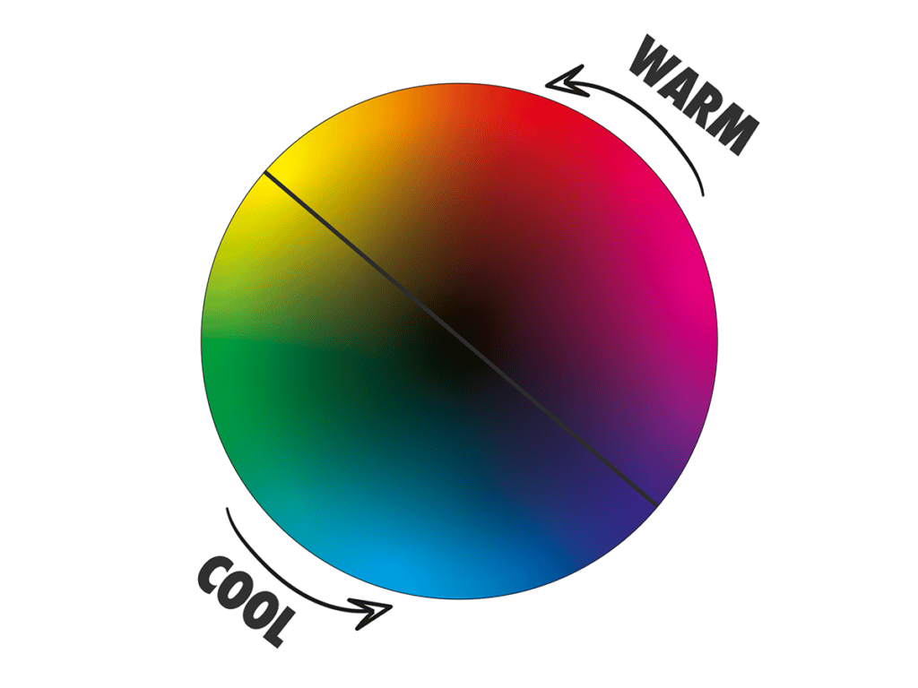
Have you ever wondered why some colour combinations work and others don’t? This can be owed, in part, to “colour temperature”. Warm and cool colours can affect the colour harmony of artworks, creating a sense of balance or disjointedness. Warm and cool colours also affect the viewer’s mood and overall composition.
In this guide, learn everything you need to know about warm and cool colours. This includes some practical tips for how to use colour in artworks to improve your compositions.
Disclaimer: Fine Art Tutorials is a reader supported site. When you make purchases through links on this site, we may earn a small commission at no extra cost to you.
What are warm and cool colours in art?
Warm colours are red, orange and yellow, while cool colours are blue, green and purple. Warm colours sit opposite cool colours on the colour wheel. Complementary colour pairs consist of one warm and one cool colour.
These opposing colour families work together in art to create a sense of balance or discord, depending on the artist’s intent.
Blue is the coolest colour on the colour wheel and orange-red is the warmest. If you add red to blue, it will make the mixture relatively warmer than blue and cooler than red. This makes the colour purple (which is still classed as a cool colour).
Warm and cool colours in context
Colour is relative. Depending on the context or surrounding colours of the colour in question, that colour can appear warmer or cooler.

Taking the example of purple again, if you were to look at two purple tones together, one that leans towards red and one that leans towards blue, the blue toned purple will look cooler. However, look at that same red toned purple next to red or orange and it will appear cool in comparison.
How to use warm and cool colours in art

There are many ways to use warm and cool colours in art, depending on the desired effect. Some artists prefer to use a limited palette of only two or three hues, using shades and tints to vary the intensity of the colour without changing its temperature. Alternatively, you can experiment with different combinations of warm and cool tones in your artwork to create interest, depth, and balance.
Choosing a colour palette

To create a sense of balance in your colour palette, select both warm and cool versions of primary tones. For example, cadmium red is a warm version of the colour red and magenta is considered cooler. Cadmium yellow lemon is a cool yellow and cadmium yellow deep is warm. Cyan blue or cerulean blue is cooler compared to ultramarine.
If you wanted to use a warm palette, to paint portraits, ultramarine, cadmium red and cadmium yellow deep would be a great starting point. To create warm toned shadows and more subtle transitional shades in a portrait painting, burnt umber is a great substitute for ivory black.
Conversely, phthalocyanine, cadmium yellow lemon and magenta would make for a great cool palette. However, to create a balance in your painting and to give you the ability to mix a wider range of shades you can include both warm and cool versions of the primaries. This is just an example of three palettes, if you want to read about other popular limited palettes, check out the guide!
Create harmonious compositions
When working with colour temperature in art, the goal is to create harmony within the composition. This can be done by using warm and cool colours together in an intentional way, such as juxtaposing warm and cool shades of the same hue or using complementing colours (one warm and one cool) to create contrast.
To use warm and cool colours in an interesting way, try creating a contrast between the temperature of your subject and the background, or by using one strong colour to dominate the composition, while other subtle hues act as accents.
Using only warm or only cool colours in an artwork can create a sense of tension, however, it can also look overwhelming. When using a dominant set of warm or cool colours, consider using a small amount of the complementary colour. This will make the colours in your artwork stand out to the viewer.
Warm and cool colours in landscape painting
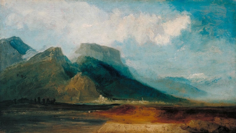
In landscape painting, warm colours are used to signify elements in the foreground, whilst distant objects like mountains or hills appear cool in tone. This is the effect of atmospheric perspective which is used to create depth and distance in a painting. Using warm or cool colour can create the illusion of three-dimensional objects or space, making your work more realistic.
To create the appearance of distant mountains, mix some of the sky colour with the colour of the foreground mountains, reduce the contrast, detail and make the edges appear softer.
How does colour temperature affect composition?
The colour temperature of an artwork can have a significant impact on its composition, as warm and cool colours are often used to create contrast and balance.

Place a focal point in your painting by creating a contrast between warm and cool tones. For example, if you painting mainly consists of cooler, muted tones, add a little red or yellow to the colour mix to warm and brighten the tones for your main subject. This will draw the viewer’s eye in and make it stand out.
Warm and cool versions of the primary colours
Red and yellow are inherently warm colours and blue is inherently cool, however there are versions of the primaries that appear warmer or cooler. For example, this deep orange red tone is warmer than magenta, which leans towards purple on the colour wheel. Equally, yellow that leans towards green is cooler than yellow that leans towards orange. Blue that leans towards green is cooler than blue that leans towards purple.
Colour theory and colour temperature
Colour theory is the study of colour in art, its applications and the effect it can have on the viewer. By having an understanding of colour theory and colour temperature, it can inform your choices when mixing and selecting colours for your paintings. If you’re able to label warm and cool colours, this will help you to make more aesthetically pleasing compositions.
Colour theory studies the psychological effect that colours can have on people. Generally, warm colours tend to have a strong, energetic feel. They can feel intense and hot, while cool colours are more muted shades that evoke feelings of calmness and relaxation.
Warm and cool colour schemes
Warm and cool colour schemes can make or break the composition of an artwork, so it is important for artists to understand how these colour families work and how they can be used to enhance a painting.
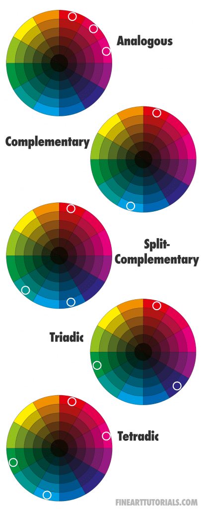
Analogous colour schemes use three hues next to one another on the colour wheel and the extended range of these colours (tints, tones and shades). An example of this would be orange, read and pink, or cyan, blue and ultramarine. Use this colour scheme if you want to create a strong warm or cool feel in your painting.
Complementary colours are opposites on the colour wheel and are more intense than analogous colours. For example, orange is a complementary colour to blue. These two colours can be used together to create contrast, with one of them being given greater emphasis. This is a great colour scheme to use, to balance warm and cool tones.
Triadic schemes use three colours that are equidistant on the colour wheel. These kinds of schemes can help to create balance and harmony in a painting, as they tend to have more visual interest than analogous or complementary colour schemes. An example of this is red, yellow and blue.
Finally
How you use warm and cool colours in an artwork will depend on the effect you want to create and the message you want to convey to the viewer. Use them to create the appearance of realism, to add visual variety, to place a focal point and to create a sense of atmosphere in a painting.