Colour harmony is an important design principle, that can help you create visually appealing and balanced artwork.
Colour is arguably one of the most powerful and enchanting elements of an artwork. Learning how to use it to create balance and harmony in a piece can take some skill and experience.
In this guide, we’ll explore the basics of colour harmony and how you can use it in your own paintings or other projects. By the end, you should have a better understanding of how to create harmonious colour schemes in your artwork.
Disclaimer: Fine Art Tutorials is a reader supported site. When you make purchases through links on this site, we may earn a small commission at no extra cost to you.
What is Colour Harmony in Art?

Colour harmony in art and in colour theory refers to the use of colours that interact with each other to make an artwork pleasing to look at. The harmony in an artwork relates to the effect it has on a viewer, based on the colour choices the artist makes. An artist may select a colour scheme, or use a variety of saturated and muted tones to create a sense of balance.
It is a concept used by artists and designers to create attractive compositions. It is all about understanding how different hues, shades and tints affect the overall mood of a piece. By creating optical unity through careful use of colour combinations, artists are able to bring scenes and subjects to life.
For example, cool colours can be used to escape into the depths of the ocean or portray feelings of serenity. Contrary to this, fiery warm colours evoke feelings of passion.
Colour harmony truly adds an extra layer of beauty to artwork, inspiring the viewer on both a visual and emotional level.
Types of Colour Harmonies: Colour schemes

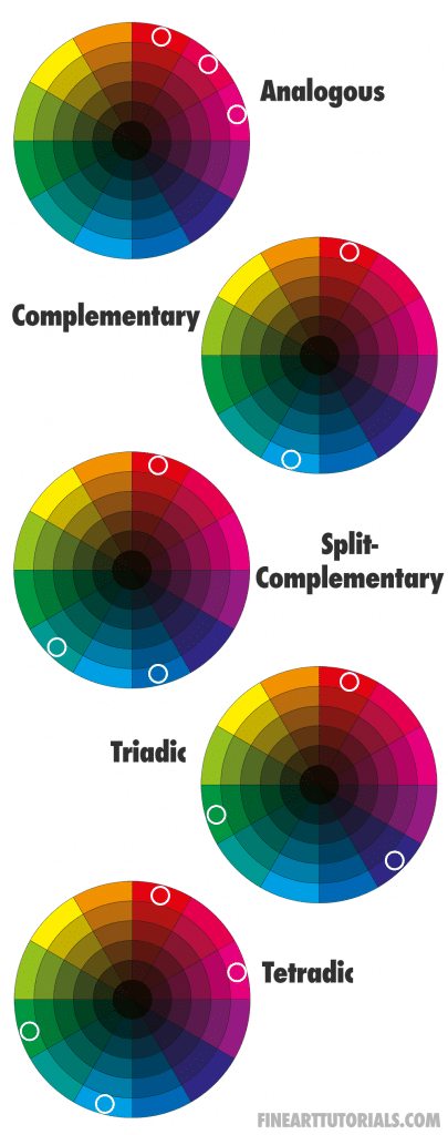
Color harmonies are combinations of colors that look visually pleasing and have a sense of balance to them. When working with colours in design, there are many types of harmonious colour schemes one can use. For example, the analogous colour scheme, complementary, triadic and square just to name a few!
Analogous colours
Analogous colours are hues that are next to one other on the colour wheel and share similar tones. This creates a calm and harmonious look, making it an ideal choice for creating soft and soothing designs.

This scheme offers the least visual variety of the other colour schemes and if you were to use especially cool, warm or saturated colours, it could give the painting a dramatic mood.
Complementary colours

A complementary scheme makes for some exciting contrasts when two shades placed directly opposite each other on the colour wheel are used. This scheme offers the balance of two extremes, which when used correctly can create a sense of vibrancy, without being overwhelming. When using this scheme in an artwork, in order to make it look more harmonious, make sure to choose a dominant colour. If the colours are equally balanced, the painting can look slightly overwhelming.

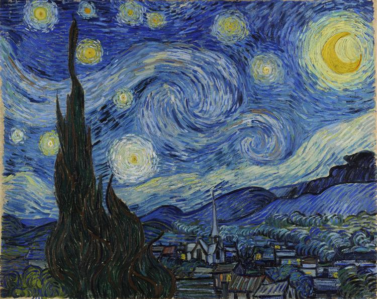
Van Gogh did this brilliantly in his starry night painting, painting the canvas with mostly cool blue tones, then pasting pops of yellow stars across the surface, which stand out against the dark night.

Also, make sure to use the extended range of the colours. Use a mixture of muted tones and saturated tones. In order for the piece to look balanced and harmonious, stick to using a larger proportion of muted tones compared to saturated tones. Also, make sure to balance dark and light values to add realism to the piece.
Triadic colours
Triadic uses three evenly spaced tones. It is a popular choice for both interior, product design and movie directors as it creates a sense of vibrancy without emphasising any particular hue.

With this scheme, your painting will feel varied, full of movement and should lead the viewer’s eye in. This is a striking scheme that should be used with muted tones to make it feel more harmonious.
Tetradic
This is a colour scheme that feels effortlessly harmonious and balanced, with visual variety. Van Gogh, Monet and other Impressionist and Post-Impressionist artists used this colour scheme to great effect.

This scheme consists of four colours which are put together in a rectangle pattern on the colour wheel. It includes two pairs of complementary colours. The key to using this colour scheme well is to make sure that you use one pair as your focal points, while the other pairs are used for accenting. When using it in painting, think about using other elements in your painting such as texture and value to add more depth and interest to the overall composition.
Famous examples of colour harmonies

Van Gogh’s ‘Blossoming Almond Branch in a Glass With a Book’ is an excellent example of a tetradic scheme that creates colour harmony for the viewer. The muted colours of the glass in the foreground and the dark branch, breaks the bright colours up, giving the piece a sense of movement.

Monet was another master at using colour harmony. His painting ‘The Seine at Bougival in the Evening’ also uses a tetradic colour scheme, with the pop of red in the sky contrasting with the muted green grass. The bright yellow light in the sky section contrasts with the muted purple cloud. What makes these colours harmonise, is that each saturated complementary colour is paired with a muted tone. The bright sky and lake gives the viewer a clear focal point, which balances the composition.
Tips and Tricks for Achieving the Perfect Colour Balance
If you are looking to find a perfect colour balance, there are a few tricks and tips that can help.
Use a colour wheel

One great way to achieve this is by incorporating the colour wheel into your work. You can buy a colour wheel, print one out or look at one online. It helps to use it as a reference when you’re planning the composition of a piece. Whether that’s altering the colours in a reference photo you took, changing the colours to make them more harmonious when painting from life, or even selecting a scheme when painting from imagination.
Toggle the saturation

Another tip, if you combine two colours that would normally clash, is to tone one of the colours down to make it appear less saturated when mixing. These colours will naturally harmonise better. A subtle approach often works best—adding too much vivid colour can easily overwhelm a painting. To mix muted tones, mix the colour with its complementary, or with grey.
Also, adding in shades of grey, shadow tones or off-white helps to break up the vibrancy and creates a sophisticated edge. Create colour harmony and balance in an artwork by using a mixture of muted and saturated tones, alongside greys and browns.
Use a limited palette
A limited palette is a palette of no more than six pigments, that you can mix to make other colours, shades and tones. By using a limited palette in a painting, you can mix more harmonious shadow and highlight tones, from the colour mixes you have already on the palette. This helps to make a more cohesive artwork.

The Zorn palette is a famous example of a limited palette, but there are many more. Check out our limited palette guide to learn about the different harmonious palettes you can use to make an artwork.
Light the artwork

Finally, ensure your artwork’s lighting is correct; artificial lighting can cast unwanted shadows and affect how the colours come across. This is true for when you’re taking reference photos and for when you’re painting in the studio. Make sure to get proper studio lights so you can see the colours in your piece clearly. Also make sure your reference has the kind of lighting you want to portray in your piece when snapping the reference shot.
Finally
Now that you understand the basics of colour harmonies, you can start using them in your own artwork. If you’re unsure of where to start, try experimenting with different combinations of colours and see what appeals to you. As you become more comfortable with using colour harmonies, you’ll develop your own sense of style. You might even find yourself gravitating towards certain schemes. It’s also important to be confident with colour mixing when using colour harmonies. Check out our guide to learn how to mix colours properly. Remember to have fun with it—after all, art is all about expression and creativity!

