
As an artist, or designer, it’s useful to know how to differentiate between warm colours and cool colours. Warm colours and cool colours affect the viewer’s perception of temperature, light and emotion in a design.
Creating a sense of light, temperature and atmosphere in paintings, for example, will require you to use warm colours. Additionally, planning the composition of a painting or design will require you to know how colours complement and harmonise with one another.
Disclaimer: Fine Art Tutorials is a reader supported site. When you make purchases through links on this site, we may earn a small commission at no extra cost to you.
Warm colours definition
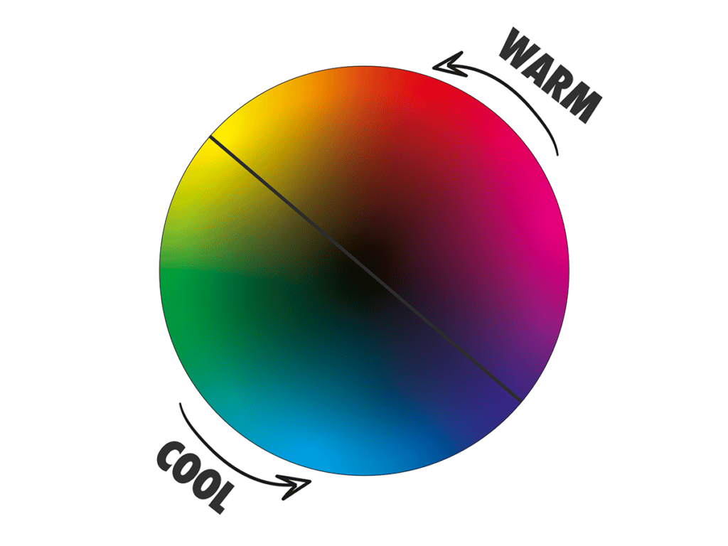
In art and design, warm colours are red, orange and yellow. These are colours that people associate with heat and warmth. On the opposite end of the colour wheel are cold colours, like green, blue and purple.
What is the purpose of warm and cool colours in art?

Choosing particular colour palettes to evoke feelings of warmth or coolness, can change the atmosphere of a painting. By balancing warm and cool colours, a sense of harmony can be achieved in an artwork. However, using only warm colours, or only cool colours in painting can create a sense of intensity. In summary, the purpose of categorising colours as warm or cool helps artists to make decisions about how to compose a painting to achieve their desired effect on the viewer.
List of warm colours

Red, orange, yellow, pink.
Combinations of these colours as well as their shades and tones can be considered warm. Purples and greens that point more towards red, or yellow can be considered warmer compared to the coolest colour on the wheel, which is blue.
Colour is perceived relative to other colours surrounding it. So if you were to place a fiery, red toned purple next to a cool, blue purple in a painting, the red toned purple may elicit a sense of warmth.
Is brown a warm colour?

Brown is a warm, neutral colour. Brown is made from all the primary colours (red, blue, yellow) mixed together, with a higher proportion of either red or yellow.
Warm colour palettes

It’s important to have a balanced palette of colours to create a wide range of tones in your paintings.
Here’s a list of popular warm pigments and some of their properties, so you can build a palette of your own:
- Lemon yellow: A sharp, bright acidic yellow with green tones. This is cooler than cadmium yellow.
- Cadmium yellow: A warm, mid opaque yellow pigment with good coverage and tinting strength.
- Indian yellow: Mustard, orange-yellow that has a high transparency. Fantastic for using in glazes.
- Cadmium red: High tint strength and coverage, cadmium red appears fiery and bright.
- Alizarin crimson: A transparent, deep red that has slight blue tones. It’s a great colour for using in shadows and glazing.
- Magenta: The pigment PV19 is considered a primary red in pigment form. It’s cooler than cadmium red, as it points more towards blue on the wheel. However, it is incredibly versatile.

These warm colours are all great choices for including in a painting palette, however, if you want to paint with non-toxic pigments, get imitation cadmium hues, instead of genuine cadmiums. If you want to learn how to mix paint colours yourself, check out our colour mixing guide.
Warm red vs cool red

Red is considered a warm colour, however, magenta points towards blue on the wheel. If you want to use a cooler palette but include red, use quinacridone magenta as the red tone. For a fiery palette that exudes warmth, opt for reds with yellow undertones such as cadmium red light.
Warm yellow vs cool yellow

Yellow is inherently a warm colour, but the closer it gets to green on the colour wheel, the cooler it appears. For example, a rich golden yellow is considered warm, but if the tone tends more towards green it will appear cooler. For a cool yellow palette, opt for lemon yellows instead of deep cadmium yellows. Warm yellows with red undertones, like Indian yellow and cadmium yellow deep will create a warm palette.
Warm blue vs cool blue

Blue is a cool colour which cannot really be described as warm. However, in art, artists generally describe blues with a red bias as warm and blues with a yellow bias as cool. So ultramarine which has purple undertones is warmer compared to Cerulean blue.
How to use warm colours in art
There are many different ways to use warm colours in art. One way is to plan the colour scheme of your painting before you start.
A famous colour scheme is the complementary colour scheme which pairs colours opposite each other on the colour wheel. Such as pairing reds with greens, or oranges with blues. In the case of these colour schemes, the oranges and reds are the warm colours.
Find ways to balance the opposing warm and cool colours. For example, you could paint with predominantly cool green colours in your piece, then add a bright pop of red. This warm tone will stand out to the viewer as the focal point, due to the incongruity in colour and temperature.
You can also experiment with adding warm coloured accents to neutral palettes, this approach would create a sense of balance rather than dynamism.
When painting with warm colours, it’s important to consider how the tones of each colour relate to one another. For example, you will want to balance a fiery red hue with cool blues and purples, or create a range of mid-tones between your light and dark values.
Overall, the key to using warm colours in a painting effectively is to plan first. By foreplanning the placement of different colours and elements and understanding how they relate to one another, you will be sure to create a striking and intentional composition.
Warm colour schemes
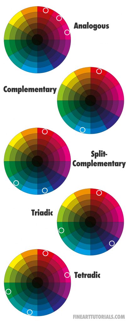
Other colour schemes of note, that artists can use to create mostly warm palettes include monochromatic, analogous, split complementary or tetradic. A monochromatic colour scheme using just reds, or oranges and the extended ranges of the colour, you can create a warm palette. The focus in a monochromatic painting is in the variation and contrast of values.
Analogous colours schemes use three colours that are placed next to one another on the colour wheel, for example, red, orange and magenta. Again, using a palette like this does not provide balance like complementary or split complementary colours do. It instead creates a sense of intensity in the artwork.
A split complementary colour scheme is an analogous colour scheme, with the middle colour on the wheel placed replaced by the colour opposite. This scheme offers a balanced colour palette, with a sense of vibrancy and focus.
Warm colours in landscape painting
In landscape painting, warm colours function to give the viewer information about the scene they are looking at. For example, from the temperature of the colours, the viewer may be able to tell the time of day, or the heat of the environment.

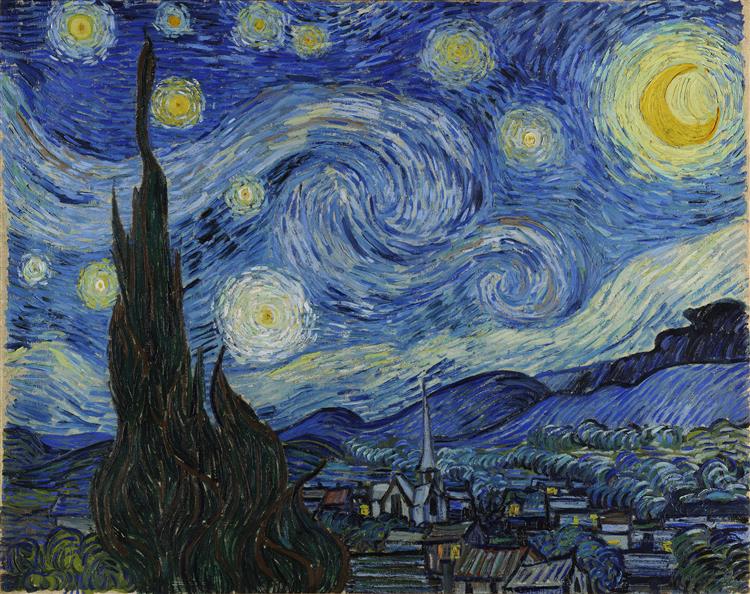
Sunset and golden hour paintings will be filled with pink, orange and red tones. Paint sun scorched grasses a muted orange tone, or paint with bright light and contrasting colours to show the intensity of the sun. Conversely, the warm tones of autumn leaves show the viewer the changing of the seasons and may evoke a sense of coolness. It helps to know how to mix colours realistically if you want to paint landscapes. Read our guide to find out how.
Emotion and warm colours

In addition to providing information about the scene, warm colours are often used in painting to evoke emotion. They create a sense of warmth, joy, excitement or happiness when incorporated into artworks. This is especially true for bright and intense colours such as pinks, yellows and oranges. Red is an especially bright, vivid colour that is often associated with intense emotions. By playing with light and dark values of red tones within a painting, you can create a sense of tension, making the viewer feel unsettled or uneasy.
As an artist, it’s important to experiment with different colour schemes and understand how your choice of warm tones will affect the overall impact of your piece. Whether you are painting something bright and joyful or dark and somber, knowing how your choice of colours will impact the viewer will help you create truly dynamic artworks.
Colour theory
Colour theory is the study of how different colours affect the human psyche and the practical applications of colour in art. It takes many different factors into consideration, including how light interacts with colour, how colours relate to one another on the colour wheel, and psychological effects of different colours.
An example of the science of colour theory and how we perceive warm and cool colours is that warm colours tend to advance or appear closer to the viewer than cool colours, which tend to recede or appear further away. Understanding how light and colour work together can help you use warm tones effectively in your paintings.
Finally
One tip for colour mixing is to keep a colour wheel handy while they are painting, so that you can easily refer to it. Whether you’re an experienced artist or just starting out, understanding how warm and cool colours interact can help you create dynamic artwork that evokes a wide range of emotions in your audience.