
Balance in art is a fundamental principle of design and composition. It describes the way in which visual elements are arranged to create an aesthetically pleasing image. It is the visual relationship between different elements within a composition, including line, texture, colour, value and space. Balance can be achieved through symmetrical or asymmetrical arrangements of these elements.
The importance of balance in art cannot be overlooked. It creates harmony and unity within the artwork, allowing the viewer to appreciate its beauty without feeling overwhelmed. Balance helps to create a sense of visual stability and makes the artwork feel more complete.
Disclaimer: Fine Art Tutorials is a reader supported site. When you make purchases through links on this site, we may earn a small commission at no extra cost to you.
What is balance in art?
Balance in art is a fundamental concept of good visual design, and it is the attempt to achieve stability or equilibrium within a composition. It involves the careful distribution of different elements including line, texture and colour in order to create an aesthetically pleasing work of art. Without balance, an artwork can appear chaotic and unplanned.
Visual weight

Visual weight refers to how dominant a visual component is in an image. The dominance can be judged by the space it takes up, or how much it demands the viewer’s attention. The purpose of creating a sense of balance in an artwork, is to balance the visual weight of different elements. Artists will balance elements to create harmony. This is so that particular visual elements don’t appear overpowering, overly crowded, too dark, oversaturated or unevenly spaced.
Of course, artists will often attempt to create a sense of imbalance to achieve a particular effect or convey meaning.
Monet was a master at creating balance in his paintings. In this painting, he uses the highly saturated yellow colour to give the building on the right more visual weight. Then the painting draws the viewer’s eye in with the curving path which separates the bright areas from the shadows. The contrast between light and shadow breaks the symmetry of the buildings on each side of the canvas.
Elements of art
The elements of art are visual components that are used to create a composition and convey meaning in an artwork. These visual elements are line, colour, form, texture, shape, space and value. These elements can be used to create harmony and balance in a piece, or to create dynamism, movement and imbalance. Different elements in a piece will have their own visual weight, the balance of the image relates to how it has composed with regards to the distribution of these elements.
Here’s some practical advice on how to balance these visual elements in an artwork.
Colour

More highly saturated colours inherently have more visual weight compared to muted and desaturated tones. For example, bright red will stand out against grey. In the Houses of Parliament painting, the bright golden yellow sky holds more visual weight than the blue buildings.
Warmer colours such as red, orange or yellow appear to come forward whilst cooler colours such as blue, green and purple recede in an image.
To create harmonious colour combinations in an artwork, balance both muted tones and saturated tones. If you use more muted than saturated tones, it will make the saturated colours stand out as the focal point of the piece. Also consider including a mixture of cool and warm tones in your piece. Of course, how you compose the colours in an artwork is up to you and will depend upon the effect you want to achieve.
Value
Darker colours have more visual weight compared to lighter colours. If a dark colour dominates the composition, it can be balanced with lighter tones.
Texture
Different textures add interest and depth to an artwork. Smooth, glossy textures will have less visual weight than rough or three dimensional appearing surfaces. Because textured surfaces stand out to the viewer, consider placing them alongside less textured areas, so that they appear more salient.
Form
Form refers to the illusion of three dimension in an image and the way forms appear to take up physical space. This three dimensional appearance is created with light and shadow to create shape and form. Form can describe geometrical forms, or organic forms. It also to some extent refers to placement of shapes, lines colours and other visual elements. The placement of elements could also be used by artists to denote a background or elements that appear further away, using linear perspective. By placing a vanishing point on a surface and creating the appearance of buildings, landscapes and streets disappearing into the distance, artists create a sense of depth.

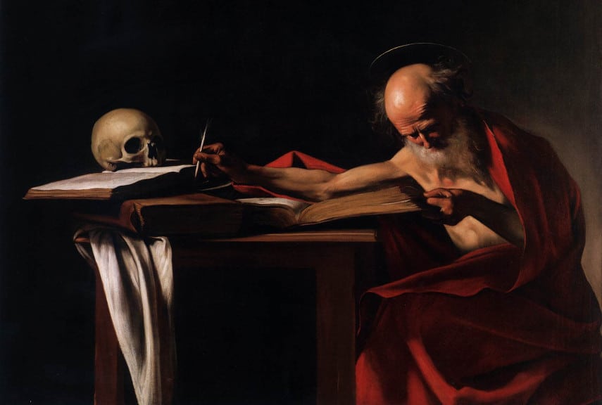
Abstract forms, organic forms and geometric forms are all types of forms seen in paintings and drawings. Organic forms have more visual weight than abstract forms. So in this piece by Edgar Degas, the organic form of the dancer stands out against the abstract backdrop.

In this painting, the boat is in the foreground, so it holds more visual weight than the distant mountains that appear further away. The mountains have softer edges, less detail and lighter and cooler tones (due to atmospheric perspective), therefore it holds less visual weight than the boats. So the viewer’s eyes will likely be drawn to the boat, then to the mountain. This asymmetrical balance in the image creates a viewing rhythm.
Shape

Larger shapes will attract more attention than smaller shapes, a collection of small shapes can appear complex and can offset the visual weight of large shapes. Additionally, more complex shapes with more sides and corners hold more visual weight that simpler shapes like squares or circles. In this painting by Pissarro, the large shape of the buildings attract the eye, but the cluster of smaller figures and carts instantly draw the attention to the road, creating a pleasing viewing rhythm.
Space

Positive space, which is the space in a section of artwork that contains a subject or object, will hold more weight than negative space, which is devoid of a subject or object.

The proximity of objects and subjects to one another has more visual weight and creates a sense of tension in an artwork. An image where objects are more evenly spaced have a good balance between positive and negative space, therefore this creates a sense of harmony.
Line
Thicker lines have more visual weight than thinner lines. Longer and more jagged lines stand out more than shorter or curved lines.
Principles of design
Balance is a principle of design. Other principles of design include rhythm, unity, repetition, movement, variety, contrast, pattern and emphasis. These principles all rely on visual elements being balanced, to create the effect that the principle describes. For example, an artwork with strong contrast requires there to be a balance in light and dark values, in saturated colours and muted tones or in smooth and rough texture. Balance the form and placement of elements to create a sense of rhythm in an artwork. Repeat the form of an object to create pattern or use a colour scheme to create unity.
Balance and composition
Balance within a composition can be either symmetrical or asymmetrical. With symmetrical balance, elements on both sides of an artwork are equal in size and shape; with asymmetrical balance, elements can be of different sizes, value range and colours but arranged in such a way that they appear balanced, so that visual weight is distributed evenly. It is important to note that balance doesn’t necessarily mean that all elements must be perfectly equal; it is more about how elements are arranged in relation to each other.
How to improve balance in a composition

When it comes to composition, artists can achieve balance by making sure that each element is evenly distributed throughout the piece. Symmetrical compositions tend to be more balanced than asymmetrical ones, since both sides of the image look equal. In this painting ‘Arizona Mesa’, Edgar Payne has created a symmetrical composition, however, the symmetry is broken is with the three figures that appear in the left, bottom third intersection of the canvas. This creates visual interest.

However, asymmetrical compositions can still be balanced if the artist arranges objects in such a way that their visual weights counteract each other. For example, Friedrich balances the large shape, jagged lines and dark tones of the tree with the two figures in this asymmetrical composition.
Compositional techniques and balance
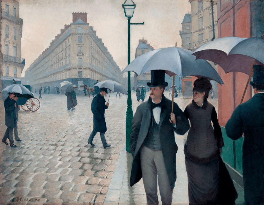
There are plenty of techniques artists can employ in their practice to bring balance to their work. One example is the use of geometrical compositions. Artists divide their canvas into sections and place the elements that they want to appear more salient in the intersections. One of the most popular types of geometrical compositions is the rule of thirds. Caillebotte uses the rule of thirds to position the figures and distant buildings.

Another technique, which relates to the use of geometric compositions is the use of spatial dividers. Using spatial dividers works well in artworks where the artist wants to create balance without a single focal point. For example, the painter could create sections on the canvas in a triangular shape, S shape or a diagonal line arrange elements of the artwork to fit into these sections. You can see that Monet used an S shaped spatial divider in his painting The Seine at Bougival in the Evening in the river that divides the bank from the buildings and sky.

One more compositional technique that works effectively to create balance in a piece is the rule of odds. This rule generally states that an odd number of subjects and objects in a painting is more aesthetically pleasing than an even number. For instance, if you were painting a still life, three vases on a table would look more visually attractive than two.
Types of balance in art
There are three types of balance in art, symmetrical, radial and asymmetrical. Composition plays an important role in achieving balance in artworks. Symmetrical balance creates equilibrium by arranging elements identically on either side of a vertical or horizontal axis, while asymmetrical balance uses different elements to create a sense of dynamic tension and visual weight. The placement of these elements should be carefully considered in order to achieve an aesthetically pleasing result.
Symmetrical balance

To create symmetrical balance in an image, when planning the composition, divide the paper or canvas up into halves along the horizontal or vertical axis using an imaginary line. Then balance the placement of your subject with an object or subject on the other side of the canvas. This will create a sense of symmetry and balance within a painting. This could be a mirror-like image, or a slight variation of a mirror image.
Symmetry in art can sometimes appear repetitive, so to add variation to the image, you can break the symmetry with an element that is not balanced on the other side of the piece.
Radial balance in art

Radial balance refers to the way in which elements can be balanced evenly around a central point. An example of this could be in an image of a flower. The middle of the flower is the centre point and the petals have radial symmetry, spaced evenly around the canvas. Escher used this type of symmetry extensively in his illusionary artworks.
Asymmetrical balance

In a painting that has asymmetrical balance, the elements of the image are not evenly spaced, mirrored or placed so that they perfectly balance one another.
However, the horizontal, vertical and diagonal axis should hold similar visual weights to appear somewhat balanced. For example, a similar range of values on each side of the canvas. Or some saturated pops of colour on each side. Van Gogh creates balance with pops of light in the buildings on the right hand side of the painting.
Using asymmetrical balance can help achieve a sense of variety, movement, rhythm and visual interest in a piece.
The importance of balance in art
Balance is an important concept for creating visually appealing designs, and it can also have psychological effects. Symmetrical balance often gives the viewer a feeling of stability and order, while asymmetrical balance can be exciting and dynamic. Balance is also important for creating harmony between all the elements in a composition. It allows them to work together to create a strong and unified image.
Overall, balance is an essential element of any artwork, from simple sketches to complex pieces. It helps bring order to chaos, providing visual stability and cohesiveness. By understanding the principles of balance and composition, artists can create visually stunning works of art that are pleasing to the eye.