
Asymmetrical balance in art is one of the most powerful tools that artists can use to create visually impactful compositions, that have rhythm and movement. By strategically placing elements within a painting and leveraging design principles like contrast, focus and unity, artists can create successful compositions whilst using asymmetrical balance.
In this guide, learn exactly what asymmetrical balance in art is. The learn how to use it to create your own unique compositions.
Disclaimer: Fine Art Tutorials is a reader supported site. When you make purchases through links on this site, we may earn a small commission at no extra cost to you.
What is asymmetrical balance in art?
Asymmetrical balance involves creating a composition that looks balanced despite the objects and subjects being unevenly distributed. By placing visually heavier elements on one side of a painting or sculpture, artists can create interesting effects. Asymmetry allows for contrast between different elements such as light and dark colours, shapes, textures, lines, form and size of objects. It also leads to creating works that appear to have more movement and rhythm.
Symmetrical vs asymmetrical balance

Artists achieve symmetrical balance when the visual elements in a drawing or painting are arranged in such a way that elements on each side of the canvas closely mirror one another. The elements appear to be of equal visual weight. An example of an artwork with symmetrical balance is The Last Supper by Leonardo da Vinci. Figures around the table roughly mirror one another on the horizontal axis of the painting. This makes the visual weight of colour, line, values and space on each side of the painting feel fairly equal and aesthetically pleasing.

On the other hand, asymmetrical balance does not appear like a mirror image, instead elements are placed in an uneven fashion. However, elements will be balanced by their visual weight and placement. A great example of asymmetrical balance is Cafe Terrace at Night by Vincent van Gogh. In this painting, van Gogh used different shades of blue and yellow to create contrast and asymmetrical balance. The blue tones of the sky dominate the right side of the painting. Whilst the yellow tones of light in the cafe windows provide focal points to visually balance out that side.
Using asymmetrical balance creates a sense of movement and rhythm in an artwork, whereas symmetrical balance creates a sense of harmony. Whilst the composition of a painting that demonstrates asymmetrical balance may appear more uneven that a symmetrically balanced composition, elements are still planned and placed to create an aesthetically pleasing composition. Whether it is symmetrical or asymmetrical, balance is key in creating a good composition.
Examples of paintings with asymmetrical balance
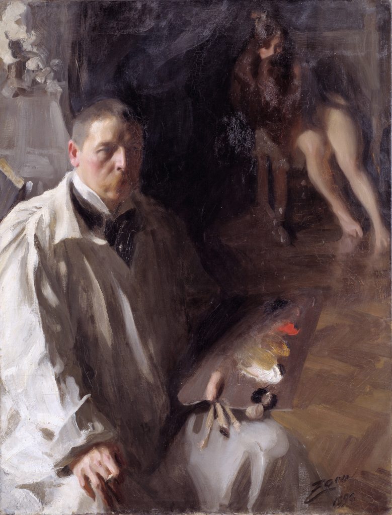
‘Self Portrait’ painting in 1896 by Anders Zorn is a great example of asymmetrical balance in a painting. Zorn has positioned himself as the focal point, dominating the bottom left hand corner of the painting, in light tones. The light reflecting on the model’s legs in the top right corner balances this out. This creates a more harmonious and stunning composition. The viewer’s eye is lead around the painting, first focussing in Zorn, then at his palette, then at the model in the far corner. In this painting, Zorn reveals elements of his process, including the colour palette he used to paint and one of the models he painted. These points of interest are brought to focus with the use of values, creating a dynamic viewing rhythm.
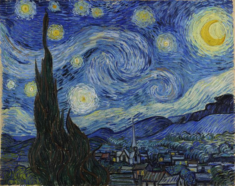
‘The Starry Night’ painting by Vincent van Gogh is another example of asymmetry in a painting. This iconic painting has winding lines, streaming up and across the canvas, creating movement and balance all at the same time. The dark lines of the cypress trees are weighed down against the light stars in the night sky, creating a peaceful and calming composition.
Asymmetrical balance and visual elements
The visual elements in art are the components that make up a painting. They are line, colour, texture, value, space, shape and form. Depending on how these elements are used, an artist can create an aesthetically pleasing composition with asymmetrical balance.

Each of these visual elements will have a particular visual weight in an artwork. Visual weight describes how dominant an element is and how much it demands the viewer’s attention. For example, thick lines have more visual weight than thin lines. Then, large shapes have more visual weight than small shapes. Additionally, saturated colours are much more likely to grab the viewer’s attention than muted grey tones. Dark colours stand out more than light colours. In this painting by Pissarro, the large building shapes are balanced by the small shapes of groups of people and carts. This makes the viewer’s eye dart between the subjects.

If a painting has a lot of dark colours on one side of the canvas and just a few lighter colours on the opposite side then this will create contrast and balance out the painting. If one side of the painting is especially dark, this can create imbalance, so try to incorporate some small pops of light or colour on the other side, whether that’s along the vertical, horizontal or diagonal axis. You can see this technique used as an example in Rembrandt’s self portrait, he included more light and detail in his hair to create a focal point at the top of the piece. This is balanced by the highlights on the middle of his face and collar. This composition is striking due to the balance of the visual weight of the shadows and the amount of negative space around the figure.
Creating asymmetrical balance
Asymmetrical balance can be used in art to create visually interesting compositions. Artists will often use light and dark tones to create contrast, as well as different shapes, sizes or textures of objects. When planning an artwork with asymmetry in mind, it is important to remember to balance the visual weight of different elements. You should also consider the placement of the different elements within the composition, since they will not be mirrored on both sides.
When creating an artwork with asymmetrical balance, it is important to keep some points in mind:
1. Consider colour, value, shape, texture, line and space when placing elements.
2. Be mindful of the visual weight of each element in order to achieve balance.
3. Place elements carefully to create a rhythm or movement throughout the artwork.
4. Observe how the composition looks on both sides, and adjust accordingly if needed.
Asymmetrical balance is a great way to create an interesting, eye-catching composition in artwork. By carefully considering the placement and visual weight of objects within the artwork, artists can create a striking and beautiful masterpiece.
Compositional techniques to achieve asymmetrical balance

One way that artists can successfully achieve asymmetrical balance in a piece is with a framing element. Renoir placed the heavier elements on one side of the composition, with the darker trees and river bank. This frames the lighter toned river and boats.

Another example of a technique that artists can use to create asymmetrical balance is the rule of thirds. Divide the canvas up into three equal sections. Then balance elements by placing them in the intersections of these divided areas. This creates a more visually pleasing image. It also enables you to strategically place elements based on the geometry of the canvas. For example, you could balance the placement of one large shape on the right hand intersection with a collection of smaller complex shapes on the left hand intersection. Or you could place a figure in one of the third intersections and leave the background space around the figure to create a sense of salience and asymmetry.
Other types of balance in art
Another type of balance in art is radial balance, where elements are arranged around a central point. This creates a sense of movement and draws attention to the centre.
Symmetrical balance is the final type of balance in art, that we have mentioned already. This is when elements are arranged in such a way that the artwork has an equal balance on both sides of a central axis. This type of balance often creates a sense of stability and harmony within the artwork.
Finally
By leveraging contrast, tension and asymmetry, artists can evoke emotions and expressions in viewers that wouldn’t be possible with other types of composition. Ultimately, asymmetry allows for the creation of visually stunning works that can leave a lasting impression.