The principles of art are design concepts that artists use to organise elements to create the composition of an artwork. They act as the systems for communicating the artists’ message. By using the principles of art, artists can arrange the elements with the style and context that they intend to deliver it.
In this guide, learn exactly what the principles of art are, how artists use these principles to organise the elements of art to achieve unique and successful compositions and how artists can use the principles to analyse artwork.
Disclaimer: Fine Art Tutorials is a reader supported site. When you make purchases through links on this site, we may earn a small commission at no extra cost to you.
What are the principles of art?
The principles of art are the fundamental rules that artists use to compose a painting, drawing or sculpture. The principles are balance, harmony, unity, pattern, repetition, rhythm, contrast, emphasis, variety, movement, scale and proportion. These principles are used in combination with one another to create aesthetically pleasing compositions and designs.
Organise the elements of art

To use the principles of art to devise a composition, the artist will organise the elements of art. The elements of art are the most basic visual building blocks that can be arranged to create a piece. These are: line, colour, texture, value, shape, form and space.
Depending on the characteristics of the elements of a design, artists can exercise these principles in an artwork. For example, using light and dark values next to each other in a painting will create contrast.
Visual weight of elements

The visual weight of an element describes how the characteristics of that particular element have visual dominance, or attract the viewer’s attention. Saturated colours hold more visual weight than muted colours, for example, texture attracts more attention that smooth surfaces and large shapes have more visual weight than small shapes. People’s eyes are naturally drawn to complex shapes more so than simple shapes, and dark values to a greater extent than light values.
In Caspar David Friedrich’s painting, the large and dark shape of the figure holds the most visual dominance in the painting, due to their size and values. This creates contrast and emphasis against the light tones and smaller shapes of rocks in the background, which in turn makes the figure the focal point of the piece.
Understanding how to configure the characteristics of different elements to create visual weight, will help you to form the basis of your composition with the principles of art in mind.
Balance
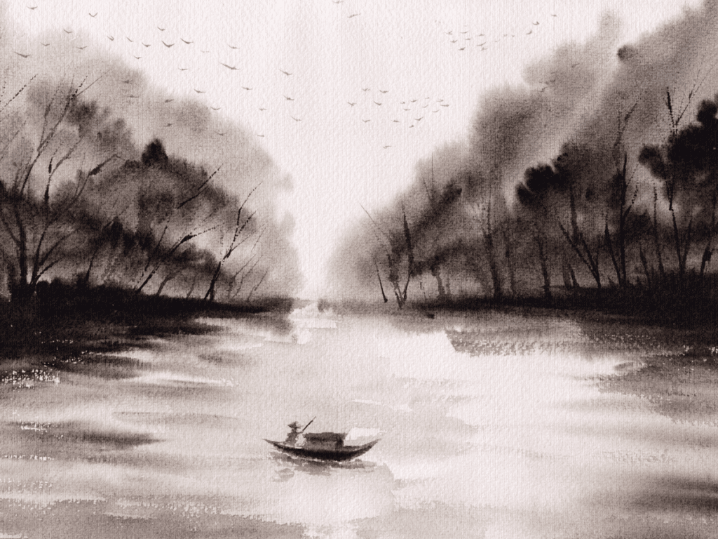
Balance in an artwork creates a sense of equilibrium. Artists can create balance by arranging elements with equal or similar visual weight around the canvas. It can be achieved through symmetrical or asymmetrical arrangement of the elements. Symmetrical balance is when both sides of an artwork have equal weight or look identical, while asymmetrical balance is when the elements are unbalanced but still maintain a sense of visual equilibrium.
You could achieve visual balance by painting a symmetrical composition, either horizontally or vertically, therefore creating a mirror image effect. The perfect balance, in a symmetrical composition, can bring a sense of peace and order to the viewer.
Asymmetrical balance
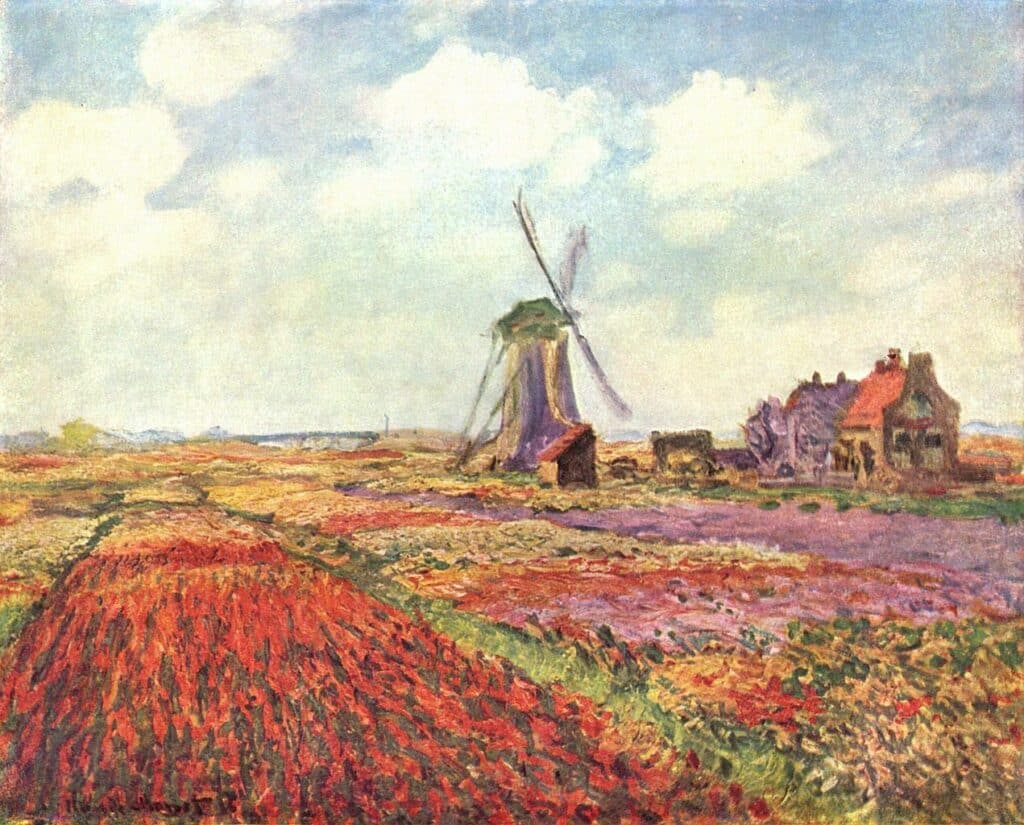
A composition with asymmetrical balance will appear balanced, but not symmetrical. It is balanced in the sense that elements are distributed across the canvas to create an aesthetically pleasing image. This means that both sides of the canvas will be occupied with elements of interest to the viewer. However, these elements do not necessarily mirror one another in appearance or share similar visual characteristics. For example, an artist may place the focal point on the right hand side of the canvas, but balance the focal point with elements that have less emphasis on the other side.
For example, the windmill and the bright red of the tulips both have visual dominance in this oil painting by Monet. The windmill attracts the attention first as the purple tones and complex shapes stand out against the pale blue sky. However, the strong, saturated reds of the tulips in the bottom left hand corner also draw the attention. The fact that both these elements have visual weight means they balance each other somewhat, even though the painting appears asymmetrical.
Break the symmetry

Breaking symmetry in an artwork is a method used to draw attention to a particular subject or object within a composition. Create focal points or emphasis in a painting by disrupting the flow with an element that defies the symmetrical composition. Van Gogh makes the figures a focal point by breaking the symmetry and placing them in the bottom corner of the painting, this draws the attention away from the symmetrical composition of the sky and the river.
Harmony
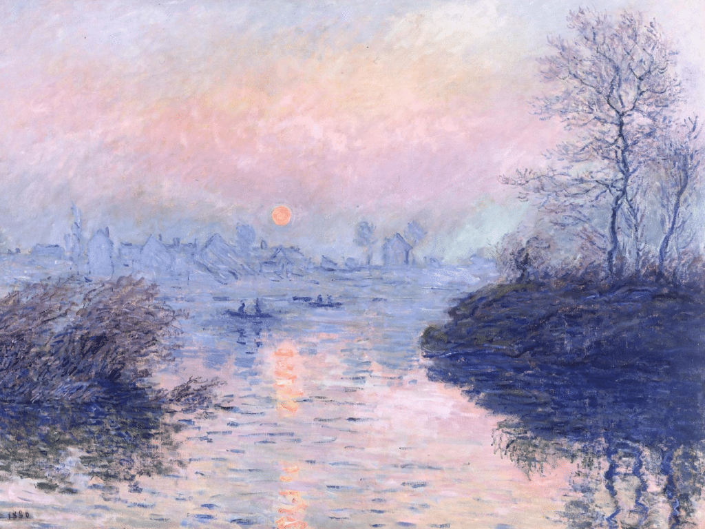
Harmony can be created when two or more elements work together to complement one another. It refers to how the elements coordinate with one another and how they are are perceived as being consistent, related and connected. Harmony connotes to there being a lack of variety of lots of different elements. The effect of harmony is one of elements working on their own and together, without being confused by too many chaotic additions. This principle of art can be used to create visual order within a piece.
To create harmony in an artwork, the artist should consider connecting elements by colour, shape and texture.
One practical way to create colour harmony in an artwork is to use a limited palette of colours. Mix fewer different pigments, so that the different hues and tones in the artwork relate to one another more. Monet famously used a limited palette to paint many of his Impressionist paintings. By using a range of cool tones from blue to pink, it creates a harmonious palette and wintry atmosphere. Harmonious shadow tones can be created by mixing colours already on the palette. For example, Monet used the blue from the distant houses on the horizon to create the darker silhouette in the foreground.
An artist can choose to create harmony between elements in a painting by preventing particular subjects and objects from standing out unnecessarily, by using methods to tie them together.
Unity

Unity is an essential principle in art as it ties separate elements together into one cohesive whole. This can be achieved by designing the composition so that elements relate to one another; this could be demonstrated by using similar colours throughout the piece, or tying different elements together with geometric shapes. For instance, Pissarro used the element of colour to create unity in his artworks. The repetitive use of orange and black in the figures, lamps and buildings create cohesion between different subjects and objects within the scene.
Unity is similar to harmony in art, however the two principles are distinct in the way that harmony connotes to how specific elements are tied together or made to appear uniform, by drawing on their similarities, then unity is about how elements maintain a sense of place within the artwork as a whole, about how the disparate elements of a painting work together to create a sense of oneness.
Pattern

Patterns are the repetition of lines, colours and shapes, that create design motifs and images. These motifs and images are repeated across a section of the artwork, or across the entirety of the artwork. Pattern in art can be further categorised into geometric and organic patterns, man made and natural patterns. Geometric patterns are made from geometric shapes and are symmetrical and consistent in form. Whereas organic patterns are more free flowing. For example, the pattern on a leopard’s coat is a natural, organic pattern, whereas Islamic tile tessellations are an example of man-made geometric patterns.
In applied arts, pattern designs are used to decorate wall papers and fabrics. One of the most famous pattern designers, William Morris, famously used organic elements, such as flowers and birds to create a continuous pattern across his designs. Another use of patterns in art is in the abstract art movement; Kandinsky was particularly fond of repeating circles, triangles and other geometric shapes to fill an entire canvas with an organised array of lines and shapes.

Patterns are another way to create uniformity and order within a design, they help to create a viewing rhythm to draw the viewer’s eye around the piece. In Gustav Klimt’s ‘Portrait of Adele Bloch-Bauer I’, the geometric embellishments on the dress hold the viewer’s attention and lead them to take in all the details.
Repetition

The principle of repetition is a great way to create rhythm, unity and balance. Repetition simply involves repeating an element or design multiple times across the artwork. This could be something as simple as dot patterns, or more complex with repeating the form of a subject or object.
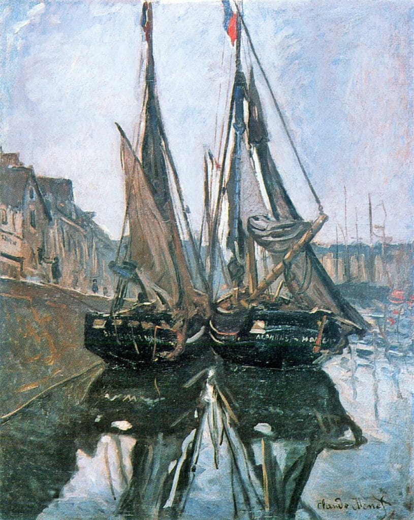
In this painting by Monet, the form of the boat is repeated and mirrored one both sides of the canvas. This creates a symmetrical balance and a sense of unity within the artwork. Repetition doesn’t just apply to forms or shapes, it can also apply to colours, values and lines.

In Vermeer’s ‘The Milkmaid’ the bright lapis lazuli pigment is repeated in the woman’s apron and in the cloth on the table. This acts to direct the viewer’s attention between the subject and objects in the painting and ties the elements together.
Rhythm
Rhythm is the principle in art that describes the way in which elements work to direct the viewer’s attention around an artwork. It is another important principle of art as it helps to create a sense of fluidity and movement. Rhythm can be achieved through patterns, repetition and the use of similar shapes or colours that lead the viewer’s eye throughout the artwork. It can also be described by the way in which the visual weight of elements creates a viewing pattern, with the most salient element attracting attention first, then the next most pronounced feature
Repeated elements create a visual tempo, quickly leading the viewer from one element to the next.

There are five types of rhythm in art, regular, progressive, flowing, alternating and random. Regular rhythm is the predictable repetition of different elements of the artwork. Progressive rhythm is a gradual progression or variation of repeated elements. The changing element may change form to carry more visual weight than the previous element.

Flowing rhythm is organic in its repetition of shapes and their placement, it can be likened to an irregular rhythm. The ripples on the wave of this painting by Winslow Homer are different and organic in shape. However, they repeat along the edge of the wave leading the eye to the focal point of the barrel where the light is shining through the water.

Alternating rhythm involve alternating between two different elements, like black and white tiles on a floor. Random rhythm involves repeating elements but placing them randomly throughout the artwork. The similarities of the elements will attract the viewer’s attention consecutively, however they will appear irregular in form.
Contrast
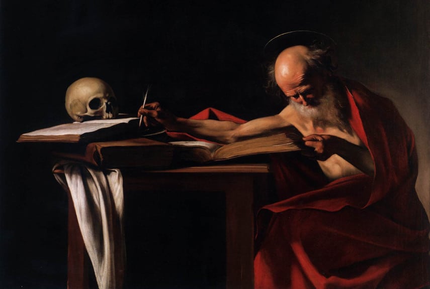
Contrast is an effective way to emphasise the difference between two or more elements. The most obvious examples of contrast in art are value contrast and colour contrast. Artists can create value contrast in their work, by using light and dark values next to one another. An example of this can be seen in Baroque art by Caravaggio and Rembrandt. They used the chiaroscuro technique to emphasise their subjects and create drama.
Contrast works to create visual tension between different elements. This can be achieved by using elements that are different in colour, shape, texture, value, form. Equally, artists could choose to contrast the thickness of lines, or use a large amount of negative space around a subject.
Conversely to principles of art like repetition, balance, harmony and unity, which all contribute to how orderly an artwork feels, contrast creates variety, emphasis and focus within an artwork.
Emphasis

Emphasis the principle of art describes how artists draw attention to certain elements within an artwork. This can be done through the use of contrast, variety and hierarchy. Elements are combined and placed next to one another in order to bring attention to and stress the differences between those elements.

The emphasised elements are the focal points within an artwork, that are most likely to attract the viewer’s attention first. For example, in the painting ‘The Last Supper’ by da Vinci, the figure of Jesus is emphasised by space and lighter values surrounding his face, compared to the other figures in the painting that are more clustered together. Additionally, the use of the most saturated red for his robe brings attention to his figure, as it contrasts to the blues and cooler tones of the robes of the other figures around the table.
Variety
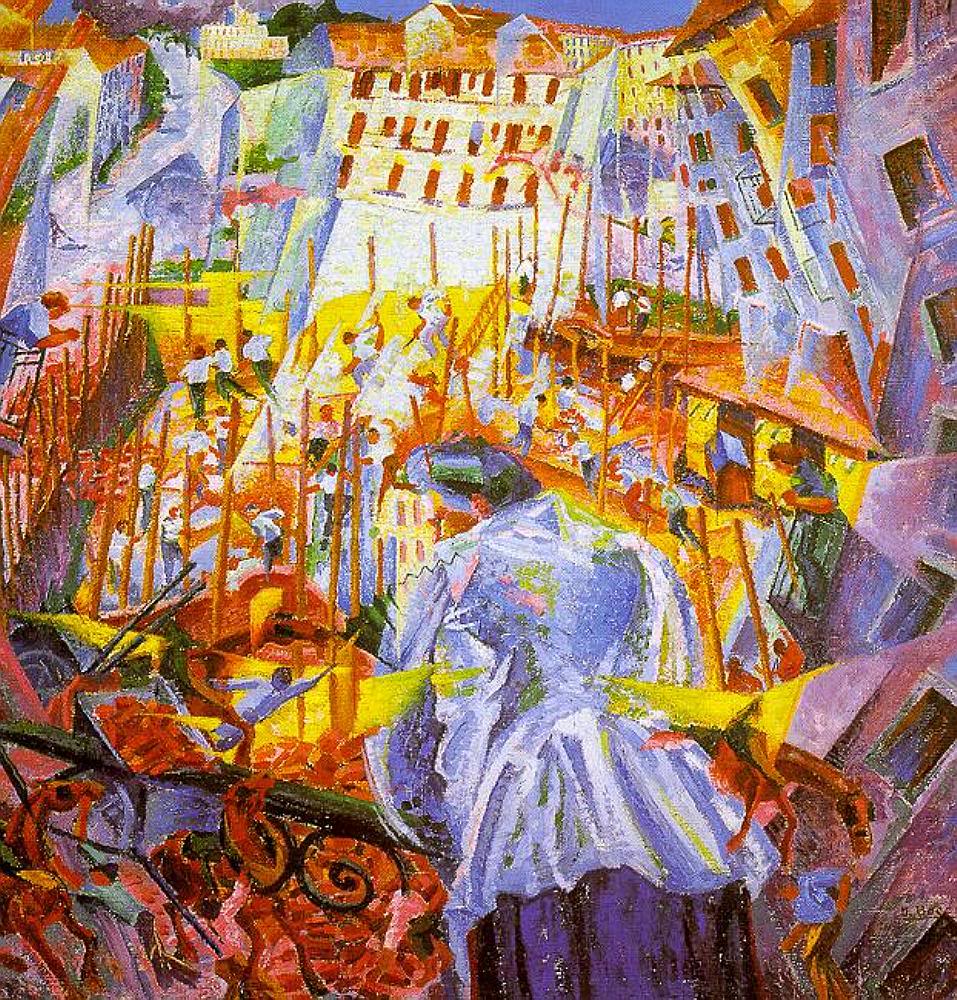
The use of different elements with differing characteristics, variety creates visual interest in a painting and keeps the viewer engaged. This can be done through the use of different colours, shapes and textures that will help to break up any monotony and add depth to the artwork.
Variety is the opposite to harmony. However, to create a successful composition in an artwork, the artist should consider including a balance of the two. The variety of elements creates focal points and emphasis within an artwork. Harmony on the other hand helps to unify and keep a sense of flow throughout the composition.
Movement

The principle of movement in art relates to the way in which artists convey a sense of motion and energy. In figure drawing, for example, artists can create movement by starting with a gesture drawing.

By focussing on the gesture of the figure first, rather than the details, the artist is able to convey a sense of movement and expression in the artwork.

There are a number of ways to convey motion. From the gesture of a figure, to using lines to denote a fast moving object in a comic book drawing. Vincent van Gogh uses texture and lines to portray the sense of movement in his painting of the mulberry tree. This creates the appearance of the wind blowing the leaves and branches.
Movement can also be conveyed through abstract art, by using lines and curves which suggest motion, as well as through the use of colour and texture which help to create visual dynamism.
Scale

Scale in artwork refers to the size of the artwork itself. It is often compared to the size of a person. For example, the sculpture David by Michelangelo is a large scale sculpture. This is because it is almost three times the size of the average person.

By creating large scale artworks, artists can create impact in their designs. Artists can also create smaller artworks to draw viewer’s attention to details and create a sense of intimacy.
‘To scale’ drawings are used to create artworks when the specific measurements of the object are known. This type of drawing is most commonly used in fields of architecture and engineering. What underpins scale, compared to proportion is that the size of the objects that are being compared should be known.
Proportion

The principle of proportion refers to the ratio between all elements within an artwork, including line length, size of shapes. Specific measurements of different objects and subjects within an artwork don’t need to be known, only their relative size or ratio. So if an artist knows that a house is roughly five times the height of a person, they could draw a person standing next to a building with a ratio of 1:5. By keeping the figure and building in proportion, it creates a sense of harmony and order within the artwork.
To give an example of how proportion differs from scale, ‘David’ by Michelangelo is large in scale, but proportionally accurate.
An example of when artists purposefully exaggerate proportion to create emphasis is in caricature drawings. The features of a person’s face may be drawn in an exaggerated way, or out of proportion to the other features in order to draw attention to that feature.

Proportion can also refer to the way in which a canvas is divided up to create an aesthetically pleasing appearance. Historically, artists have used both the rule of thirds and golden ratio to place elements within a geometric composition. The figures in this painting by Edgar Payne are placed in the third intersection of the canvas. This draws attention to the figures.
Composition and the principles of art
The composition of an artwork is the arrangement of elements that make up the entire piece. The principles of art combine to create a successful composition. Principles like emphasis and contrast will help to draw a viewer to parts of an artwork, keeping them engaged. Then principles like unity help to bring sense and order to the artwork.
Formal analysis
Formally analysing artworks is a useful tool for understanding these principles in action. This way, you can see how an artwork has come together to create a successful composition. By looking carefully at the elements of an artwork, such as line, colour, shape and texture, it can provide insight into how the artist has used the principles to produce a finished artwork.
Formal analysis is a great way for artists to develop their skills, as well as build an understanding of the principles that can be used in their own work. By analysing what works and what doesn’t work within an artwork, it provides insight into how different elements can be combined together to create a successful composition.

