
Emphasis, which is a principle of art and design, can be used to create a sense of focus within artworks. By arranging different visual elements such as line, texture, shape, colour, value, space and form, artists are able to draw attention to certain aspects of their work by creating contrast. Understanding how to effectively use emphasis can help bring a piece of art to life. Artists also use emphasis to convey emotion and create a unique visual experience.
Disclaimer: Fine Art Tutorials is a reader supported site. When you make purchases through links on this site, we may earn a small commission at no extra cost to you.
Emphasis in art definition
The definition of emphasis in art can be described as the use of techniques to create a focal point, or draw attention to specific sections within a piece. This can be achieved by making certain elements more dominant than others. For example, making a shape larger than other shapes in the composition, or using brighter colours compared to duller ones.
Examples of Emphasis in Art
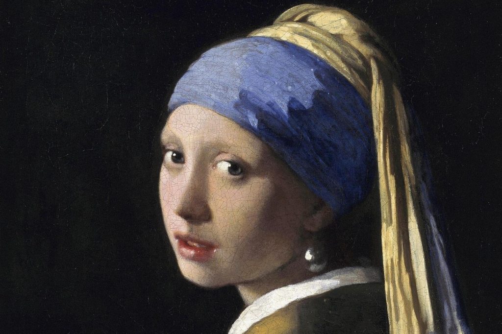
Emphasis can be used in a variety of ways within artwork, depending on the artist’s desired outcome. One common example is to highlight certain elements or shapes by making them larger than other elements. The emphasis in ‘Girl With Pearl Earring’ by Johannes Vermeer is on the woman’s face. This is due to the highlights contrasted against the dark background. The simple colour scheme creates unity and the viewer’s eye is lead around the piece to different sections that have been emphasised by Vermeer, such as the bright, reflective pearl and the colourful headdress.

Another way to create emphasis is through the use of colour. This can be achieved by making certain elements brighter or darker, creating a sense of contrast. The haystack in this painting by Monet has a similar value range compared to the distant trees. However, it’s the different hue that stands out. The red tones of the haystack appear emphasised against the green of the foliage, making it a focal point.
Emphasis and Focal Points

The main goal of emphasis in art is to draw attention to specific aspects within a composition. Theses aspects are known as focal points. These focal points are usually the most important elements within a piece. They are often used to convey a particular message or emotion. By creating focal points throughout the artwork, it helps to direct the viewer’s attention around the composition, creating an interesting visual journey.
In this painting, Klimt contrasts the surreal against the realistic. The geometric patterns of the dress are eye-catching, but the viewer is instantly drawn to the woman wearing the dress. This is because people are automatically drawn to people’s faces and the skin tones stand out against the metallic gold tones. Then Klimt directs the viewer’s eye around the opulent, symbolic jewels on the dress and around the head. This creates an interesting visual hierarchy that catches the viewer’s attention and makes their eyes linger for longer, due to the detail and pattern.
Visual elements in art
Each visual element, such as the colour, texture, shape, form, space, line, value of a particular subject or object will have its own visual weight.
Colour has more visual weight when it is warmer in tone, when it is more saturated or darker in value. Bear in mind that the proportion of colours will affect how much an element stands out.
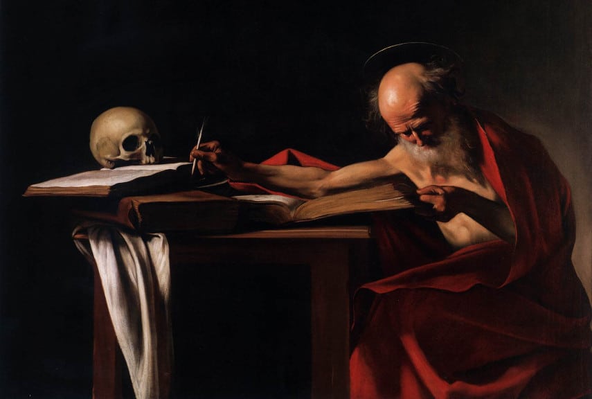
For instance, darker colours stand out against lighter colours, but if the painting is mostly made of dark colours, with pops of brightness, the brightness will stand out. This is evidenced in the painting by Caravaggio, where the highlights on the skull and Saint Jerome stand out against the dark background. Caravaggio uses a technique called chiaroscuro to achieve this. The highlights stand out due to the its uniqueness in the composition. Use these aspects of colour to create more colour contrast to create points of salience and emphasis in a painting. It’s the use of variety of one particular element which contrasts to the unity of the other elements that creates emphasis.
How to create emphasis in art
To create emphasis in art, artists must first understand how to use visual elements to create visual weight. This leads to selecting dominant elements and therefore creating emphasis and focus. As mentioned before, warmer colours appear more dominant than cooler colours. Then more saturated colours have more visual weight than more muted tones and darker values stand out against lighter values.
Then the artist should also learn how to create contrast through the balance, or imbalance of these elements.
Colour contrast is perhaps the most obvious way to create contrast and therefore emphasis in an artwork. A more subtle way to create emphasis is by adding definition in the details and form of a subject. For example, using hard edges for a subject in the foreground and soft edges for a distant object. Another way to create emphasis with form is to paint geometric forms next to organic forms, this will create contrast and therefore emphasis.

Separate a subject away from other subjects in a painting (i.e. create more negative space around the subject compared to others). In the Last Supper, da Vinci has used a number of techniques to create visual weight on Jesus’ figure. This includes, the light behind him creating contrast around his head, his position in the artwork. But it also includes the negative space around him, compared to the clustered figures to his sides.

Shapes that are larger stand out against smaller shapes and more complex shapes stand out against simpler shapes. Groups of small complex shapes will demand as much attention as one large simple shape. The small complex branch shapes stand out against the large simple shapes of the house in this Cezanne painting.
If you’re planning to incorporate texture in an artwork, consider adding more volume and texture to a subject that you want to emphasise. More rough and dimensional texture has more visual weight than smoother textures.
Contrast and emphasis
Contrast is another principle of design that compliments the use of emphasis. It creates tension by presenting differences between elements and directing the viewer’s eye to a certain point or area. By emphasising one element, it will draw attention away from similar elements in the artwork. For instance, in a painting that consists mostly of earthy tones, a contrasting electric blue line will stand out amongst the other colours.
Hierarchy and emphasis

The use of hierarchy is another important concept when creating emphasis in an artwork. Hierarchy is the presentation of visual elements in order of importance. By giving elements more visual weight, it will draw attention to them first. Then the viewer’s eye will be lead around the composition to focus on other areas of emphasis. The hierarchy of emphasis creates a rhythm for the viewer. Whereby, the viewer will be attracted to the subject with the most visual weight first, then the subject with the second most visual weight and so forth.
Edgar Payne was a master at creating rhythm in compositions. This example of his painting Arizona Mesa creates a visual hierarchy, first of the red mountain, then of the three figures, then of the desert plants and sky.
Variety and emphasis

The principle of variety states that elements must be different enough from one another to create interest, but similar enough to work together harmoniously. The use of variety is essential in creating contrast between elements which will draw attention to certain areas or points in an artwork.
Key takeaways
- Emphasis describes how artists create salience by arranging the visual weight of elements. These visual elements include line, texture, shape, colour, value, space and form.
- By emphasising certain points of an artwork, the artist can direct the viewer’s eyes around the piece.
- Contrast creates tension by presenting differences between elements and directing the viewer’s eye to a certain point or area.
- Hierarchy is the presentation of visual elements in order of importance, with the most important element at the top.
- Variety is essential in creating contrast between elements which will draw attention to certain areas or points in an artwork.
By understanding and utilising these principles together, artists can create effective emphasis and focal points within their artworks. Emphasis is an invaluable tool for artists to draw attention to areas of an artwork, to create an impactful piece.
Finally
By using emphasis, contrast, hierarchy and variety together in artworks, artists can create powerful compositions and capture the viewer’s eye. With practice and experimentation, you can use these principles to create effective focal points of emphasis in your art.
Feature image: Caspar David Friedrich: Wanderer Above the Sea of Fog