
Visual hierarchy is a fundamental principle of visual arts and design. It describes the way that artists organise visual elements in order to direct the viewer’s visual journey and emphasise the most important points.
In this guide, we will explore visual hierarchy—what it is, its elements and how to use it when creating artworks.
Disclaimer: Fine Art Tutorials is a reader supported site. When you make purchases through links on this site, we may earn a small commission at no extra cost to you.
What is visual hierarchy?
Visual hierarchy is the visual structure of a composition. It describes how elements are arranged to lead the eye around an artwork in a particular way. Hierarchy gives form and meaning to an artwork. Hierarchy in art helps create impact by drawing attention to certain elements and guiding viewers through the artwork in a meaningful sequence.

In a composition, some elements will stand out as having more importance, while other elements will appear less salient and will be less likely to catch the viewer’s attention. For example in this painting by Monet, the woman with the parasol takes centre stage. This is due to the perspective, the amount of the frame she takes up, her positioning and the level of detail on her figure.
By understanding how the placement of elements and the visual weight affects the salience of particular elements, artists can to some extent organise the hierarchy of importance of subjects, objects and design motifs in a piece.
Elements of art

The visual elements in art are building blocks that make up a painting or sculpture. These elements can be used to create hierarchy in a piece, depending on the visual weight of each element. These visual elements are: colour, shape, form, texture, line, value and space.
Each visual element can be used to create a statement or draw attention to certain areas of an artwork. By combining these visual elements in different ways, artists can create visual impact and direct the viewer’s focus in order of importance.
Visual weight of elements
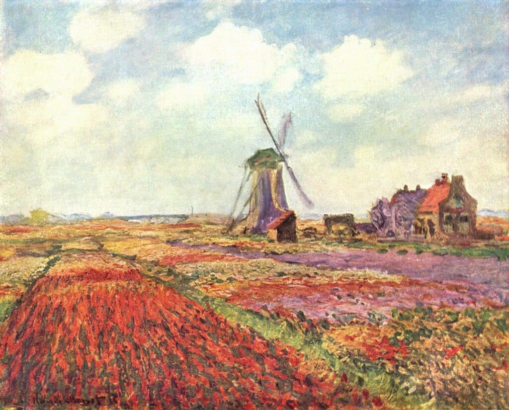
The visual weight of an element refers to how dominant it appears, or how much it demands the viewer’s attention. For instance, the visual element of colour can demand attention in a few different ways. Warm colours such as red, orange and yellow attract attention more so than cool colours like purple, blue and green. Similarly, saturated colours will visually dominate any muted tones. For example, in ‘Tulip Fields in Holland’ by Monet, the bright red tones of the tulips are likely to attract the viewer’s attention first, then the eyes will move to focus on the purple and yellow contrasting tones, then finally the eyes will rest on the cool muted tones of the sky.
Darker values will attract the viewer’s attention more than lighter tones in an artwork and complex shapes will have more visual weight over simpler shapes. Large shapes will come forward in a painting compared to small shapes and highly textured sections of a painting will appear more salient over sections without texture. Use the visual weight of elements to your advantage when planning the composition and hierarchy of different subjects.
Visual hierarchy examples

There are a lot of details and different objects in Vermeer’s ‘The Milkmaid’. However, when analysing the piece in terms of its visual hierarchy, there are a few different focal points.
The figure of the milkmaid is the most salient focal point. This is due to the fact that faces naturally draw attention more than anything else. Then the bright contrasting colours of the clothing is the next most dominant element. The warm tones of the terracotta jug draw the eye next. Then the unifying element of the bright blue cloth on the table that reflects the blue of the apron. Being the lightest elements in the piece, the attention is then directed to the bread, as it brings value contrast to the table. Because it is painting in a realistic style with lots of detail, it encourages the viewer to stop a take in the details of each element. This creates a regular viewing rhythm.
How to create visual hierarchy in art
When creating visual hierarchy in art, it is important to consider how you want the viewer to experience your artwork. People look for order, when they view artwork, so think about ordering different elements in terms of their importance. This could mean deciding that one figure will be the focal point and the most important subject in the piece. Then another figure will be the next most prominent focal point in the piece. By breaking down your composition like this, you should have a rough idea of the visual hierarchy. You could even create a composition sketch to make it easier to visualise.
When you have determined which elements you want to be the most eye-catching and important in the piece, then consider the visual weight of each element in your painting. Decide how these visual elements will draw attention and how the intended focal point will draw the most attention. Consider spacing out elements within the composition to create visual flow throughout the painting. You can use contrast, textures and visual elements to create visual emphasis for specific sections or subjects.
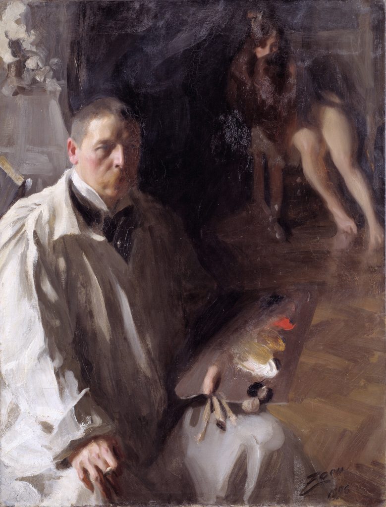
Use visual weight of the different elements to create hierarchy in your piece. For example, if you were painting two figures and you wanted to draw the viewer’s attention to one rather than the other, you could paint the figure intended to the main focal point with more colours or value contrast in their clothing. You could also make it so that they appear larger due to the perspective of the viewer. These are two examples of ways to create visual dominance with elements, that Anders Zorn used in his self portrait, in order to create a structure of emphasis.
Composition and visual hierarchy
When creating visual hierarchy in art, composition is a crucial factor. Your composition should be planned out from the beginning stages of painting. This way you can consider how different visual elements will lead the viewer’s eye around the canvas. Use elements such as line, shape and colour to direct the viewer’s focus around your artwork. Place more visual weight towards the focal point of your painting. Use contrast to draw attention away from less important sections or subjects.
Principles of art
The principles of art refer to guidelines that are used in artworks to devise compositions and to create effects. Visual hierarchy is one of the principles of art. Designers use visual weight and placement of visual elements to create visual flow throughout a composition. Contrast, emphasis, movement, pattern, rhythm, scale, proportion and balance are the other principles of art. They can all be used to elicit particular effects from the viewer. Many of these principles of art and composition are interlinked. Visual hierarchy, emphasis and contrast all work together to attract the viewer’s eye. Then rhythm and visual hierarchy work together to direct the viewer’s eye around the painting.
Contrast and hierarchy
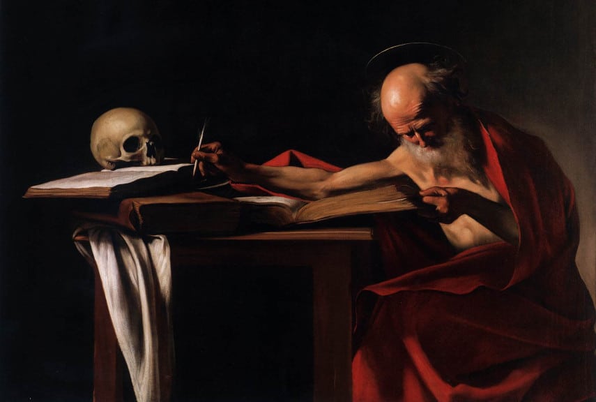
Contrast helps to create visual impact between two elements. This could include light versus dark, warm colours versus cool colours and highly textured sections against flat areas. Using contrast between elements, you can create emphasis and hierarchy within a painting. The technique of using high value contrast in a painting is called chiaroscuro. Caravaggio used this technique extensively to create hierarchy in his works. Saint Jerome, who is is lit against the dark background, draws the most attention with his bright red robe. The skull pulls the viewer’s attention next, as this mirrors the values of the main focal point. This composition has balance and hierarchy, which makes it appear aesthetically pleasing for the viewer.
Emphasis, focal points and hierarchy
The use of emphasis is key when creating visual hierarchy in artworks. To create emphasis, elements such as colour are given characteristics that have more visual weight. This can be done by using bright colours or contrasting values to create emphasis in certain sections. Visual emphasis helps to create visual hierarchy, as it draws the viewer’s attention towards specific visual elements within the painting.
Rhythm and hierarchy
Rhythm can contribute to creating order and hierarchy in artworks. It refers to a relationship that occurs between elements, when those particular elements are repeated throughout a composition.
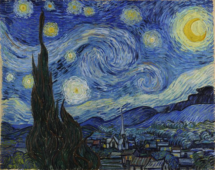
By repeating lines, colours or shapes, you can lead the viewer’s eye around your artwork by creating flow. This flow helps to create visual hierarchy, as it directs the viewer’s eye around your artwork in a coherent manner. Vincent van Gogh uses the repetition of textured, curving lines to direct the viewer towards the focal points of the glowing stars.
Proportion and hierarchy

Finally, proportion is also used to create visual hierarchy in artworks. Proportion refers to how visual elements are sized relative to one another within a composition. Subjects placed closer to the viewer, will appear to have more visual importance compared to subjects further away.
Finally
In conclusion, visual hierarchy is a principle of art and design used to create impact, emphasis and flow within artwork. Artists will use elements with visual weight such as bright colours and principles of design such contrast to draw the viewer’s eye around a composition. Visual hierarchy is an important tool for any artist or designer to use to create artworks that are striking and aesthetically pleasing.