
The Zorn Palette is a simple, yet remarkable colour palette that has captivated artists for over a century. In this comprehensive guide, we’ll unravel the secrets behind this limited palette and discover how it can transform your artwork by simplifying colour choices and harmonising your creations.
Disclaimer: Fine Art Tutorials is a reader supported site. When you make purchases through links on this site, we may earn a small commission at no extra cost to you.
What is the Zorn Palette?
Definition and Description
The Zorn Palette is a limited colour palette consisting of just four colours:
- Cadmium Red
- Yellow Ochre
- Ivory Black
- Titanium White
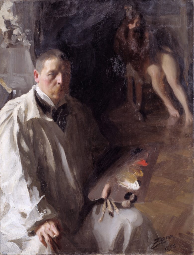
These four hues form the foundation of the Zorn Palette. Their versatility allows artists to create a wide range of colours and tones with remarkable depth and nuance. In his self portrait painting, Anders Zorn reveals his limited palette.
Limited Palette Concept
A limited palette refers to a colour palette that utilises a small number of pigments, typically three to five. By restricting the colour choices, artists can achieve greater harmony and cohesion in their work. In addition, artists can develop a deeper understanding of colour theory and mixing.
How does the Zorn Palette Work?
A limited palette should provide artists with the ability to create both tonal and chromatic variation in their paintings. To do this, a palette will usually consist of the primary colours (or variations of the primaries), white and either black or a dark earth colour.
The Zorn palette includes variations of the primaries, as ivory black is a low chroma blue. Therefore, when you add white to this colour, it becomes a lighter muted blue tone. Then yellow ochre is used to create yellow, muted green and bright orange tones. Cadmium red, on the other hand, is a high chroma, warm, deep red. This pigment is of course used for red, purple and orange tones and also for neutralising greens. It is suitable as a portrait palette, because it consists of warm pigments, perfect for creating skin coloured highlights and mid tones. Then ivory black is used to darken colours and create cooler tones and shadows.
Anders Zorn and the History of the Palette
Background Information

Anders Zorn (1860-1920) was a renowned Swedish painter known for his exceptional skill in portraiture, landscape painting, and etching. His extraordinary talent for capturing the essence of his subjects earned him international acclaim, and his works are still highly sought after today. He had a realistic, yet loose painting style and was consistent in using his limited palette throughout his career. He is a great example of an artist who used few materials to create wonderful compositions, with harmony, balance and contrast.
Development and Influence
Zorn developed his signature palette as a means to simplify his colour choices and enhance the harmony within his paintings. By using only four colours, he was able to create a remarkable range of hues with incredible depth and realism. The Zorn Palette has since become a popular choice among artists seeking to refine their understanding of colour theory and improve their painting techniques.
Limited Palettes in Art
Concept of Limited Palettes
Limited palettes have been used by artists throughout history as a means to achieve greater control over their colour choices and create more cohesive compositions. By working with fewer colours, artists can focus on the relationships between hues.
Other Famous Limited Palettes
In addition to the Zorn Palette, there are several other well-known limited palettes that have been popularised by famous artists, such as the Impressionist palette used by Claude Monet, which focused on primary colours, and the earth-toned palette favoured by Rembrandt. Each of these palettes offers unique advantages and challenges. Using them allows artists to experiment with different approaches to colour mixing and application.
Mixing Skin Tones with the Zorn Palette
Techniques for Creating a Variety of Skin Tones
The Zorn Palette is particularly well-suited for creating a wide range of realistic skin colours. By adjusting the ratios of cadmium red, yellow ochre, ivory black, and titanium white, artists can achieve an impressive spectrum of hues that accurately represent the diverse complexions found in human skin tones.
Mix a higher proportion of cadmium red and white, using yellow and ivory black to balance and neutralise the palette for accents of red on the lips or cheeks. Then mix in a higher proportion of ivory black for shadow tones. Bear in mind that skin colours are usually a lot more neutral in tone than they first appear. So work from a more neutral base, then increase highlights and saturation as the painting progresses. Another tip, is to pay attention to the tinting strength of different pigments when mixing. For instance, cadmium red has a high tinting strength, so you can mix a lesser quantity to achieve your desired results.
Tips for Achieving Realistic and Expressive Skin Tones
To create lifelike skin tones using the Zorn Palette, it’s essential to observe your subject closely and consider the underlying colours and values that contribute to their unique complexion. Pay attention to areas of warmth and coolness, shadows and highlights,. Experiment with varying mixtures of the four colours to achieve the desired effect.
Which Shades Can You Mix from the Zorn Palette?

This painting ‘Baking the Bread’ showcases the use of this palette. It’s not possible to achieve bright blues, or vivid greens when using just the Zorn colours, however, it’s possible to achieve a range of bright reds, oranges and yellows. Warm brown tones and muted greens are possible.

Notice how, even in a seascape painting, which the viewer may expect to exhibit ranges of blue tones, the shades of the water appear purple. This is due to the dominant colour of cadmium red, overriding the neutral low chroma dark blue of the ivory black.

In portrait paintings, onlookers would not notice the lack of bright blue tones, due to the fact that it is not naturally a colour that appears in skin tones.
The Benefits of Using the Zorn Palette
Colour Harmony and Cohesion
One of the most significant advantages of working with the Zorn Palette is the inherent harmony and cohesion it brings to your artwork. By using a limited selection of colours, you can create a more unified and visually appealing composition.
Developing an Understanding of Colour Theory
Working with the Zorn Palette also provides an excellent opportunity for artists to refine their understanding of colour theory. Additionally, artists can improve their mixing techniques by using a limted palette. By focusing on just four colours, artists can gain a deeper appreciation of the relationships between hues and how to manipulate them effectively.
Analysis of Anders Zorn’s Most Famous Artworks Using the Zorn Palette
Key Pieces Showcasing the Palette’s Capabilities
Anders Zorn’s extensive body of work features numerous examples of his expert use of the Zorn Palette. Some of his most famous pieces that showcase the palette’s capabilities include “The Omnibus,” “Home Tunes,” and “Ols Maria”

In each of these works, Zorn demonstrates his mastery of colour mixing, achieving stunning depth and realism using only four colours.
Techniques and Applications
In his paintings, Zorn utilised the Zorn Palette to create striking contrasts, delicate transitions, and a remarkable sense of atmosphere. By carefully observing his subjects and adjusting his colour mixtures accordingly, he was able to achieve an extraordinary level of detail and realism in his work.
Conclusion
We hope this comprehensive guide has provided valuable insights into the magic of the Zorn Palette and inspired you to experiment with this versatile colour scheme in your own artwork. By embracing the simplicity and harmony offered by this limited palette, you can elevate your understanding of colour theory, enhance your painting techniques, and create captivating compositions that resonate with viewers.