
When you’re new to oil painting, there is a lot of trial and error involved in the learning process. Artists will need to experiment to find which materials and techniques work best for them.
Oil painting is a forgiving medium. You can utilise the opaqueness of titanium white to fix mistakes, or the paint can be lifted from the canvas simply by wiping it away. But learning about common oil painting mistakes early on can help artists to save materials they would have used through trial and error and achieve their intended effects much sooner. After all, successful painting is about being intentional with the application and of course being happy with the results.
Disclaimer: Fine Art Tutorials is a reader supported site. When you make purchases through links on this site, we may earn a small commission at no extra cost to you.
Overusing grey and black paint
Learning to paint is just as much about learning the properties of your pigments as it is about your skill in applying colour to canvas. Incorporating too much grey and black pigments in your mixes can make colours look muddy, and isn’t always the best way to deepen shadows.
Ivory black for example, is in fact a low chroma blue and is cool in tone, therefore it won’t necessarily work harmoniously with other colours. For example, if you were trying to deepen warm toned shadows in a portrait painting, the ivory black would make the portrait tones appear cooler and dominate the colour mix.
Using burnt umber will darken colours in a more gradual and harmonious way. Burnt umber balances out the cool colour profiles of blues and when mixed with ultramarine, it will make a deep black.
Using ivory black and paynes grey could work for moody stormy seascapes, a monochromatic black and white painting, or a painting with predominantly cool tones. If you want to darken a colour slightly, burnt umber is a good choice.
It’s important to note that by mixing complementary colours (colours that sit opposite each other on the colour wheel), harmonious neutral grey and black tones can be mixed.
Overusing titanium white

On the flip side of using too much black or grey pigment in colour mixes, is using too much white.
There are two types of pigment that make white, zinc and titanium. Although they produce the same colour, they have very different properties. Titanium white is opaque and when used alone in colour mixes, it can reduce the intensity of the colour. This makes colours appear chalky, soft and more neutral. To lighten colours whilst maintaining a high chroma (intensity), use zinc white. Zinc white is more transparent than titanium white and won’t lighten colours as much, so a good choice is to mix titanium and zinc together to level out their properties.
Another mistake beginners make in relation to using white, is that they will use pure white for highlights or lighter objects such as clouds in the sky. Objects in real life settings are hardly ever pure white. For example, clouds will usually be light grey, neutral yellow or blue. Take time to focus on your reference to achieve accurate mixing of light values.

Not paying close attention to tone and value
The value of a colour is simply how dark or light a colour is. A helpful exercise is to take a photograph of your painting, and put it in black and white. Then you can see, regardless of what the colours are, how accurate the portrayal of shadows and highlights are. When analysing a reference photo, artists are often surprised at how colours are closer in tone and value than they are initially perceived.
Not focussing on edges
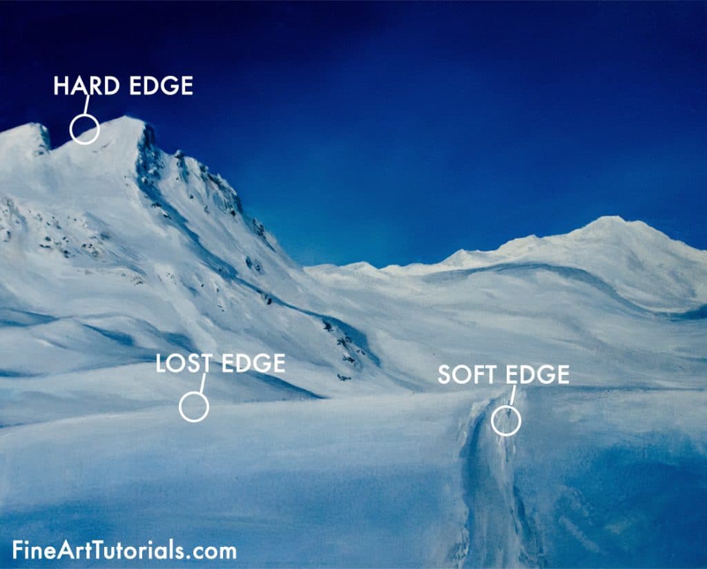
Edges refer to the relationship between two elements in a painting. A hard edge means that two shapes appear separate with a distinct edge or line defining the transition. This will mean a significant change in value or colour between the two shapes.
Soft edges mean that the transition between two shapes are more blurred and with a lost edge, the transition is almost indistinguishable. When portrayed in a skilful way, edges add an essence of realism to a painting. They demonstrate perspective, distance, weather, light source and the time of day. The edges provide the viewer with extra visual information that may be missing if the artist had not paid attention to rendering them.
Not mixing transitional shades

To achieve realistic effects, you might learn the blending technique to create seamless gradients in the skies of your landscapes, or to achieve smooth skin tones. The trick is to mix transitional shades between the two colours on your palette before you apply them to the canvas. To do this, mix the two colours you were planning on blending together, then take a little from each of these mixed colours in varying quantities to create the new transitional shades.
Using over saturated colours
Another feature of beginner artwork is that it’s often highly saturated. It feels intuitive to mix colours without toning them down, however, colours in real life settings are often much more neutral that we first make out.
To neutralise a colour, mix in either burnt umber, or some of its complementary colour. For example, if you want to mix blue to paint an ocean scene, you could neutralise the blue by either mixing in a small amount of orange, or burnt umber. Gradually make the colour more neutral until you are satisfied with how your mix looks.
A technique that can help with gauging how neutral or saturated a colour should be is using an underpainting to cover the canvas with a mid tone earth colour. Neutral mixes will appear brighter over a toned canvas and as they do in life settings compared to when painting on plain white.
Of course, many artists paint in highly saturated colours, this can be a stylistic device. But it can help to learn how to mix colour accurately to improve the basic skills.
Mixing colours as you paint
Something that really helped me to speed up my painting process was observing my reference and mixing most of my colours before I started painting. Of course, I usually end up mixing more transitional shades as the painting session goes along, but starting with an organised palette saves me time mixing whilst I’m painting. I find that mixing whilst painting can interrupt the flow.
Not using mediums
Oil paint is naturally viscous in texture. Even with artist quality paint, due to the thickness of the consistency, sometimes it can feel like it doesn’t spread far on the surface or that you’re scrubbing it in with the brush. If this is a frustration for you, using a painting medium can change the working properties of the paint to your liking. Mediums make oil paint feel easier to handle.
Make the paint less viscous so it spreads right across the surface in fluid, even strokes with some linseed oil. This medium is a good choice for artists who like painting in detail, or want a more fluid, slower drying paint to work with. If you want to use linseed oil but don’t want to slow the drying time of the paint, add in some solvent to the paint mix.
If you’d prefer to work with thick, textured paint, add some cold wax to the mix. It thickens oil paint, so that you can build up some serious texture on the canvas. Wax retains brushstrokes and you can even apply it with a palette knife. Painting in thick texture like this is called the impasto technique.
Not planning composition first
The composition can make or break a painting. You don’t have to paint exactly what you see from a reference photo, instead, spend some time planning the composition and rearranging some of the elements.
Grab pad of oil paper or sketchbook and plan how the different elements will fit together. Focus on what you want to stand out as the most salient element. You can bring this forward with positioning, or by rendering more detail. The centrepiece of the painting doesn’t have to be front and centre. Use the rule of thirds and place the main subject in one of the three intersections, for example. This will draw the viewer’s eye in slowly and look more aesthetically pleasing.
Think about how each element relates to the others. Create multiple thumbnail sketches and test out some colour schemes then pick your favourite one to paint. That way, when you start painting, you will feel more confident that you will create something unique, with a composition that works.
Using too much solvent
Solvent thins oil colours and it’s suitable to use in the first layers of an oil painting as it speeds up the drying process, but using too much of it can make colours appear dry and chalky. A paint film that has more oil content will appear glossy, lustrous and more vibrant compared to one that has been thinned with solvent.
Remember to always follow the fat over lean rule when oil painting too, whereby the oil content of the paint mixture is gradually increased with each consecutive layer. This will create a structurally sound painting and prevent unwanted warping of the paint layers.
If you’ve found anything on this site especially useful, you can make a donation to me through PayPal. I take a lot of time to research and write each topic, making sure each tutorial is as detailed as possible and I make all my content freely available. Any small donation (even the price of a cup of coffee!) can help me to cover the running costs of the site. Any help from my readers is much appreciated :).
Follow the link in the button below to support this site.
This was immensely helpful. Thank you for being so generous with your instruction.
I love this tutorial and that you have shared your knowledge for free. It will be extremely helpful to me in teaching a beginner class in contemporary portrait and figure painting.
Thank you so very much.
,
מלמד מאוד, תודה רבה על הבאת הידע המקצוע שלך לאחר
תודה
רותי
The method of explaining is very simple and easy to understand , which gives clear idea about how to work trouble free. The nature of colour is explained in very beautiful way.
Thanks a lot for such a useful tutorial.
Picked up some new knowledge. Thank you
I’ve always painted with acrylics and am trying out oils for the first time. This was very helpful! Thank you so much.
I found these articles very helpful is starting to oil paint. I have been soaking up the information. I also appreciate that so many of the articles are linked together so that it explains a method throughly.
Your article note on use of medium in oil painting is very useful to beginners. Fat over lean is little confusion. I have to try to understand it clearly. My few paintings have become dull and chalky and seems not followed the rule of fat over lean. Thanks for your guidance on oil painting.
I’ma beginner and have done a few days in the studio with a teacher using oils, this is so helpful as it corroborated what I was taught but can refer back to it. Thank you
I found this article incredibly helpful in avoiding common pitfalls as a beginner oil painter. The tips provided are practical and easy to follow, making the learning process much smoother. Thank you for sharing these valuable insights! – Tristian