Create your own gouache landscape painting with this step by step tutorial. Learn how to paint a gouache landscape with a limited palette of colours, using brushwork techniques to create the impression of texture. The key to creating a successful gouache landscape painting, is in painting with multiple layers.
In this tutorial, I approach the painting first by blocking in mid tone colours, then layering shadow and highlight details on top. The process involves establishing the broad shapes and colours, then refining in consecutive layers, leaving the finest details and highlights until last.
You can use this same process for gouache landscape painting, despite the reference photo. I’ll share some colour mixing tips and also give more ideas of landscapes to paint with gouache.
Disclaimer: Fine Art Tutorials is a reader supported site. When you make purchases through links on this site, we may earn a small commission at no extra cost to you.
Supplies for gouache landscape painting
You may already have your own gouache painting supplies, but here are some recommendations in case you need to stock up.
- Gouache paint: quality brands of gouache paint are M. Graham, Schmincke, Holbein and Winsor & Newton. For this tutorial, I use Winsor & Newton colours, which are highly pigmented, affordable and wonderful quality.
- Gouache brush: watercolour brushes work well with gouache. I use a Da Vinci Casaneo for backgrounds, which is a soft, absorbent synthetic brush. I also use a round Winsor & Newton series 7 brush for details. Square shaped brushes are brilliant for covering large areas of colour quickly and keeping brush strokes loose and painterly looking.
- Surface: use any kind of paper suitable for watercolour. I use the Strathmore Visual Journal, they make a cold pressed, 140lb book which I use for sketchbook work. Cold pressed paper is more absorbent than hot pressed paper, it also has a slight texture to it. You can use this texture to create the appearance of organic details in rocks, leaves and more. Hot pressed paper is smooth and better for illustrative pieces. Another great surface to use is Aquabord, which is a cradled wooden panel primed for watercolour or gouache paint.
- Palette: use a ceramic palette, or plastic palette. Ceramic palettes are more expensive, but resist staining and are heavy, which makes them great for studio work as they are stable when mixing colours. Plastic palettes are great for taking to go and sketch outside, or travelling. I use the Mijello plastic palette, which seals and locks moisture in, keeping squeezed colours fresh between painting sessions.
- Extras: I use masking tape to achieve a clean edge around the artwork, I also use two water cups, one for cleaning and the other for mixing into colours, paper towels and paper clips to secure the page in place.
Choose your reference

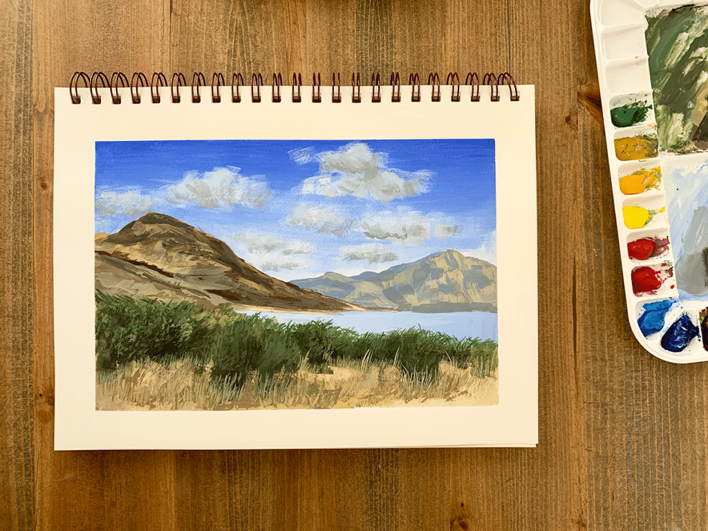
For the purpose of this tutorial, I used this reference photo that I took of a mountain and lake scene just outside of Queenstown in New Zealand.
Use this process for any landscape painting you want to try, whether that is using your own image or a stock photo. Feel free to screenshot my image and follow along with this blog or the YouTube video tutorial. However I do ask if you use the reference photo, to use it for practice only and if you share the results on your personal social media or website, please credit this blog, or the YouTube channel by sharing the link! Thank you!
Plan the composition
If you want to change the composition from the reference photo, make some thumbnail sketches to map out where the essential elements will go. Plan what the focal point will be and how the subjects will be arranged to optimise the aesthetic qualities of the painting.
I planned the composition for this mountain gouache painting at the photography stage. I took the photo at this angle, because I liked the way that the foreground bushes framed the mountains in the distance. The image also adheres to the rule of thirds, with the bottom third taken up by grasses and bushes and the top third by the sky. The main bulk of the mountain also fits with the left third intersection, making it a focal point of the painting. Because the elements are positioned and spaced in a way that leads the eye around the image, naturally creating flow and rhythm, it makes for a good composition.
We can also determine where the light source is coming from, which will help us understand the interaction between different elements, such as the softness of edges and where shadows are being cast. The light source in this image is coming from the right hand side.
Create a sketch

When you’ve decided on the composition of the piece, either by planning a few thumbnail sketches, or even a mock-up, the next step is to sketch the rough outlines on your watercolour paper.
You don’t have to be detailed with the sketch, use this stage to plan the proportions and structure of the piece. This will prevent you from making a mistake at a later stage. Watercolour pencils work excellently for sketching underneath gouache paints. This is because they are water soluble, so colour will dissolve under gouache washes, leaving no pencil marks in the final piece.
Paint the sky

The sky in this painting is a deep blue which transitions to a lighter blue near the horizon. To create a gradient like this, you will need to mix transitional shades between the two colours. I start by mixing the darkest colour of ultramarine mixed with a tiny dot of titanium white, then lining the top of the sky. Whilst the paint is still wet, I mix a little white in and paint a strip below the deep blue. Then I repeat this process of adding white to the blue and painting in strips, overlapping the previous colour until I reach the horizon line. Blend colours by using the wet on wet technique.
Large square brushes are excellent for covering the white of the paper quickly. The Casaneo brush by Da Vinci holds a lot of colour and water in the bristles, which makes painting this sky gradient feel quick and easy.
Cloud painting

To paint the clouds, I used the dry brush technique to achieve the broken, translucent, fluffy texture. The colour of the cloud isn’t pure white, it’s white mixed with a tiny amount of the light sky blue colour already on the palette. This tones down the mix and makes for a more realistic cloud colour.
To use the dry brush technique, get a medium sized brush, a square or filbert would work well. Then load it with the cloud colour and remove excess paint and water from the bristles on a paper towel. The brush should still have colour in it, but it will be fairly dry. Brush over the paper to form the clouds. If you are using cold pressed or rough paper, the dry brush will pick up the texture of the paper.
The shadows of the clouds are a mixture of titanium white, light sky blue and a little ivory black. Shadow can be built, so layer light to dark if you feel cautious about creating too stark of a contrast too early. The shadows sit underneath the cloud formations.
Paint distant elements

Create a sense of atmospheric perspective by lightening colours of distant elements. The distant mountain appears as a neutral blue colour, much lighter than the mountains in the foreground. Mix this shade with blue, titanium white and ivory black. Paint in the neutral blue block colour, then optionally wait for it to dry to add more details on top.

I mixed the neutral blue colour on my palette, with yellow ochre and titanium white to achieve a mixture around two shades lighter than the mountain colour. I painted short strokes to create the impression of dappled sunlight across the grass of the mountain.
For background elements, you don’t need to paint too much detail. I used a medium sized square brush to keep brush strokes loose. I wanted to make this mountain appear out of focus to contribute to the effect of it receding into the distance.
Block in the foreground mountain

The foreground mountain is the main focal point of the painting. It appears dark and contrasted in comparison to the distant mountain. I started by blocking in the darker tones, which was a mix of burnt umber and ivory black. I waited for each layer to dry before applying the next, to create hard edges. The impression of volume in the grassy and rocky areas of the mountain was created by varying the tones and values.
Block in the grass tones

Mix the mid tone of the grass colour that forms the bottom third of the painting. This was a simple wash of yellow ochre, with a little titanium white and ivory black to tone it down. I used a square brush to paint the large area quickly.
Paint the lake

The lake is a lighter colour than the sky, it has subtle reflections of the clouds in the middle. The colour of the lake is equal parts titanium white and ultramarine, mixed with a small amount of phthalocyanine (primary cyan blue). Wait for the base colour to dry, then add some white to the colour mix to make the reflections. Colours will look lighter when wet compared to when dry, so if you want more dramatic reflection colours, add in a little more white.
Paint the foreground bushes

The foreground bushes are a mix of viridian green, yellow ochre and ivory black. I start by blocking in the darker mid tones so that I can layer the lighter details and highlights on top after. I use a square brush to keep brush strokes loose to avoid paying attention to detail too early.

Add more branch details by using the edge of a flat brush. Frame the lake by painting branches upwards in short sweeps. This will cover the blocked in bush background.

Then once this layer is dry, make a brighter mix with green, yellow ochre, a touch of ivory black and white then layer on top with a round brush. Use a stippling action to create leaf details. Create the details in clumps for a more realistic appearance. As the light source is coming from the right, the leaf details curve downwards to the right.
Create grass textures

Create shadows in the grass with a wash of yellow ochre and ivory black. Paint this beneath the bushes.
Use a round brush that tapers to a point, like the Winsor & Newton series 7, and load it with a mix of titanium white and yellow ochre.
Paint upwards in short strokes to create grass texture over the mid tone background. Paint grasses in clumps in front of the bushes. This will create the impression of sunlight catching the grass.
Add details to the foreground mountain

The yellow grass colour in the mountain is a mix of yellow ochre, and burnt umber. Create the impression of outcrops by mixing lighter, more saturated colours. Shadow mixes appear more grey and have more ivory black and titanium white mixed into them.
Refine details

Take a step back from the painting and ask if anything needs altering or changing. A few final details could be added or adjusted here and there. The trick is knowing when to stop painting, as it is possible to overwork a piece.
I smoothed out some of the textures on the clouds and added a few highlights in the mountains and grasses.
Gouache is a fast drying medium, so once you’ve finished it should be ready within a few minutes. Do whatever you want with your finished painting, frame it, or keep it in a sketchbook to log your practice.
Gouache landscape painting tips
How to mix colours with gouache
Gouache is often described as opaque watercolour, colours are more pigmented. Freshly squeezed paint will appear opaque, but will have a semi translucent quality when water is added. To brighten colours and make them more opaque add titanium white.
To learn more about how different pigments combine to make new colour mixes, read our guides on colour mixing and colour theory.
Painting a landscape means choosing the right colour palette. Landscapes feature rich greens and brown colours, alongside blue skies, even bright yellow and pink flowers. The Introductory Set by Winsor & Newton provides a perfect palette for beginners to get started with landscape painting. The only colours you will need to add are titanium white, which they label opaque white and burnt umber.
Build texture in layers
Start by blocking in the broad shapes and colours in the painting. Starting with a mid tone is the most efficient way of painting, as you can use the most common tone first, then alter it in consecutive layers with a few highlight or shadow details. The first layer will look nothing like how you want the finished piece to look, you have to plan how you will build texture and layers to create the impression of highlights, shadows and details.
The best way to make organic looking texture, for example, the texture you might see on rocks, a tree trunk, the edges of clouds, distant bushes and leaves, is by using the dry brush technique on cold pressed paper. This creates the illusion of detail and saves you from spending hours with a round brush creating individual marks. In this gouache landscape painting, I used the dry brush technique to create the texture in the bushes, the grass and the clouds.
Leave the details until last
Once you have built layers of texture and added some shadows and subtle highlights, it’s time to refine the details. Get a round brush and add the the final highlights and finest details. It makes sense to layer these last, as if you were to add these in early on, they would likely get covered by other elements.
Gouache landscape painting ideas
Gouache landscapes have a signature look, with opaque water based paint, build bright, bold colour layers fast. It also lends itself to botanical painting, illustration, character design and much more. If you want some gouache painting ideas, check out our guide.
Coastal gouache landscape
The process I used to create this mini coastal gouache landscape was almost identical to the process I used to create the mountain painting. I started by blocking in the broad shapes and finished by refining details in the grasses and flowers.
Paint en plein air
Painting en plein air can improve your landscape painting. The quality of light is better when painting on location. Also, nothing compares to the sense of atmosphere you get from standing in front of a beautiful landscape. This will translate to the painting, as you may choose to include details you wouldn’t have otherwise picked up on had you been painting from a photo reference.
Composition sketches
Use the gouache medium to create a composition sketch for a large piece you are working on. It’s a flexible, fast drying medium, that is easy to set up and clean away. It’s perfect for creating a quick sketch to plan colour combinations before you paint a larger piece.
What is gouache?
Gouache is a water based medium, made from gum arabic and pigment. In artist grade gouache paint, the pigments are more heavily concentrated compared to watercolour. This gives the gouache an opaque quality.
Gouache can be used with similar supplies to watercolour and alongside the medium. It is a flexible medium in the sense that artists can choose to paint from dark to light, due to its opacity. Layers can be built in much the same way as in acrylic or oil painting. It lends itself to some interesting techniques, such as dry brushing and creating washes. It is one of the best mediums for complete beginners.
If you’ve found anything on this site especially useful, you can make a donation to me through PayPal. I take a lot of time to research and write each topic, making sure each tutorial is as detailed as possible and I make all my content freely available. Any small donation (even the price of a cup of coffee!) can help me to cover the running costs of the site. Any help from my readers is much appreciated :).
Follow the link in the button below to support this site.