
Learn everything you need to know about creating a toned drawing in this guide. Toned paper is a great option for those working in coloured pencil, pastel, charcoal, or just about any drawing medium.
Sketch in the darkest shadows and the lightest highlights with a dark and white coloured pencil. Create definition and contrast. The colour of the paper really makes the light accents pop out of the page.
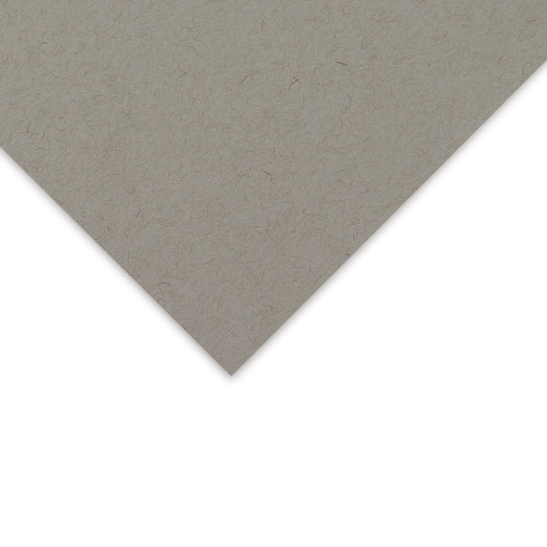
Toned paper will come in grey or brown, and in a variety of formats. For example, if you’re working in pastel, it would be beneficial to choose a paper with ‘tooth’ that the pastel will adhere to.
Disclaimer: Fine Art Tutorials is a reader supported site. When you make purchases through links on this site, we may earn a small commission at no extra cost to you.
Benefits of drawing on toned paper
Drawings can be completed faster with toned paper
The main benefit to drawing on toned paper is that drawing can be completed at a faster rate compared to drawing on white paper. This is because the midtone is already established, which saves valuable time shading. Leave the toned paper to show through in the drawing to represent the mid tones in the artwork.
All you have to focus on is the deepest shadows, some of the darker midtones, then add the highlights. Then you’re done! This is especially useful if you’re taking drawing lessons, or go to life drawing classes. Equally, if you don’t have much time to fit in your drawing practice to your weekly schedule, toned paper could be a great option for you. It’s easier to build a full range of value from a mid tone.
It’s easier to determine value relationships from a mid toned surface
A mid toned paper aids artists in subtly altering values, rather than going overboard by rendering stark contrasts between dark and light. The subtlety in transitions between values can make drawings appear realistic. This is because it’s easier to increase the value to make a shade lighter slightly, or darker slightly, rather than work to extremes as you would have to do if you were working on white or black paper.
Light colours pop!
Because the lightest values on toned paper are generally just used for the brightest highlights, in most artworks there will be significantly less rendering of light tones required. Because the lighter values occur less frequently, they are more salient to the viewer and therefore stand out more.
If you’re working with colour, for example, with pastel or coloured pencil, the colours of the lighter values stand out more against a toned background. They will appear more saturated in contrast to the neutral tone. For example, have you ever coloured a very pale yellow onto white paper, only for it to disappear? On toned paper, the saturation will intensify and appear as it does in life settings.
Achieve realistic values with toned paper
Hardly anything in life is pure white. Almost everything you see, no matter how light it looks, will just be a light shade of a particular colour. This is with exception of a light source like the most luminous part of a flame, or the sun, which can be represented by a small area of pure white.
Most colours in life settings will be toned down. For example, fluffy clouds can appear white against a blue sky, but when you really pay attention to the colours, they are actually grey, light blue or even yellow if the sun is shining through. Toned paper will enable you to better represent these subtleties in tonal values in your subject.
The best toned paper for artists
Strathmore 400 Series
Buy Strathmore 400 series paper
This is an archival quality, 100% recycled acid-free paper. It’s thick (118gsm) and is perfect for use with pencil, pen and mixed media. The paper comes in a tan colour, a warm greyish brown—use it with light and dark media to create wonderful tonal drawings. This paper can be used with any dry media, such as marker, graphite, white gel pen and coloured pencils.
Clairefontaine Pastelmat
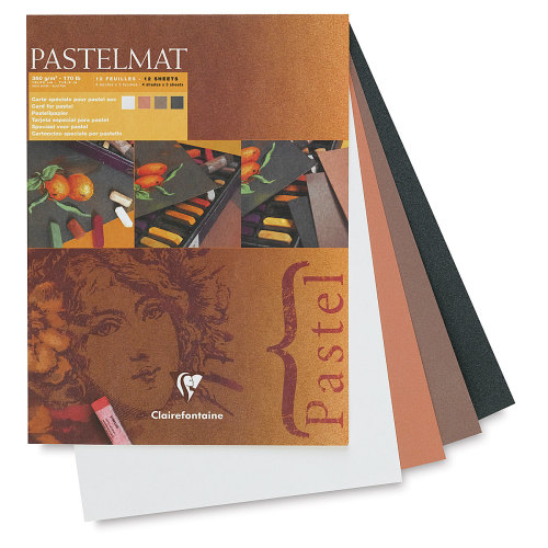
This is an extra thick, card surface designed for use with pastel and coloured pencil. The surface has a sanded texture that allows soft pastels to adhere better. With Pastelmat, you can create multiple layers of coloured pencil drawing, without the need for fixative. The paper is 360gsm, incredibly sturdy and feels velvety in texture, with a cellulose coating. Pastelmat comes in a range of colours, from light grey to brown. Browse through their range to find your perfect toned surface. The paper is water resistant, so it can be used with gouache and acrylic too.
Canson Mi-Teintes Pads
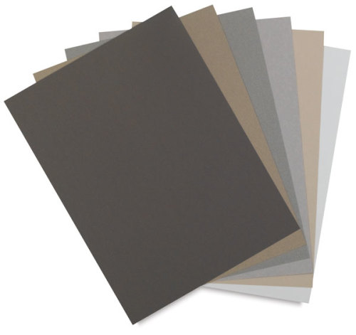
Canson Mi-Teintes paper has a vellum texture on one side and a flat texture on the reverse, papers come in a range of earth tones and grey colours. Both sides of the paper are perfectly suited for use with dry media, such as coloured pencil, graphite, charcoal and pastel. The paper is heavyweight, at 160gsm and has a cotton rag content of 66% to strengthen paper fibres.
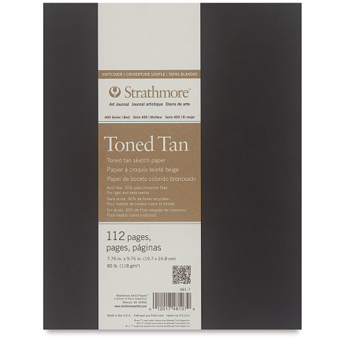
Strathmore 400 series soft cover sketchbook
Buy Strathmore 400 series sketchbook
This art journal has a velvety smooth soft cover and due to the sturdy stitched binding opens flat. Sketchbooks are a great accompaniment to art class, or when you’re out painting on location. This book is ultra lightweight and can easily fit into your bag. The paper is 118gsm and great for use with coloured pencil, graphite and pen.
Other supplies you need for drawing on toned paper
To draw on toned paper, artists need to capture the full value range of the subject. Therefore artists will need materials to accurately render light and dark values. A white pencil, like a Faber-Castell Polychromos oil pencil, a stick of conté, or a white pastel would work brilliantly. To create the dark values of the drawing, graphite, charcoal or coloured pencil. If you choose to work with coloured pencil, you can choose a limited palette of colours to create a tonal drawing.
A tip for creating realistic value transitions, especially in portraits and in figure drawings, is creating a blended appearance to resemble soft shadows on the skin. Get a paper stump to blend charcoal or pencil, as the paper stump picks up the pencil residue, you can use the paper stump to create light shaded tones. Clean paper stumps with sanding paper. To lift areas of shadow to reveal mid tones, for example for sections of reflections on the shadow areas, which in portraits is often under the nose or the chin, get a kneaded eraser. This eraser will lift charcoal, coloured pencil and graphite to create subtle transitions and highlights. Tombow Mono erasers are fantastic for rubbing out small areas, for example details in the hair, small lines or pore details.
Coloured pencil on toned paper
Working with a brand of coloured pencils like the Faber Castell Polychromos, you could choose two pencils to create a tonal range. For example, burnt umber and white would work excellently on a warm brown toned paper. Or you could choose burnt sienna and white to go with an orange-brown toned paper. Alternatively, if you’re working on grey paper, you could choose the colour dark sepia for the shadows and white for the highlights to create your tonal piece.
Another option is to choose colours to fit into a value scale. This means choosing a range of light and dark pencils that have the same colour profile. For example, use a black Polychromos pencil for the darkest areas, then use a selection of their cool greys to create value transitions and white for highlights. This could mean using around four of five pencils for one toned drawing. The toned paper will act as one of the values in your value scale. Of course, you don’t need to use this many pencils to create a toned drawing, but this is just another example of how to create an artwork on toned paper. The other option is to use a range of colours on toned paper. For example, you could buy some blue toned paper and use a dark blue tone for shadows, light blue and white for highlights. If you’re interested in learning more about how to draw with coloured pencils, check out our guide.
Colourful drawings on toned paper
Toned paper is a preferred surface for many coloured pencil artists. This is because the tone of the surfaces enables artists to perceive subtle colour and value transitions easier. It’s more difficult discerning between value relationships and contrast when working on a stark white background. Build layer upon layer of coloured pencil, starting with mid tones and gradually increasing the contrast of the drawing. Coloured pencils allow you to draw realistically, blending multiple layers on the surface. Try drawing wildlife, flowers, still life or portraits, if you’re stuck for inspiration, check out our list of 70+ drawing ideas.
Toned drawing: Portrait tutorial
Artists can create beautiful portraits that have an almost sculptural appearance incredibly efficiently on toned paper. As you see in this drawing, the artists let the mid tone paper show through and focussed on rendering the dark and light accents. The key is to create soft transitions between the shadow areas and the paper.
It can feel more intuitive to start building the lightest highlights first, then gradually shade the dark areas. Work on a mixed media paper like Strathmore 400 series, so that you can use multiple different mediums. For example, if you start with graphite or charcoal and then decide you want to add in a pop of colour, you can add coloured pencil, watercolour or gouache afterwards.
Portrait drawings rely on accuracy for success, for example if the eye or nose is in slightly the wrong place the whole artwork will look off. If you’re new to portrait drawing, you can use the grid method to help with the placement of the facial features. Make sure to start a regular drawing practice, as accuracy will improve over time.
When drawing portraits, start with light lines to map out the placement of different facial features. Refrain from starting by filling in the darkest shadow areas, instead sketch with light pressure. Use a hard pencil, like a HB or H with light pressure, so that lines are easily erased afterwards. It can help to outline the shadow areas, so you know where the darkest areas will be. When you’re certain that the structure of the face looks correct, gradually increase the contrast. Realistic values are often less contrasted than we initially perceive.
Tips & techniques for toned drawings
Draw highlights first
More often than not, it makes sense to layer shadows over highlights when drawing on toned paper. However, this depends upon which medium you are using. For example, if you’re using charcoal or graphite for shadow tones and white pastel or pastel pencils (e.g. Polychromos) for highlights, if you were to layer the waxy highlight over the charcoal, it would create a smudgy looking bluish tone. Which, especially when working on warm toned paper can appear messy. To achieve more clean transitions between light and dark, start with the light, then gradually layer in the dark areas.
This approach to drawing on toned paper doesn’t apply if you’re using pastel or pastel pencil for shadows tones, only if you’re using charcoal or graphite. If you’re working with two oil pencils for example, you will be able to layer the lighter highlights over darker mid tones. You will see colours mix in a more logical way by using mediums that work in harmony with each other.
Establish a value scale
When creating monochromatic drawings on toned paper, it can be helpful early on to establish a value scale across the drawing. By focussing on one particular area and building details in that one spot early on, it can throw you off and make it more difficult to determine values in other areas of the drawing. Instead, start by lightly mapping out where the lightest elements will be with your white pencil. Then lightly sketch where the darkest shadows will be. This will show you where the areas of high contrast will be. Afterwards, you can work on increasing the contrast in the areas you mapped out, filling in dark and light mid tones and creating transitions from these dark and light mid tones to the tone of the paper.
Remember that often less is more with toned drawings. It’s easy to overwork it. If you overwork it from the offset by starting with intense shadows and highlights, you may end up erasing lots of the marks you made in the drawing.
Focus on shapes before details
This is a technique and approach that also applies to painting. The premise is to focus on the image as a whole, rather than paying attention to small sections at an early stage. Look at the large shapes and tonal masses that make up the drawing and at the first stage outline these. For example, if you were drawing a face, map out the shadow sections in the drawing, so you have the largest masses that create the impression of the face as a whole, before focussing on the eye drawing or individual eyelashes. Another example is if you were drawing leafy trees in a woodland, you should focus on creating the broad tonal masses of the foliage, before drawing the individual branches.
The key to a successful artwork, is often in simplifying the image and omitting the unnecessary elements. A common mistake beginners make is over modelling, where artists draw too many details that appear too contrasted in relation to the value scale of the drawing. Drawing single leaves on a tree will not change the effect of the drawing as a whole.
Study your reference and edit it in Photoshop. For example, you could put the reference into greyscale, then go to the filter>noise settings and set the drawing to median. This will show you the average light and dark tonal values in specific areas of the reference. Use this as a tool to help you better understand value relationships and simplify the drawing.
Pay attention to edges
The edges in an artwork refer the transitions between different elements. For example, a hard edge in an artwork consists of a distinct separation between two elements, usually in the form of a line. A hard edge transition in a drawing will be created by a large and sudden shift in value. Soft edges in a drawing will look blurred—elements will transition into one another smoothly. In a lost edge, the transition between one element and another will be so smooth that the placement at which one element starts and the other stops should be almost indistinguishable.
Draw texture
Another skill to master when creating realistic style drawings is to layer texture to create the impression of detail. For example if you are drawing hair, shade with the side of the pencil in the direction that the hair strands curve. Then lightly use the tip of the pencil for the ends of the hair, where individual strands are visible. Create the illusion of light reflecting off of the hair, by getting a fine tipped eraser, like the Tombow Mono Zero and lightly lift where the strands are reflecting light.
Shading techniques
In most of the demonstrations in this article so far, the shading technique of ‘tonal shading’ has been used. This is where the artist will apply more pressure to the pencil in darker areas to define shadows.
You can use a number of pencil shading techniques such as hatching, cross hatching and stippling to define areas of light and dark. Artists also create the appearance of texture with techniques like scumbling, where small circles are layered on top of one another; artists avoid blending pencil with tools like paper stumps to retain pencil marks on the paper. This can add variety and interest to a piece. If you’re interested in learning about other pencil drawing techniques, check out our guide.
Still life: Pineapple drawing on toned paper
There are broadly 5 steps to drawing a pineapple on toned paper. I used the Strathmore 400 series toned tan sketchbook for this drawing, along with Polychromos pencils in burnt umber and white. First determine the light source, then draw guides to create an accurate drawing. With the guides in place, use them to find the placement of the leaves, pineapple fruit and the diamond shaped fruitlets. You can define the rough outline sketch by drawing in some details. Then increase the contrast of the sections with shadows and highlights. Use a white pencil for the brightest sections.
Toned paper art inspiration
If you’ve found anything on this site especially useful, you can make a donation to me through PayPal. I take a lot of time to research and write each topic, making sure each tutorial is as detailed as possible and I make all my content freely available. Any small donation (even the price of a cup of coffee!) can help me to cover the running costs of the site. Any help from my readers is much appreciated :).
Follow the link in the button below to support this site.
Drawing on toned paper is definitely a plus, especially for mapping out values.
It makes the mechanics of drawing that much easier.
Thank you for a well written tutorial.