
Paint an ocean wave with soft pastel, a step by step tutorial with video!
Soft pastel is a wonderful highly pigmented and soft medium that lends itself to expressive mark making techniques and blending. Painting the ocean, waves and water scenes always turn out beautifully with soft pastel, due to these features.
Soft pastels are fairly thick in shape and soft, so they are conducive to expressive styles. For this tutorial, let go of making detail marks and instead focus on creating vibrant colours, form and the impression of movement in the water. In this guide, learn the essential techniques, like layering, blending, colour mixing and how to create water spray by scratching the pastel. I’ll walk you through each step, including how to set up the surface ready for painting and how to finish the pastel painting with a fixative.
Disclaimer: Fine Art Tutorials is a reader supported site. When you make purchases through links on this site, we may earn a small commission at no extra cost to you.
Paint an ocean wave with soft pastel: Video tutorial
Watch step by step how I created this soft pastel wave. It’s an easy and fun tutorial that doesn’t involve many steps. Skip to the bottom for the supplies list.
How to paint an ocean wave with soft pastel: Step by step
Follow each step to create this ocean wave for yourself. Use my finished painting as a reference. When pastel painting, it’s important to remember to go with the flow, and enjoy the process. Start by working the pastel in with the lightest touch to the paper, then slowly build colour layers. Pastels are great for painting loosely and creating expressive marks, so let go of details and enjoy!
Set up your workstation

You can of course work flat on a table with pastel, however there are a few benefits to working at a vertical angle. Soft pastel is a dry and dusty medium, so to avoid dust pooling and collecting on areas of your drawing, prop it upright so that dust collects underneath the artwork. Then put a cover like a tablecloth down to protect your floor or table.
One way to do this is to tape the paper to a board, like a piece of wood or MDF with masking tape. Then prop the board up on a surface support like an easel. If you don’t have an easel, you can find something else to prop the board up against. However, you can buy relatively inexpensive easels, like these tabletop easels or drawing boards which are perfect for pastel painting.
Draw the sky

Start the pastel painting with the sky. I’m using a light neutral toned blue for the sky, and holding the square Art Spectrum pastel on its side. By holding the pastel like this, I can cover larger sections of the drawing. Take care to use light pressure, as pastel is so soft, you don’t need much pressure to release intense, saturated pigment marks onto the surface. I blend in a brighter more saturated light blue colour for the top of the sky.
Line the horizon

To achieve a clean straight horizon line, stick a strip of masking tape where you want the sea to meet the sky. I’m using square shaped soft pastel, so I used the edge of the pastel to establish a clean line.
For my own pastel painting, I’m using a limited palette of colours. I didn’t have the exact colour match I wanted to create the distant sea colours with in pastel form, so I decided to mix two colours together. The distant sea colour near the horizon is dark in value, a deep blue that leans ever so slightly towards purple in hue. So to create this colour mix, I use my ultramarine shade, then I lightly apply some dark teal over top. The ultramarine on its own was way too saturated, so the dark teal colour will act to tone it down. I’m using a limited palette to demonstrate how you can instead take the approach of colour mixing to create your desired effect. However, if you wanted to use a single pastel to create the horizon colour, Unison’s colour ‘Blue Green 2’ would be a good match.
I’m applying the lightest pressure I can for the first stage of the drawing. This is because soft pastel can very quickly fill the tooth of the paper. So by applying colour layers lightly to start off with, you will give yourself more room to build colour and adjust values as you go along.
Create a colour gradation on the horizon
The sea on the horizon is dark in tone then it gradually gets lighter and more saturated nearer the wave. To create this effect, layer a lighter turquoise colour over the top of a darker teal close to the top of the wave.
Draw distant ocean waves

Use the light turquoise to create horizontal lines across the top of the ocean near the horizon. This will give the impression of distant waves and ripples catching the light.
Blend all this out with your finger or with a blending tool if you have one. The distant ocean doesn’t have to look detailed, or have sharp lines. This section of the artwork can be soft in appearance and out of focus, as the main focus is the wave, which you can add more detail to.
Draw the wave outline

Outline the wave shape, the foam and the shadows. Draw this with your mid tone pastel, the one that will form the base colour of the wave, for me this was my dark teal colour.
The shape of the wave is a barrel, that takes up around a quarter of the drawing, although you can make it slightly bigger or smaller to achieve your desired effect. At around two thirds of the way across the drawing to the right, the wave curls upwards. The lip of the wave casts a shadow as the light source is coming from the left. You can draw in this shadow with the midtone teal colour.
Block in mid tones

I use a light neutral blue green to block in the base colour of the foam.
For the wave, the darkest areas are at the top and bottom (near the barrel). The dark mid tone I use for this is the teal colour. Then I have also drawn in some mid tone highlights in the middle of the barrel to show where the light is hitting it.
Block in shadows

A shadow is cast to the right hand side of the barrel of the wave, underneath where the lip is curling over. For the shadow colour, I used a dark teal mixed with a deep violet. This creates a neutral dark blue. The violet provides some contrast and distinction between the mid tones and shadow. This creates a more vibrant, expressionistic impression. The other shadow areas are underneath the foam, where I used the same colour combination to create depth. There is also a shadow being cast in the middle of the barrel, to the right of the lightest section of foam.
At this stage, I also used the same colour I used for the foam to paint the section of water in front of the wave.
Add volume to the wave

I use a light turquoise colour to line highlights on the wave. Broadly, the highlights curve in short strokes diagonally down to the right. This curvature creates the impression of volume. Blend this into your midtones for a softer appearance.
Start adding highlights

The brightest highlights are the foam details in the wave. Use your lightest turquoise colour, or an off white to stipple in highlights. Stippling is a technique whereby pastel is pressed into the paper using a repetitive dotting action.
This creates texture and is perfect for sea foam. Blend out the edges a little using your sponge tool.
Draw in the foam detail highlights in front of the wave. I use my lightest turquoise colour to render these abstract lines. I want to create the impression that the foam is being drawn into the wave.
Increase contrast by deepening shadows and adding more highlights

Because we’ve used the blending technique throughout the painting, the darkness of some of the shadows has been lost. Use your dark colour to line underneath the foam once more to emphasise it a little. However, if you feel this section is dark enough already in your painting, you may want to skip this step.
The hardest edges that require the least blending come in the top layers of the pastel painting. This leads the viewer to focus on them the most. Take your lightest turquoise colour and draw some final highlights using the same short curved action as you did to create volume in the wave. Use a sponge to soften the edges of the marks, but don’t blend completely.
Use an off white colour to dot in some large ocean spray in the lightest sections of the wave. You can see from my process shot that the lightest sections sit on top of the foam.
Final ocean spray details

A tip to create the finest details of ocean spray, is scraping your white or light turquoise soft pastel onto the paper over the foam section. Scrape it with either a knife or your fingernail. Press a sheet of paper, like glassine paper or tracing paper onto your surface to press these fine particles of pastel into the paper, so they don’t fall off.
Spray the pastel painting with fixative
The last step is to fix pastel with a fixative. It’s an optional step, but using a fixative will protect the pastel painting from moisture, smudging and some fixatives will even protect from UV damage. Follow the instructions on the fixative bottle and always use it in a ventilated environment.
After you’ve sealed the drawing, it’s ready for framing!
Supplies needed to paint an ocean wave with soft pastel
You don’t need too many supplies to paint an ocean wave. With soft pastel, there’s minimal setup and cleanup required, which makes it an easy and immediate medium to work with.
Pastels
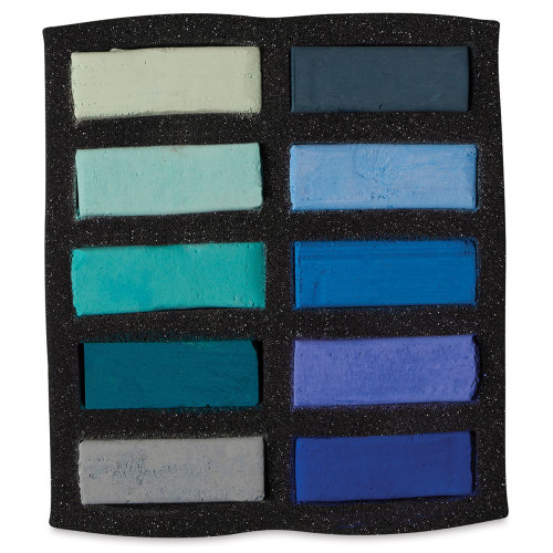
For the tutorial, I used the set of turquoise colours from Art Spectrum. However, you can choose any set you like. I would advise getting pastels in various blue and green shades, with one ultra light turquoise colour and a white or off white. I used a violet tone for the shadows, which when applied over a deep teal colour neutralised the mix.
Here are some fantastic brands that offer sets of marine shades:

Unison pastels are extra soft, highly pigmented a feel luxurious to use.
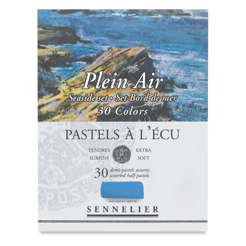
Sennelier pastels are even softer than Unison and have a unique buttery feel. These are artist quality and highly pigmented.
Art Spectrum are excellent quality, affordable, pigmented and square in shape. Use the edges for covering large areas or creating sharp lines.
Check out our review if you’re interested in learning about the best soft pastels for drawing.
Surface
The best surfaces for pastel painting have ‘tooth’ or surface texture that enables the pastel to adhere and stick to the paper. Pastelmat is like a thick card with a velvety texture, that will hold multiple layers of soft pastel. Sennelier pastel paper is another great option. Check out their coloured papers—working on a toned ground can help you to perceive tonal transitions in the artwork better. If you want to draw on a board, that makes it easier working at an easel, Pastelbord is a great, museum quality surface to use.
Blending Tools
To blend pastel, you can use your fingers, a brush, or a tool. Use these blending tools: a collection of soft brushes and silicone tools to blend and mould pastel on the paper.
Pan Pastel manufactures a range of blending tools called Sofft tools purpose made for soft pastels. They are dense sponges attached to a handle shaped like a palette knife. Sofft tools come in different shapes and sizes and work to simultaneously press pastel into the paper and subtly blend. It’s best not to over blend pastel as colours can start to appear dull. So this is really the perfect tool to use with the blending technique.
Fixative
This is an optional material that functions to fix pastel in place, to prevent it from smudging and protect it from moisture. Sennelier pastel fixative gives a fine mist that will seal pastel. Use it outside for adequate ventilation.
If you’ve found anything on this site especially useful, you can make a donation to me through PayPal. I take a lot of time to research and write each topic, making sure each tutorial is as detailed as possible and I make all my content freely available. Any small donation (even the price of a cup of coffee!) can help me to cover the running costs of the site. Any help from my readers is much appreciated :).
Follow the link in the button below to support this site.